As a solo designer, I took on all the roles that a team might need: Maker, Stitcher, Writer, and Asset Collector.
For my Design Sprint, I first had to make a plan and define requirements. Business requirements state why the organization is undertaking the project and the benefits to the company and the stakeholder. I was undertaking the project because the client had asked me to improve her at-home fitness experience, as well as the other members of her soccer team.
The benefits of our organization undertaking this project will be:
She would like to show this presentation directly to the other Cathletes and Cathe herself to improve the overall experience with the app.
If the app users enjoy it more and find it easier to use, they will be more likely to recommend the app, thus increasing the number of users of Cathe on Demand.
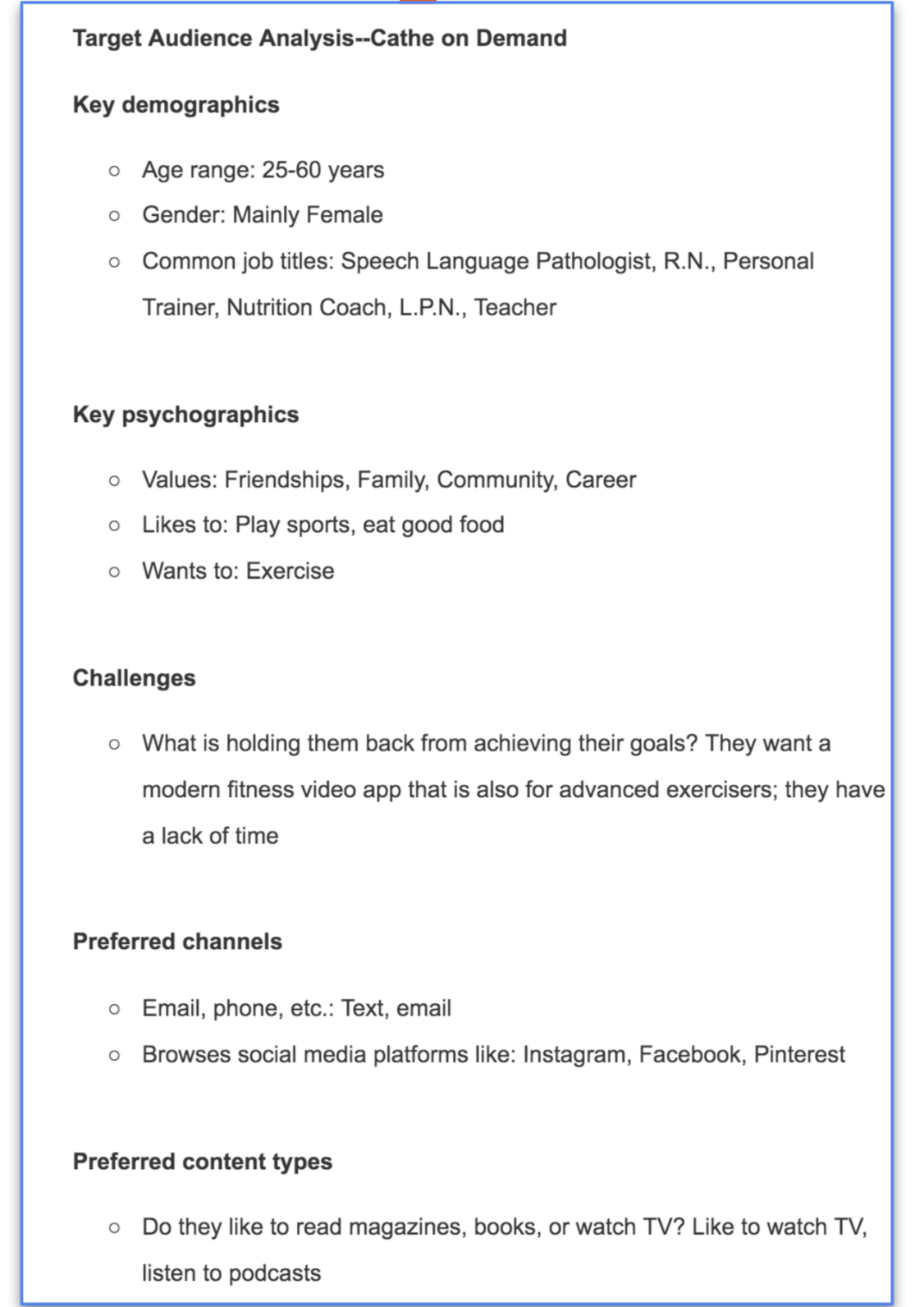
I interviewed my client and asked her about her vision, goals, insights on who the users will be, how she wants things to work with the product, and any previous efforts to accomplish this. I created a Target Audience Analysis. Based on the client interview, I defined my target audience using the research I’ve completed and my investigations.
Functional requirements state what the product needs to do to accomplish the previous tasks. For example, the product needs to do these things to achieve the functions mentioned earlier: It needs to have high-definition images and videos. It needs browsable videos. It requires a user-based library of videos completed.
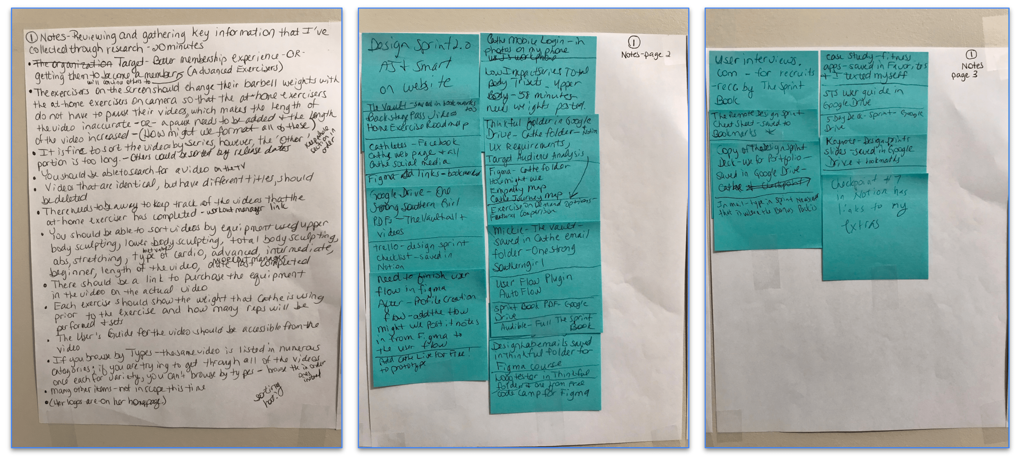
I needed to review all of the research I had accumulated so far about my real-world client and the project that I was embarking on during this design sprint. I recorded myself reading all of the Checkpoints so that I could listen to them over and over again during this sprint.
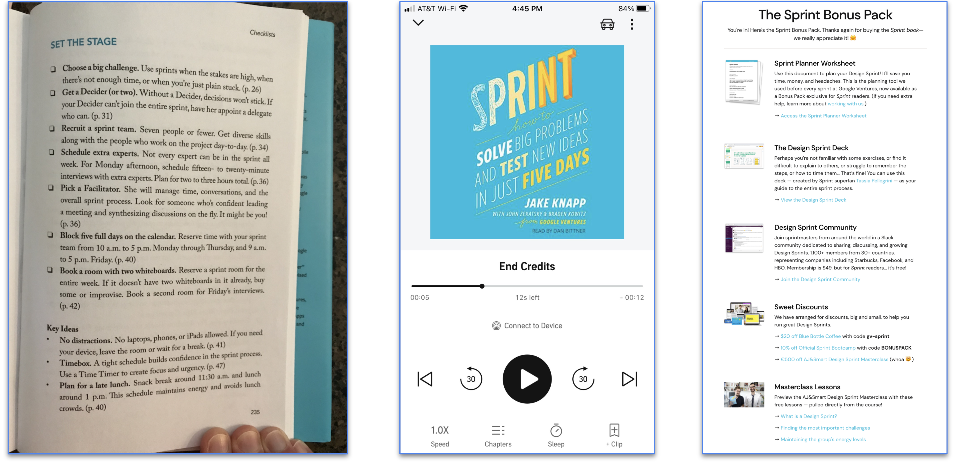
I bought a physical copy of the Sprint book to help me with this Sprint. I also bought it on Audible. They even gave me a Sprint Bonus Pack for being such a good customer!
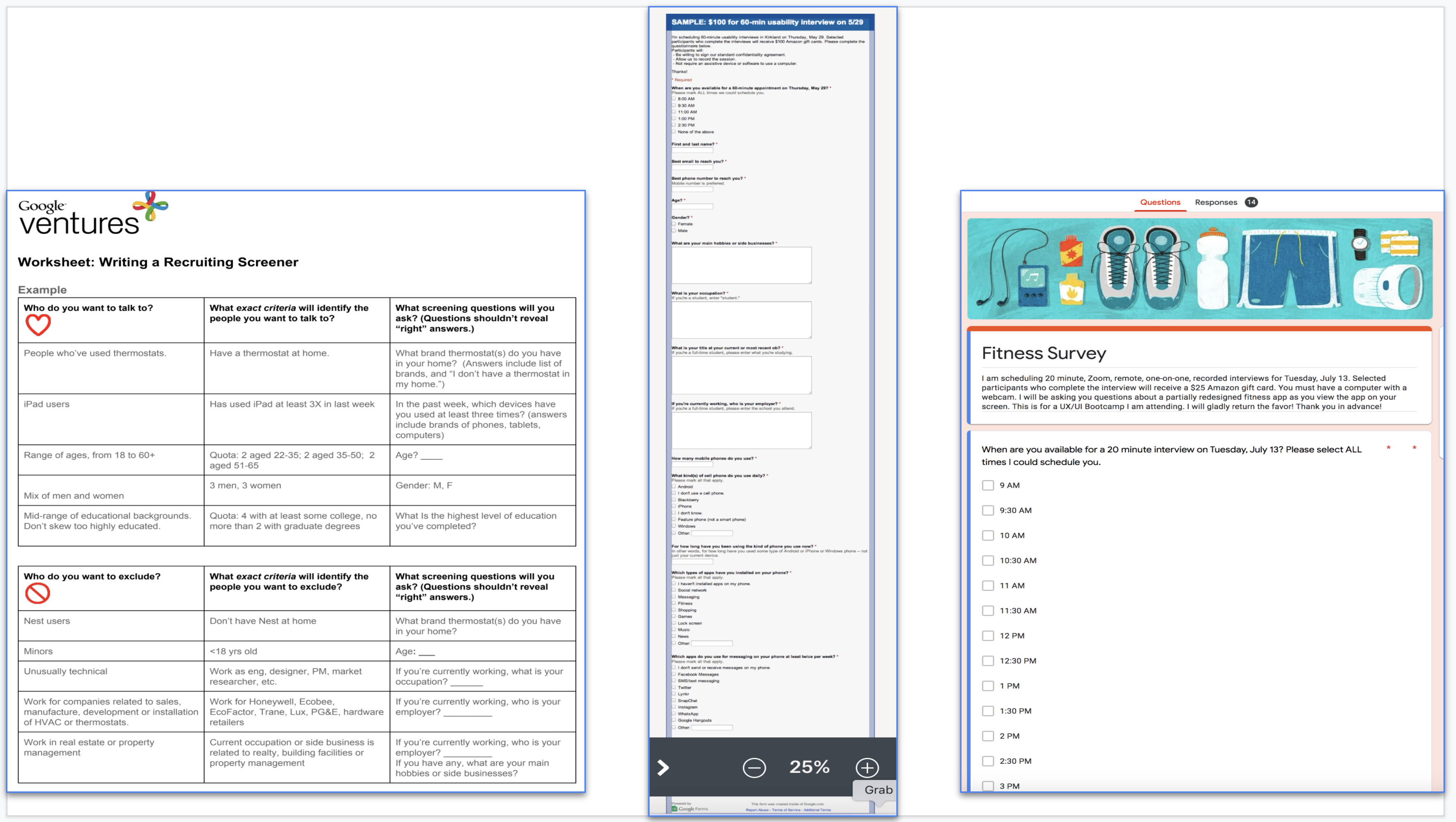
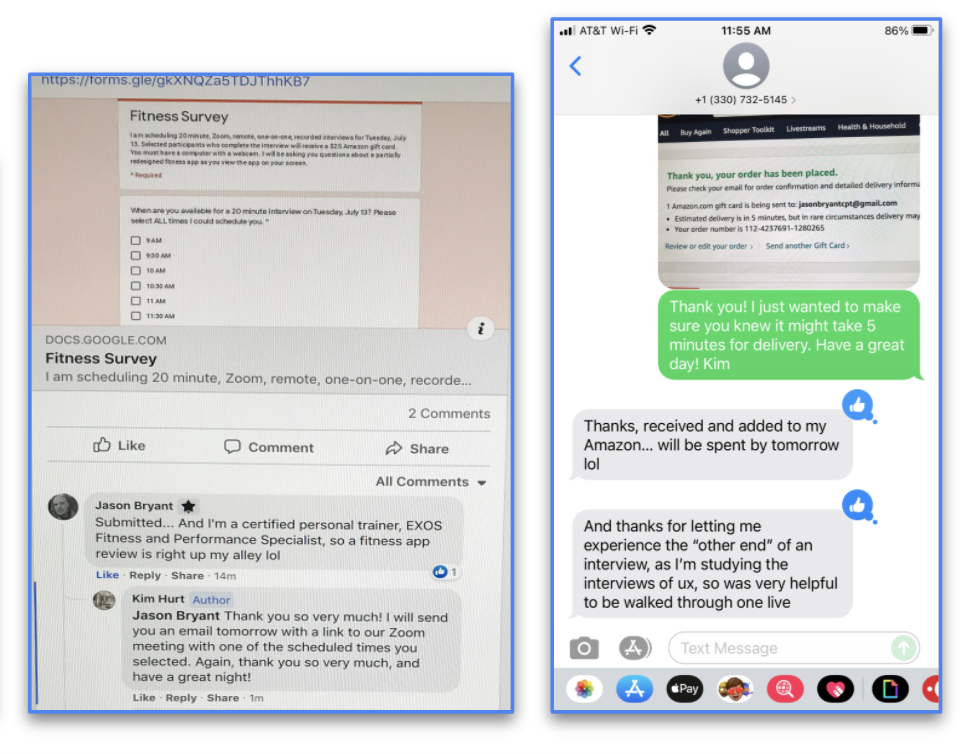
I wrote a screener survey for user testing recruits. I asked questions that helped me identify my target customers based on my target audience analysis, but that didn’t reveal exactly who I was looking for. I used this worksheet for writing my screener. And I used this template for an example research screener form. I created my screener questionnaire in Google Forms, as it's free and easy to set up. Plus, the responses go right into a Google spreadsheet that I can sort and filter. I made sure I included a multiple-choice question that lists available time slots. This saved me so much time emailing to align the participants' schedules. Finally, I recruited users for the final week of testing interviews.
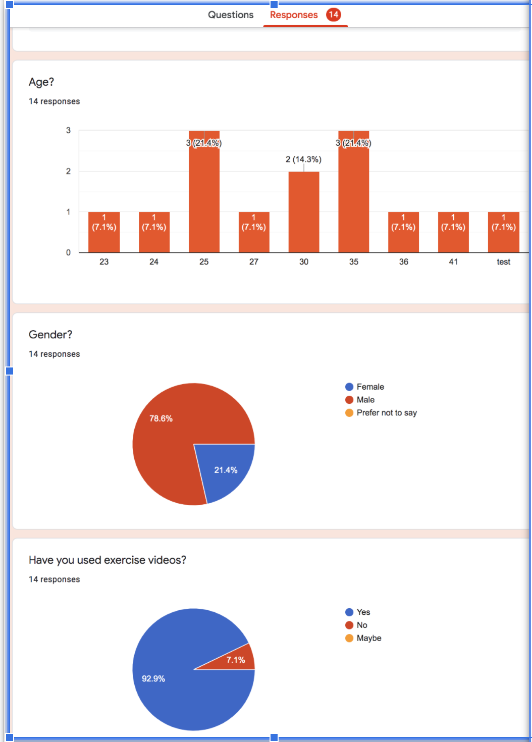
The survey eliminated the participants who had not used a video to exercise. 7.1 percent of the respondents had not used a video to exercise. At the beginning of the survey, I made it clear that any chosen participant would also need to have a computer with a webcam. I needed a range of ages, from 18 to 50. 42.7 percent of the people I surveyed were in their twenties. 42.8 percent of the people who participated in the survey were in their thirties. 14.5 percent of the people who answered this question on the survey were in their forties. Cathe’s following consists of primarily females, so I needed more women than men. 78.6 percent of the respondents were male, and 21.4 percent were female. I needed a range of educational backgrounds. 14.3 percent of respondents had no college experience. 47.6 percent of them had some college background. 38.1 percent of the survey takers had a college degree. I wanted to exclude people who had not used professionally created exercise videos. 7.1 percent of the respondents had only used YouTube videos. Also, I did not want to include minors. I did not have any people who took the survey indicate they were a minor. These findings drove my process by showing me that I should first contact two people in their twenties and two people in their thirties. Then, I got one person in their forties. Thankfully, I was able to contact four of the women to participate and one man. Of these five people, one of them had no college experience. Two of the five had some college, and the other two people had a college degree. These five people represented my target customers.
Using the many groups I have joined on Facebook specifically for this purpose, I recruited users for my design sprint. First, I posted a generic ad that appealed to a broad audience. Then, I followed up with emails and phone calls. Finally, throughout the week, I contacted each recruit to ensure that they were available for my user testing sessions.
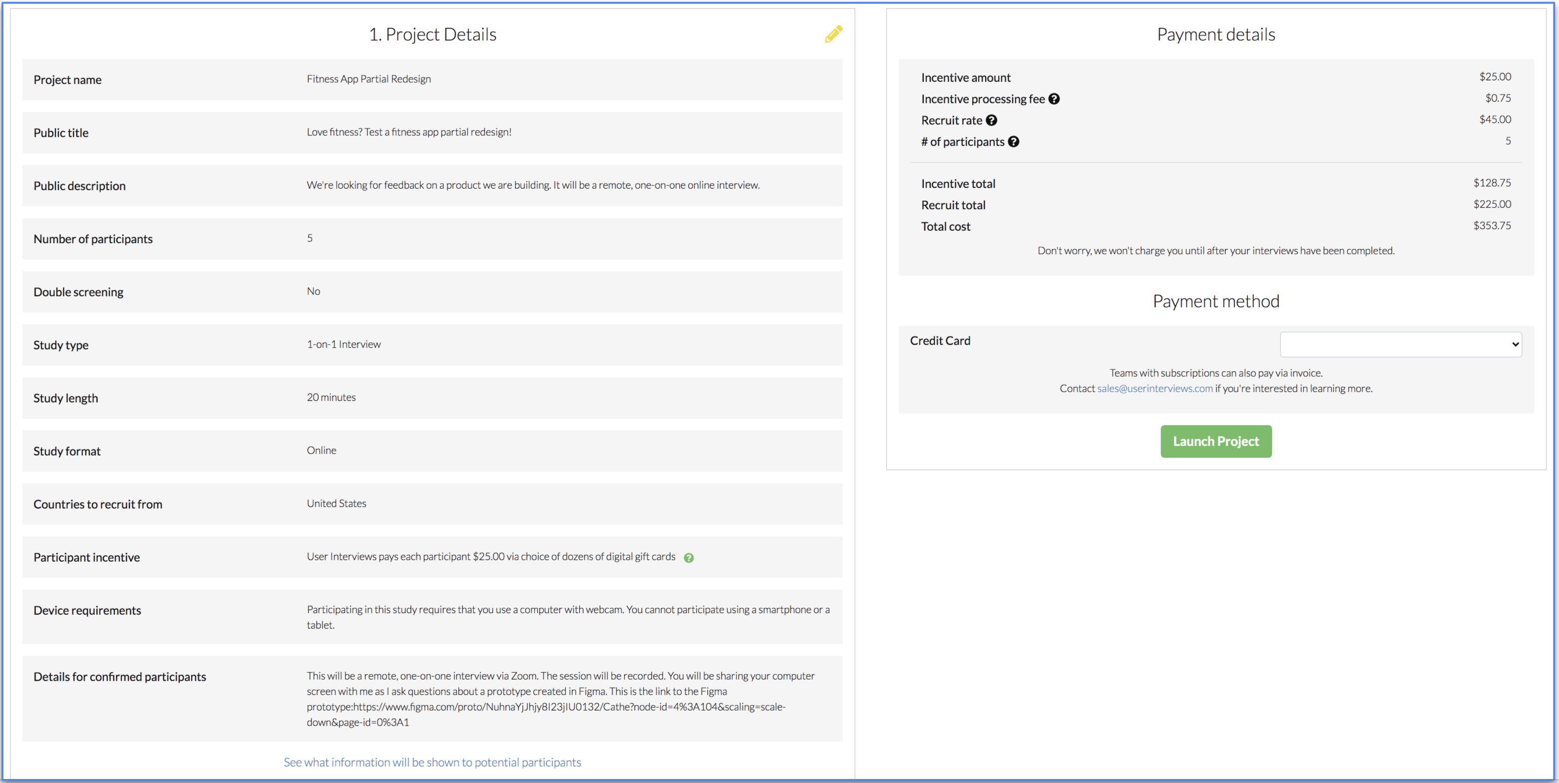
I tried out many online user testing sites. This site looked very promising until I arrived at the very end of the process. That is when they finally mentioned the Payment Details.
How already assumes a solution exists — we just need to uncover it.
Might means this is a process that is free of judgment. This is the time we can imagine everything.
We means we’ll get to this solution together. It’s a team sport!
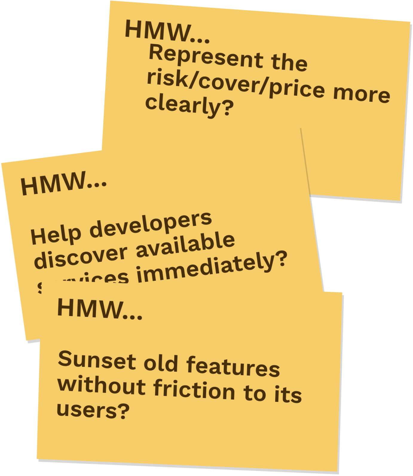
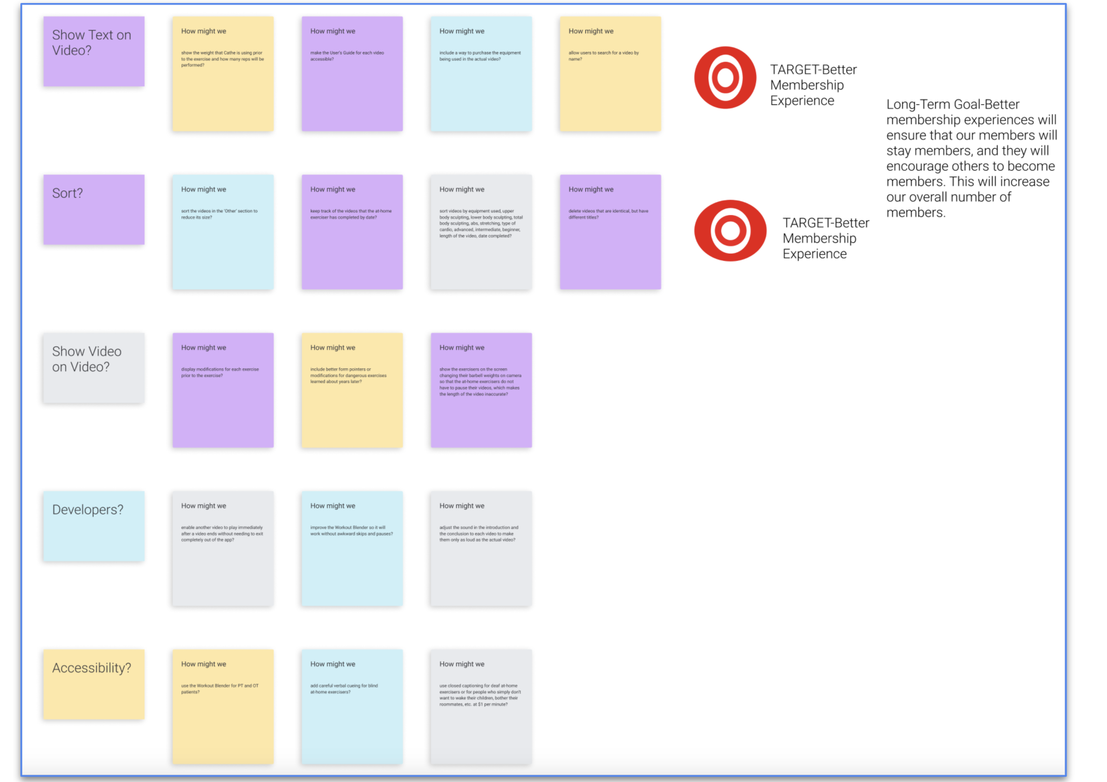
Some of the How Might We notes include:
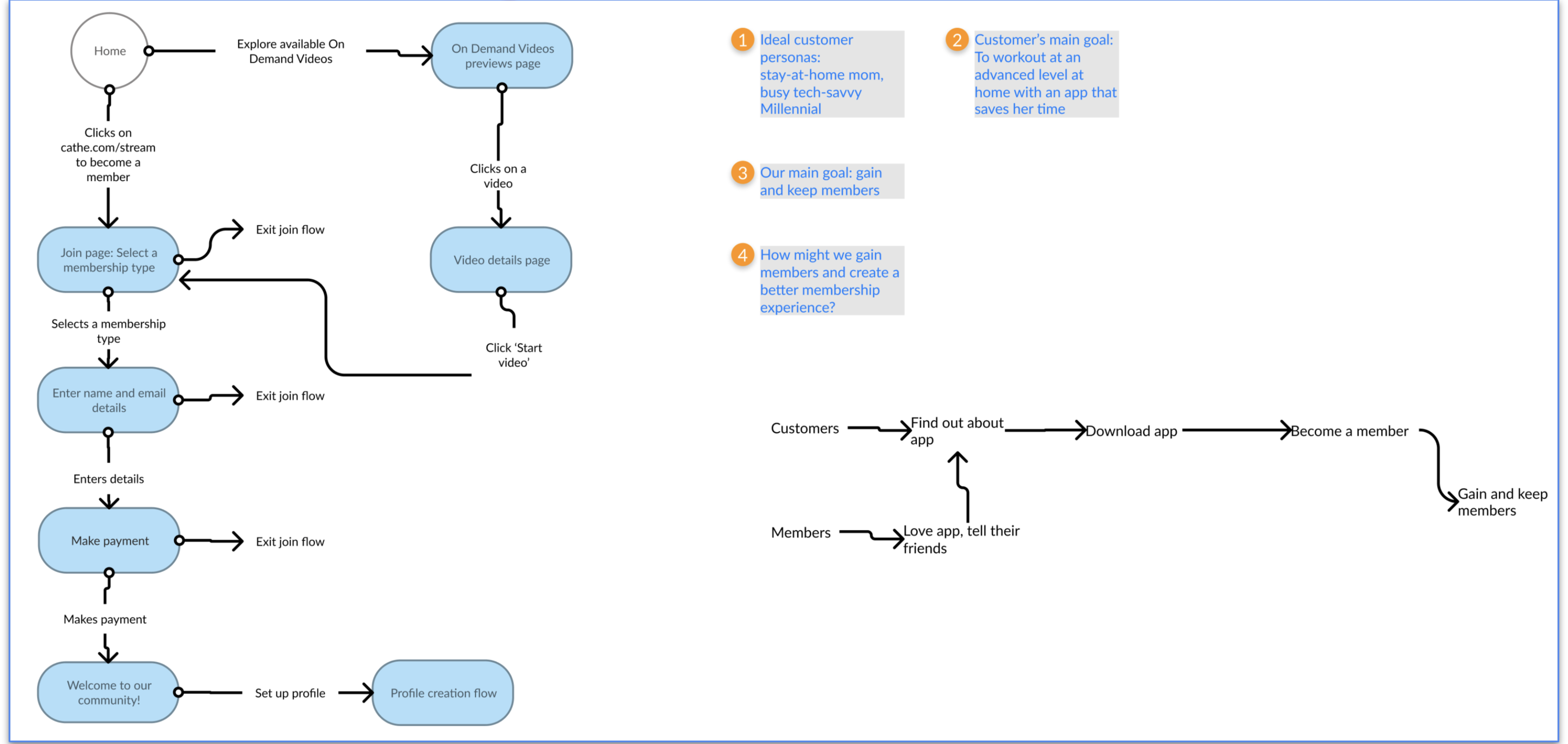
I narrowed all of these down into the top two categories (shown in rows above) to become the targets of this sprint.
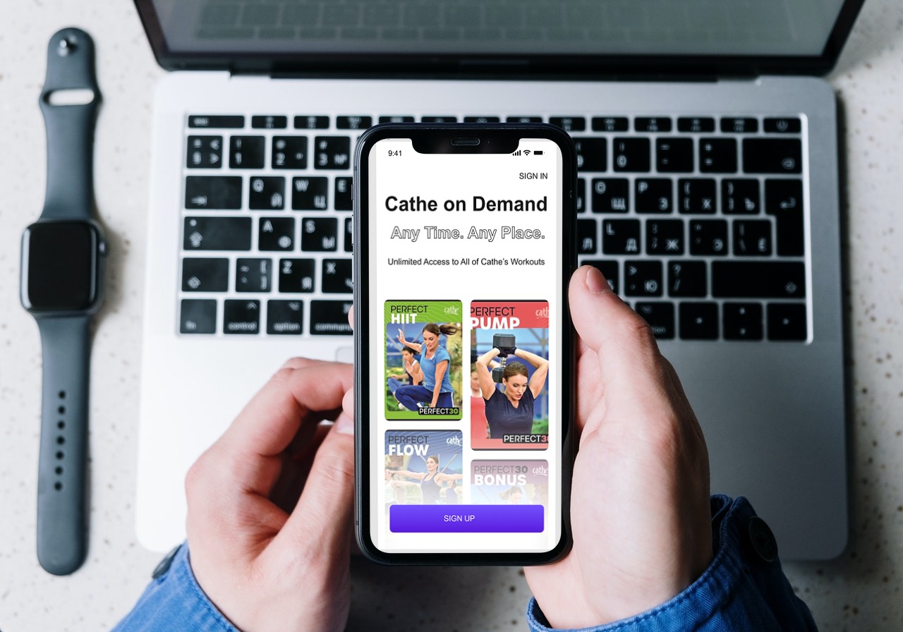
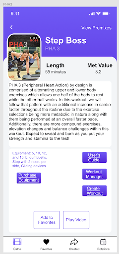
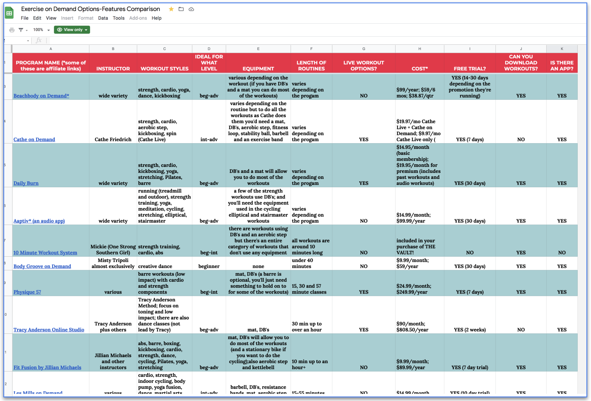
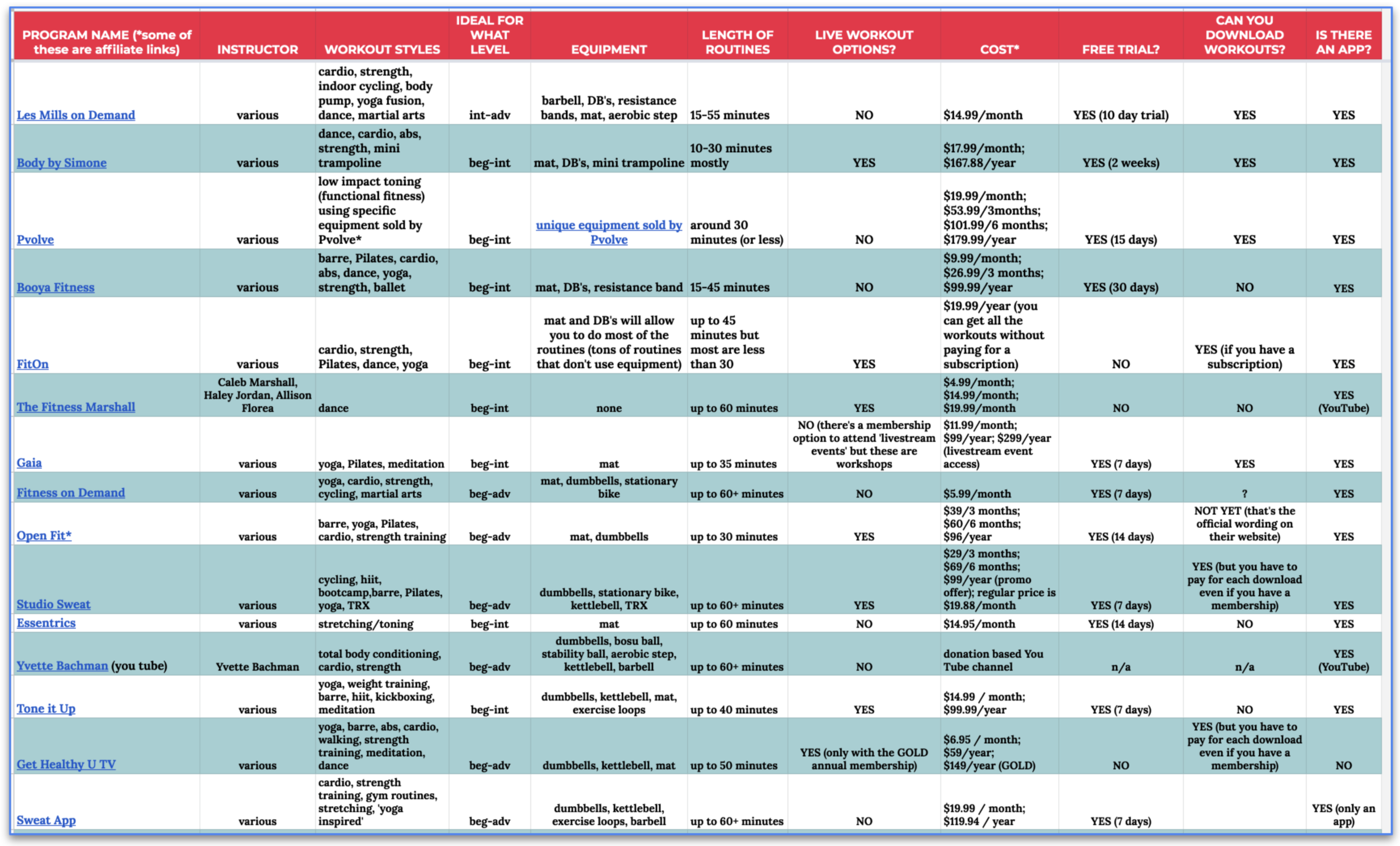
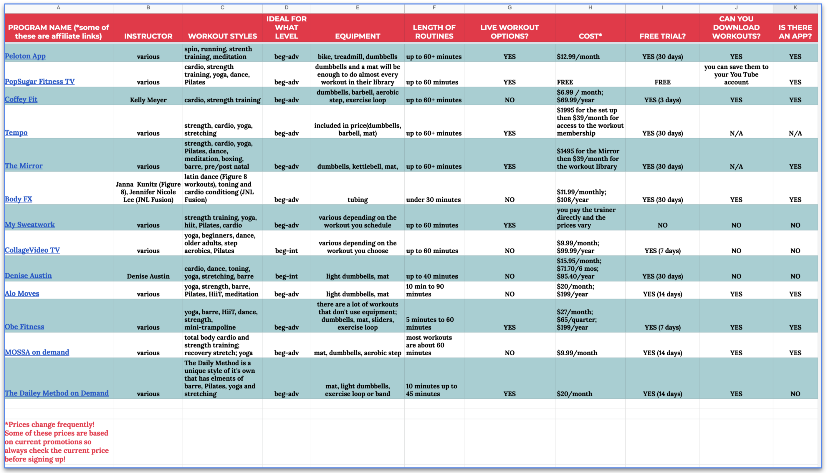
I researched many fitness on-demand options and all of their features. There are many, many fitness on-demand options! Cathe on Demand has more advanced videos than any of these other options.
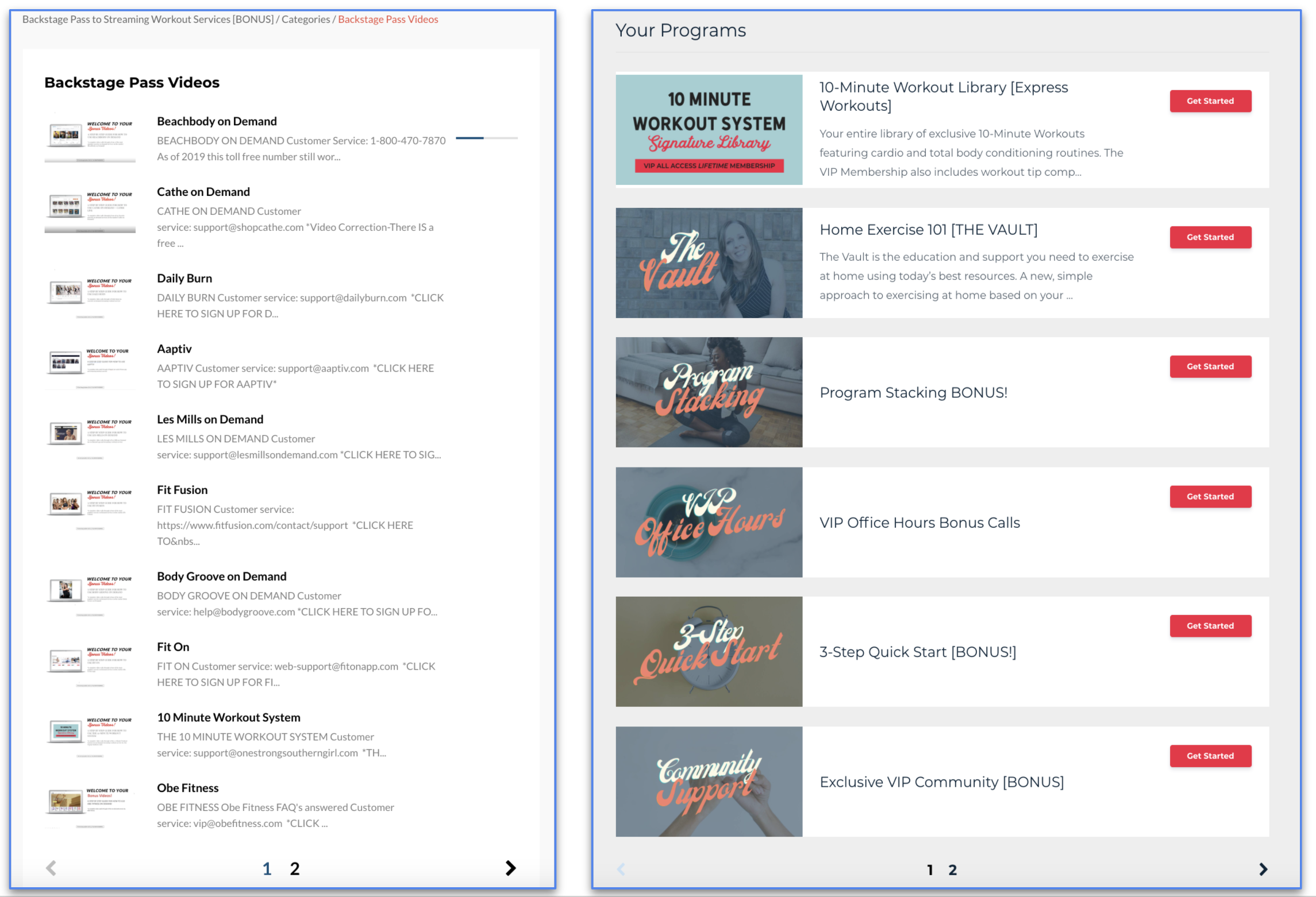
I found a woman online who had purchased every popular fitness on-demand system similar to Cathe on Demand that I could find. She has videos of herself going through each one of them in detail. That is what you see in the first image. She calls her entire system: The Vault. I purchased access to The Vault and had many conversations with her. The Vault includes other programs for fitness on-demand as well. That is what you see in the second image. In her reviews, she states many times that Cathe on Demand is by far the most advanced.
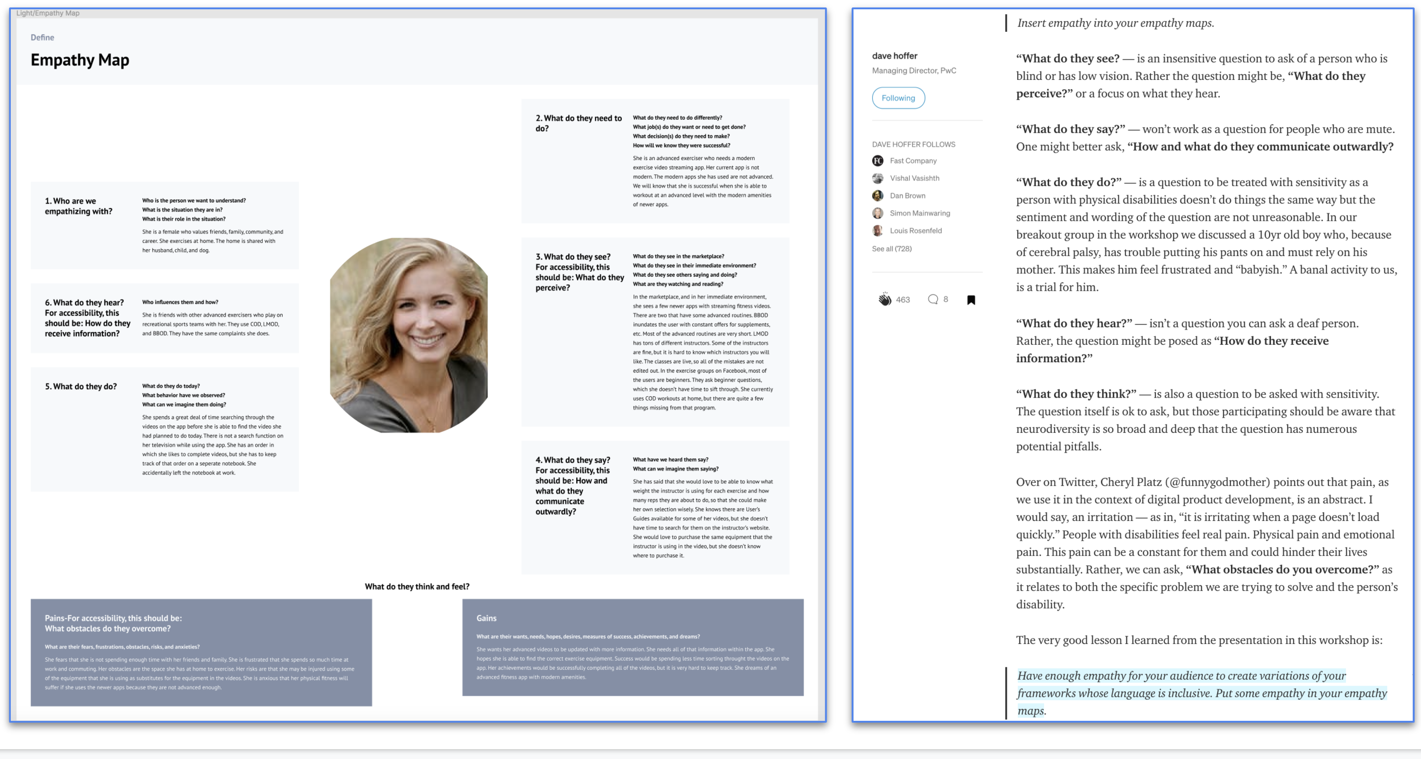
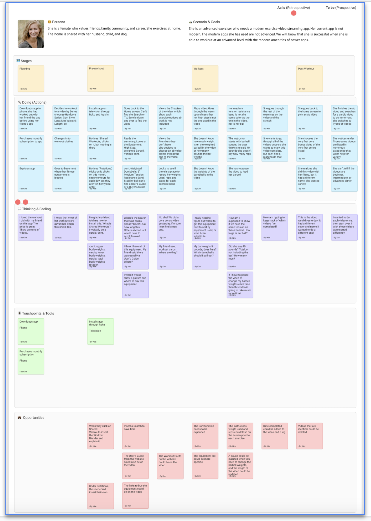
I created a plan of action. I identified which processes or interactions were the most important to sketch during this design sprint. I reviewed the list of questions I have for my following client interview, taking the time to edit for inherent bias consciously. Using Figma, I created a persona, an empathy map, and a journey map for my app project.
Download the Persona here.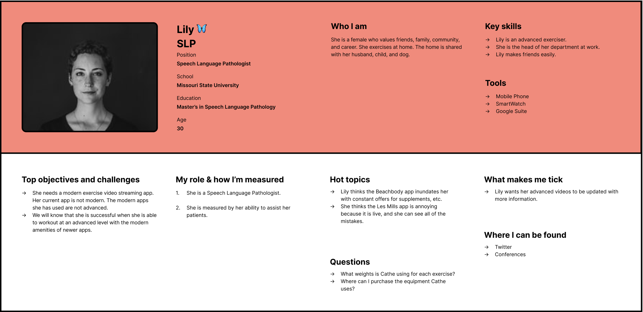
The Empathy Map includes:
The four stages of the Journey Map are Planning, Pre-Workout, Workout, and Post Workout.
These are the things she is thinking or feeling during the four stages.
Some of the opportunities are:
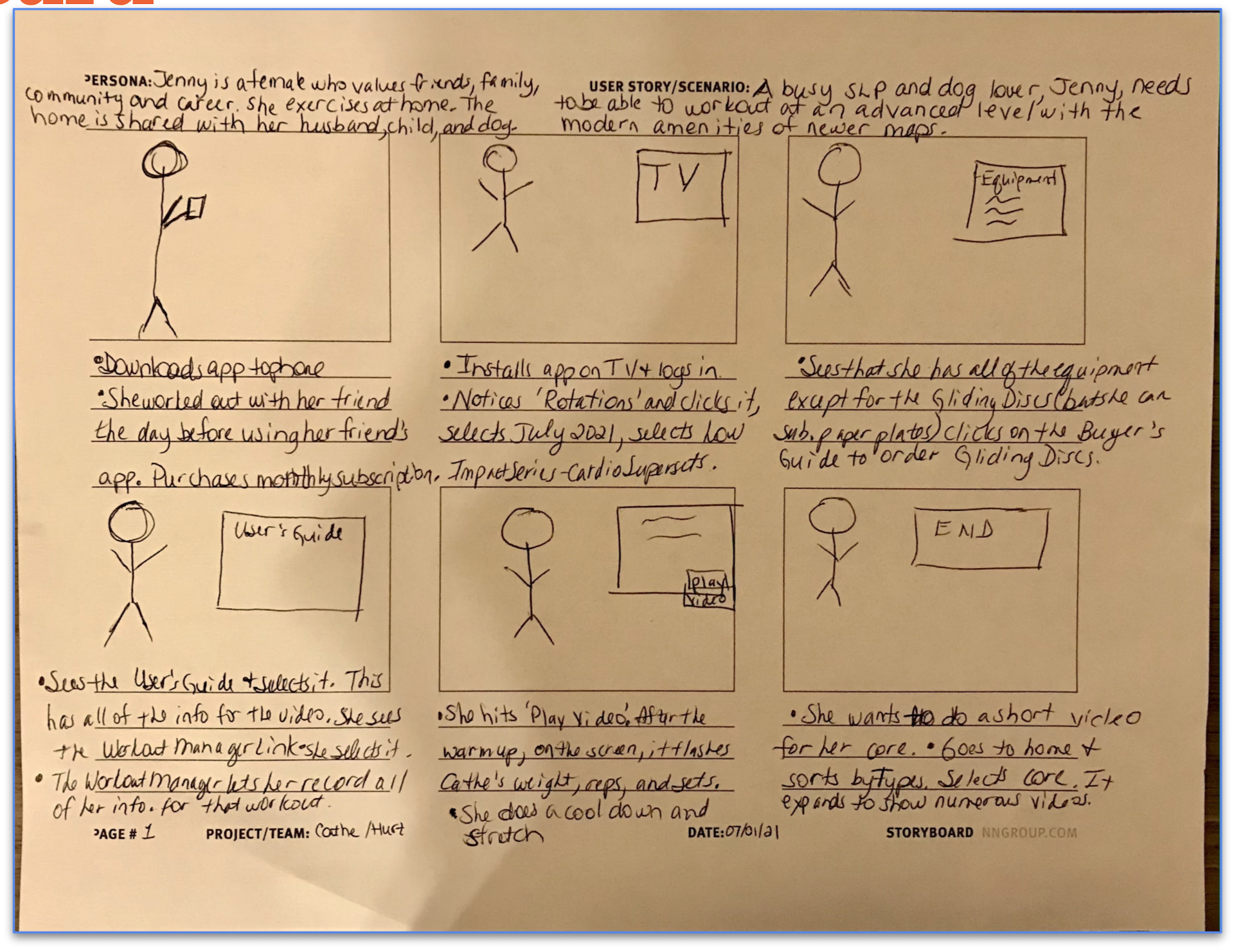
I started creating my storyboard by defining my user’s action steps as they use the product. I took six sticky notes and five minutes to write out six necessary actions the user will take as they used the product. I remembered the user journey scenarios. Then, I made a storyboard by completing the following steps:
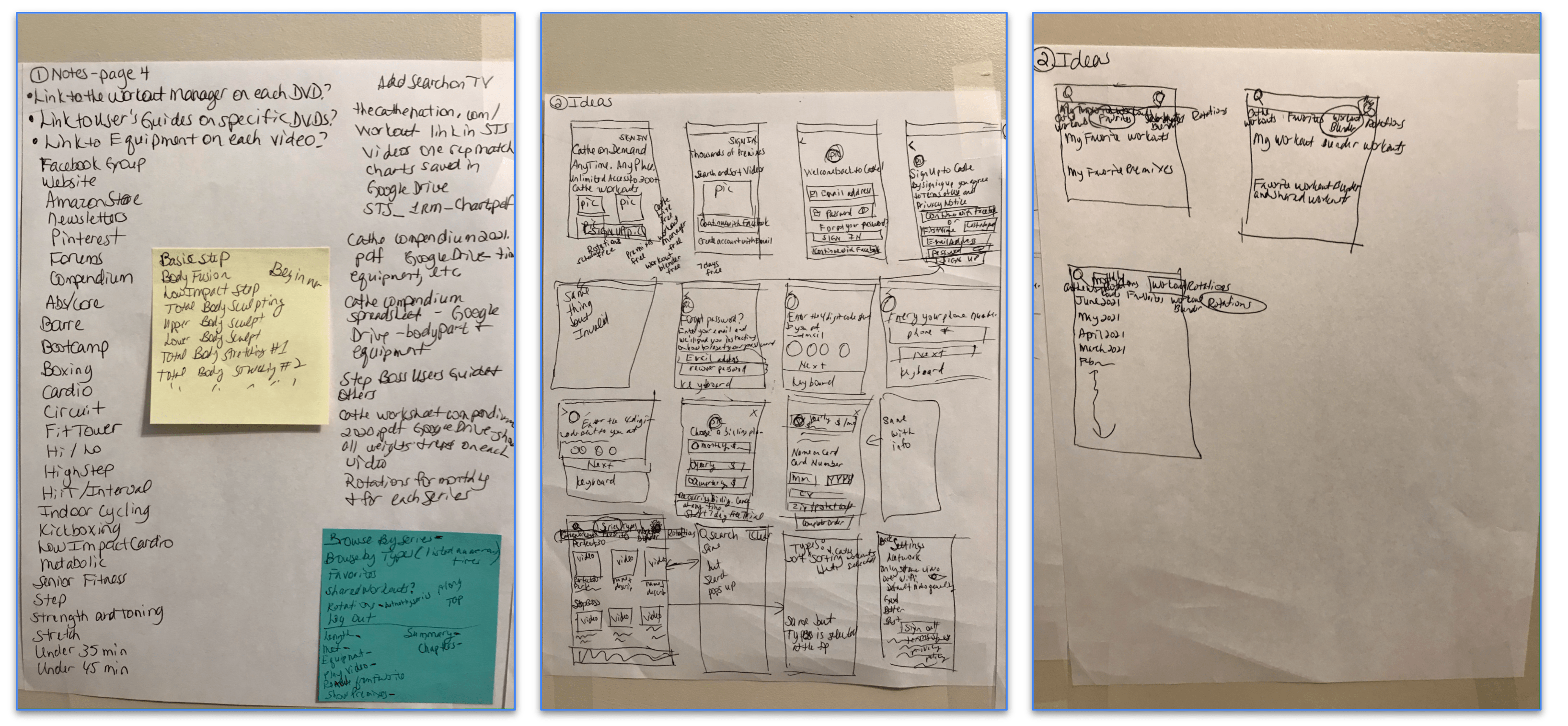
During the first step of the sketching process, I started making notes and gathering essential information on what I’ve researched and learned about my product so far. My notes included written ideas about the product and what I might incorporate into my solution sketch. This stage was not about new ideas—it was about copying ideas down from the information I’ve already gathered during the design sprint.
In the second step of the sketching process, I created some rough doodles to visually highlight parts of my notes and warm up my brain. Overall, I wanted to take some of my written notes and make them a bit more tangible. For example, I found ideas for a page that I liked, and I started sketching some doodles. These didn’t need to be beautiful; they were meant to help me kickstart my thinking and drawing. This step included a combination of written and visual notes.
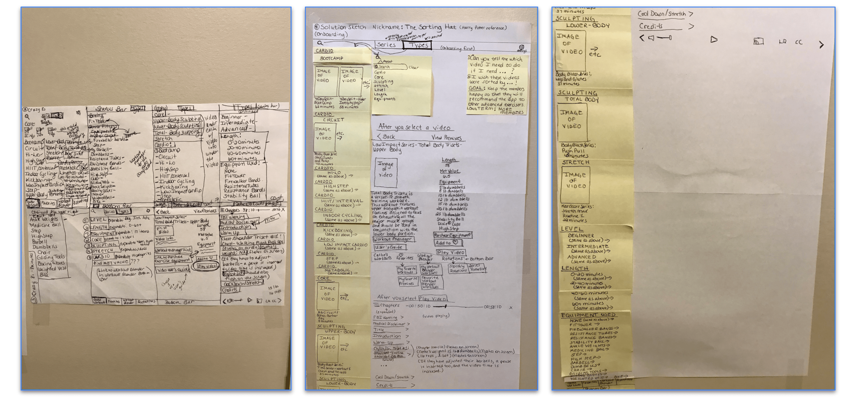
For the third step of the sketching process, I played Crazy 8s (or Crazy Eights). Crazy 8s is an activity that's designed to help you push beyond your first idea—which is often the least innovative—and to generate a wide variety of solutions to your challenge. Again, my sketches communicated my concept and were simple. To complete this activity, I took a sheet of paper and folded it into eight squares. In each square, I made a 60-second sketch of a variation of a feature of my product. This took about eight minutes.
The fourth and final step of the sketching process is to create a more detailed solution sketch based on one of the variations I produced in the Crazy 8s activity. Again, I focused on the variation that I thought was the strongest. Unlike my 60-second sketches, which are quick and simple, this solution sketch was utterly self-explanatory. It was as detailed and readable as possible—but not necessarily pretty. Obviously. The goal was to create one fully fleshed-out idea for the solution that I thought was the best. I budgeted at least 30 minutes for this step. To make the solution sketch, I started by taping 3-4 pieces of paper together. Then I used sticky notes and a pen. My solution sketch didn’t need to be beautiful, but it needed to be as clean as possible. Finally, I gave it a nickname.
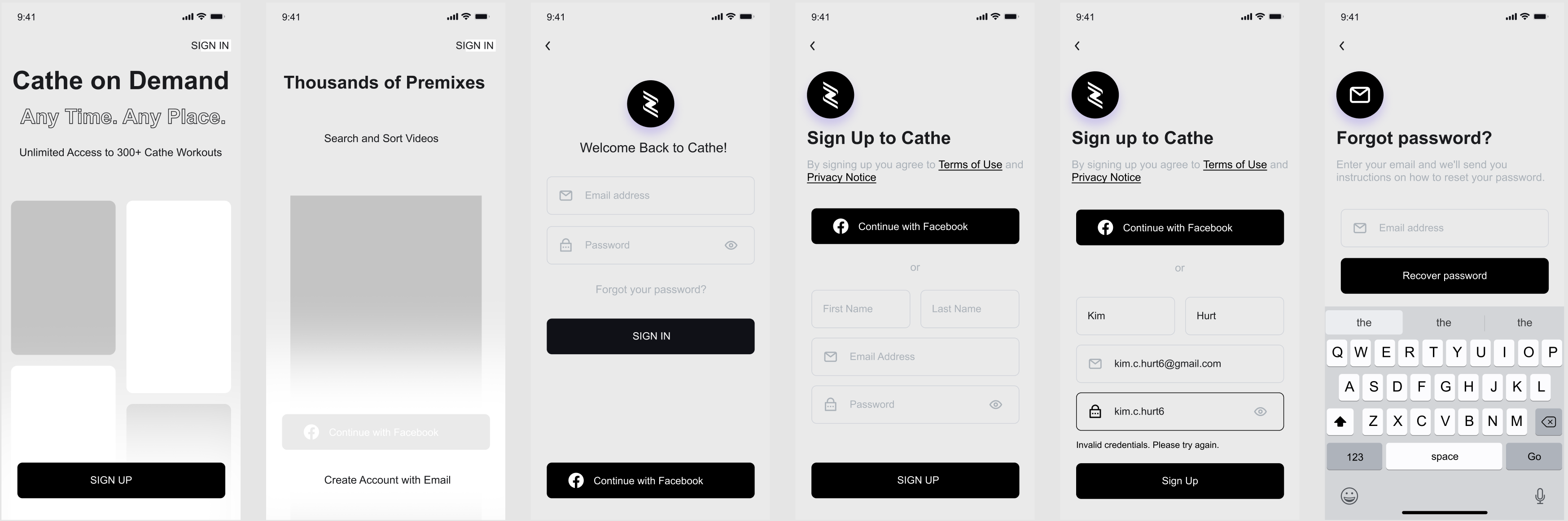
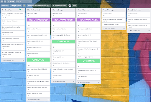
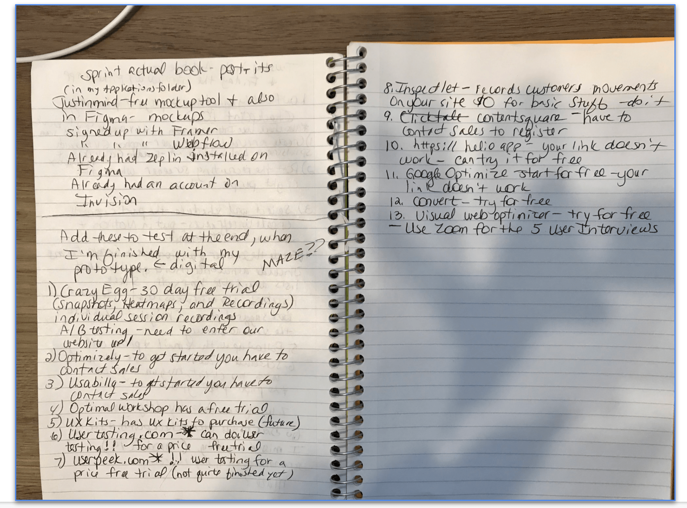
I used Figma for this project, but I have explored and tested: InVision, Adobe XD, Origami, Sketch, Zeplin, Proto.io, Axure, Webflow, Framer, Principle, and Justinmind. I also regularly receive many, many emails from these products. I broke the storyboard into more miniature scenes. Parsing the stages helped me plan so I could be methodical in my prototyping. I did a final check for consistency and typos in my prototype, as they can be very distracting in a user test. I chose Maze as a tool that I added to my prototype to acquire extra data during testing. I also researched all of the other tools mentioned in the checkpoint. I am still receiving their emails as well. Finally, I decided to use Zoom for testing. Zoom allows you to record every session easily.
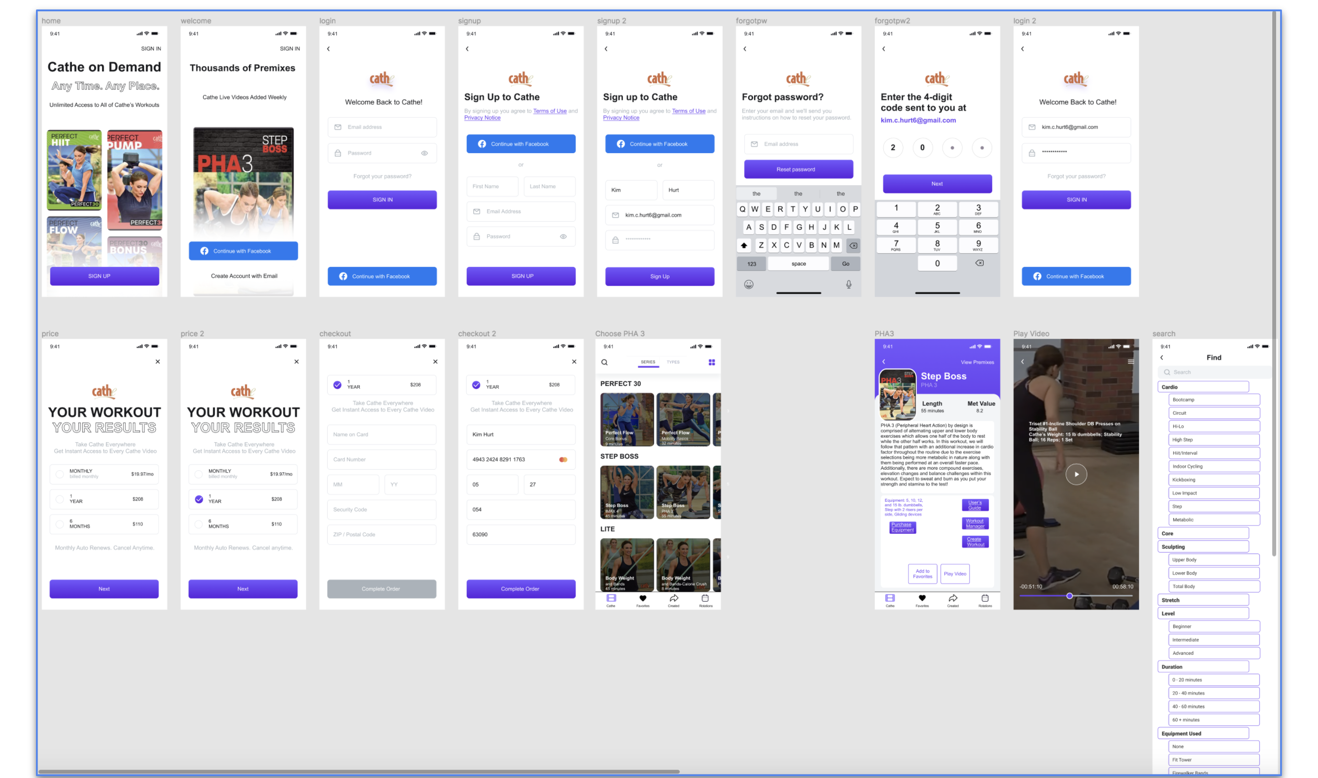
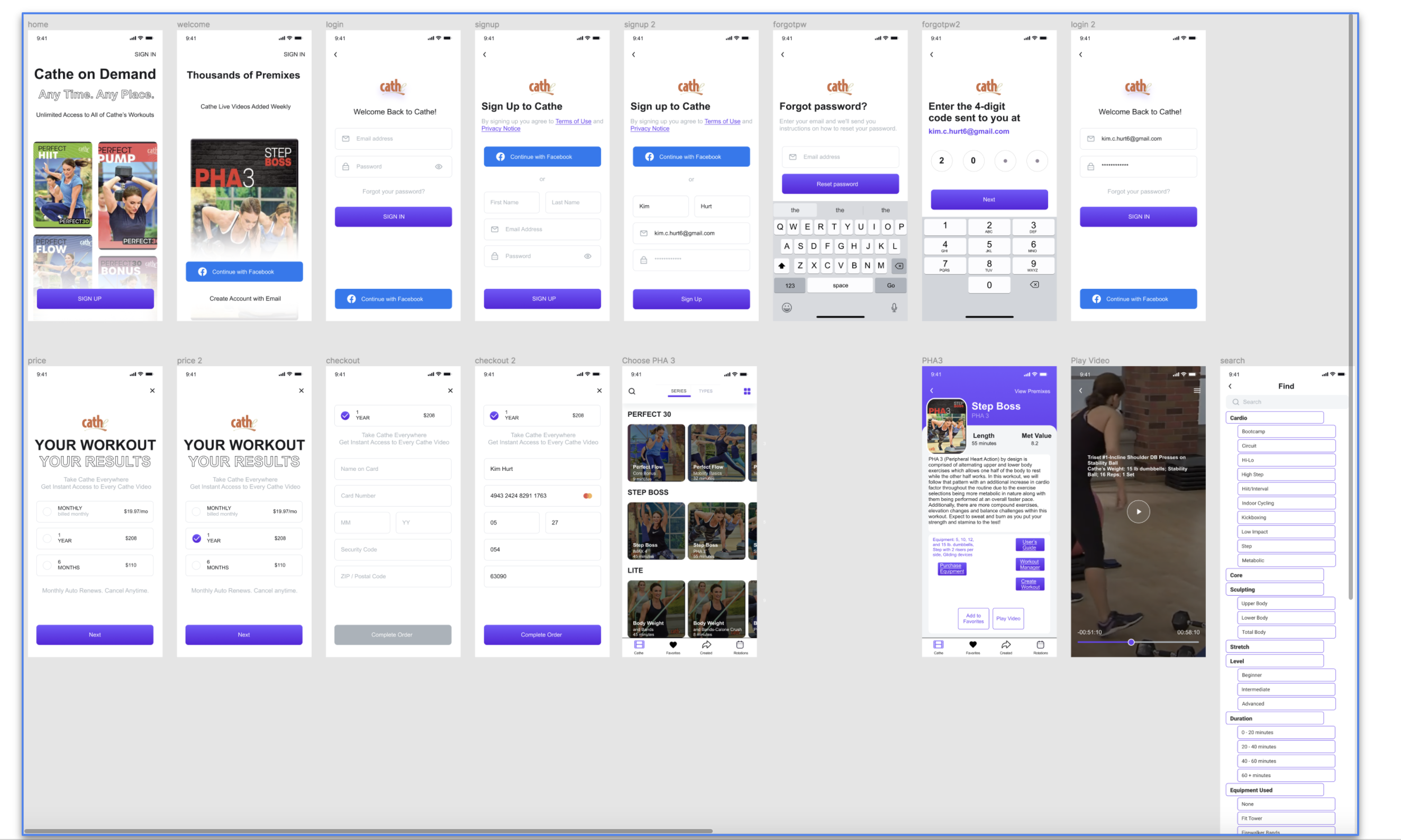
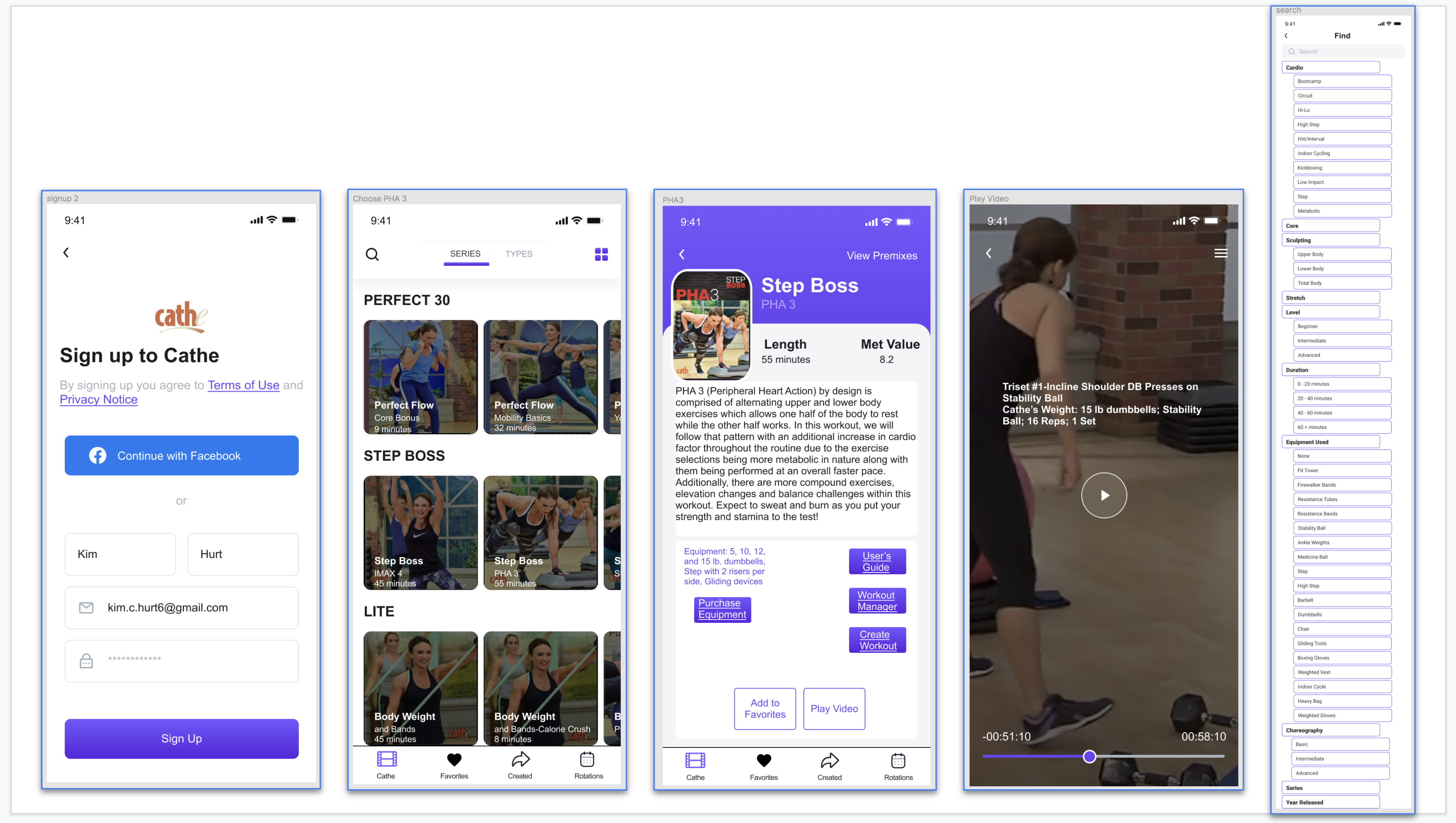
Below is the prototype before user testing. I began by building a template in Figma. I included any content that will help the user navigate the product and achieve their goals. I converted placeholder text into actual words, labeled links and buttons as clearly as possible with authentic content, as they will be in the final product. I added color or images only if they would help convey functionality for the upcoming user testing. Finally, I added simple animations or interactions as needed. Thus, you can interact with the prototype.
Download the Prototype prior to usability testing here.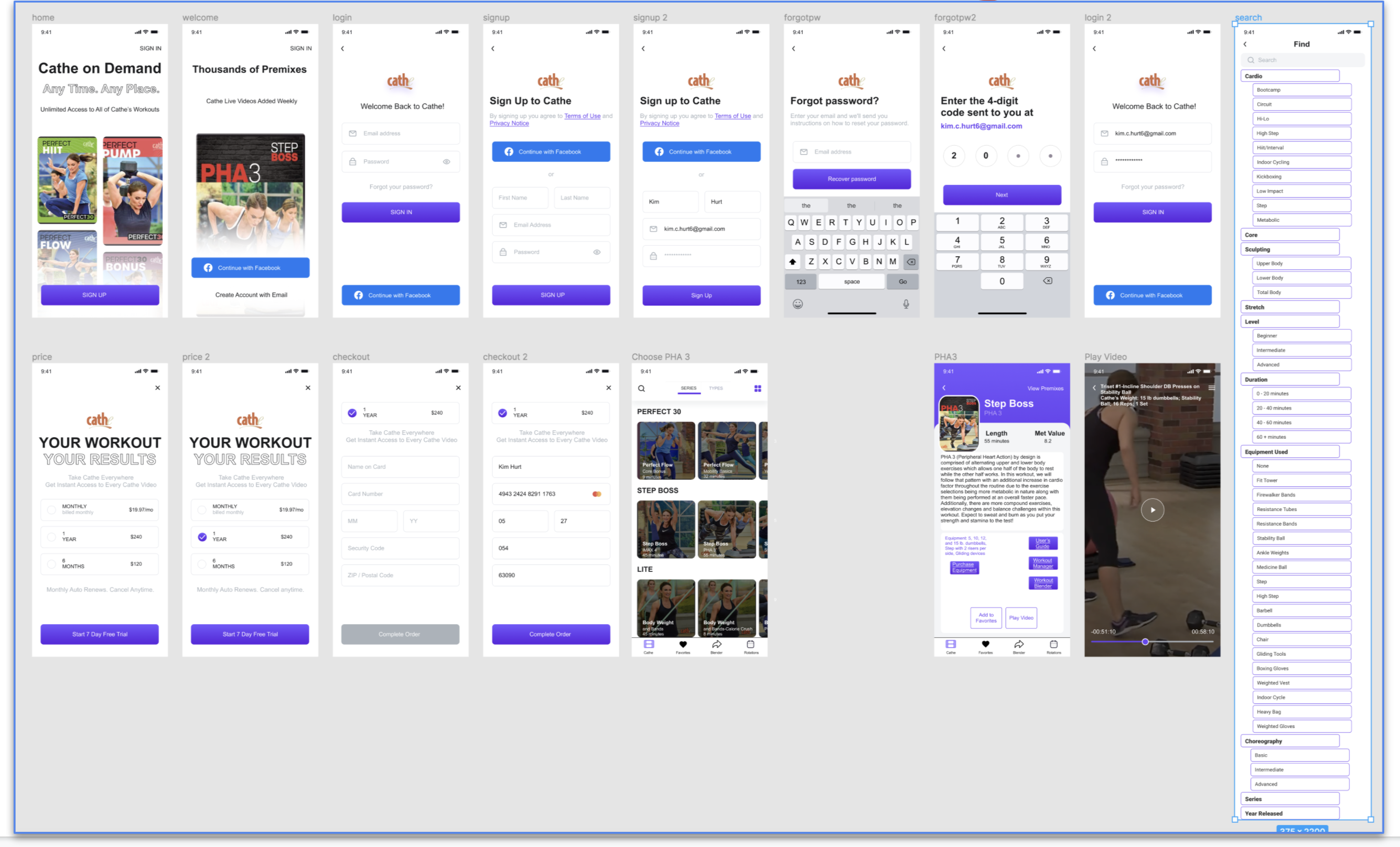
I prepared for the testing phase by writing a guide and a script for the interviews. To draft the guide:
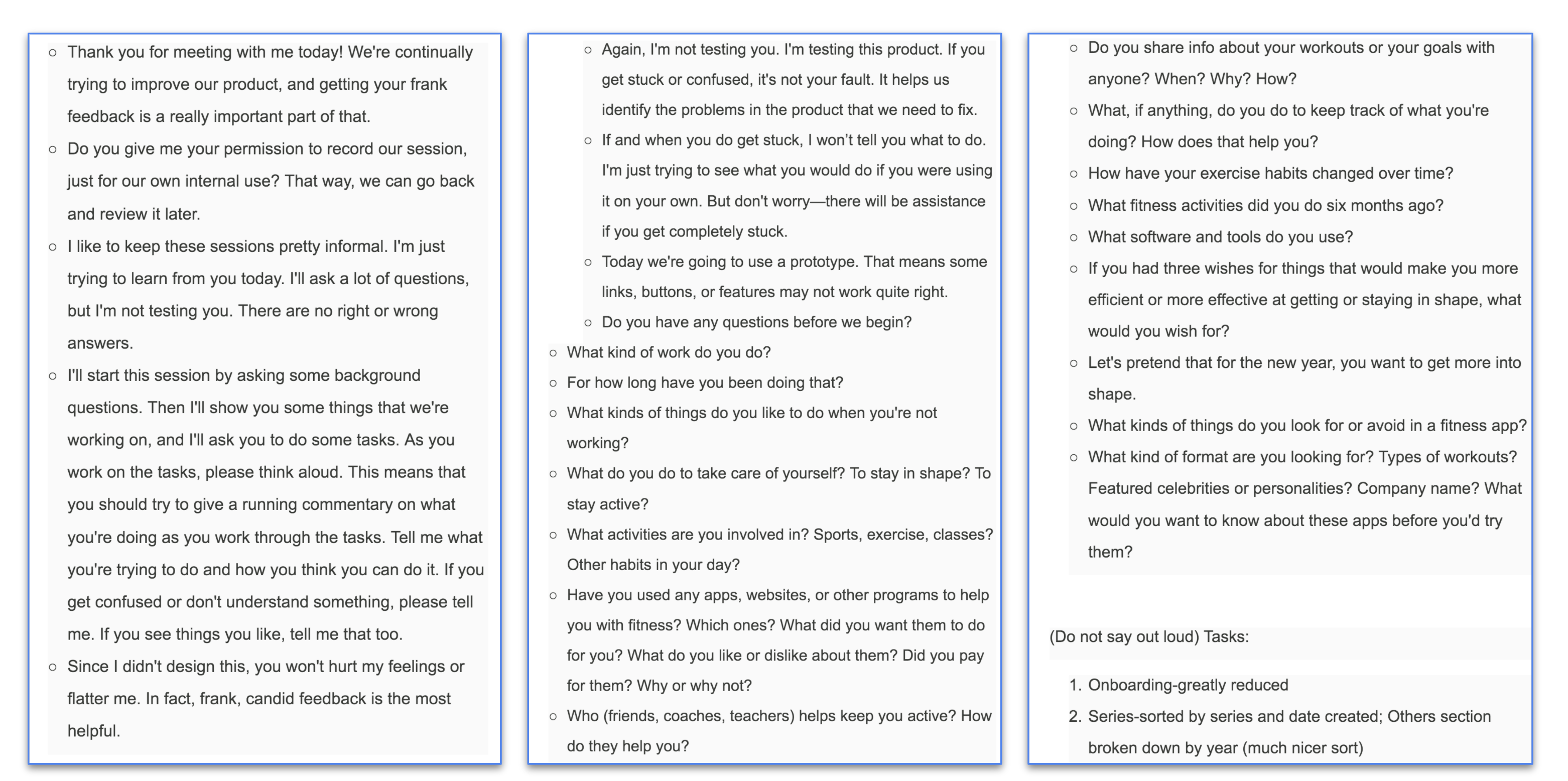
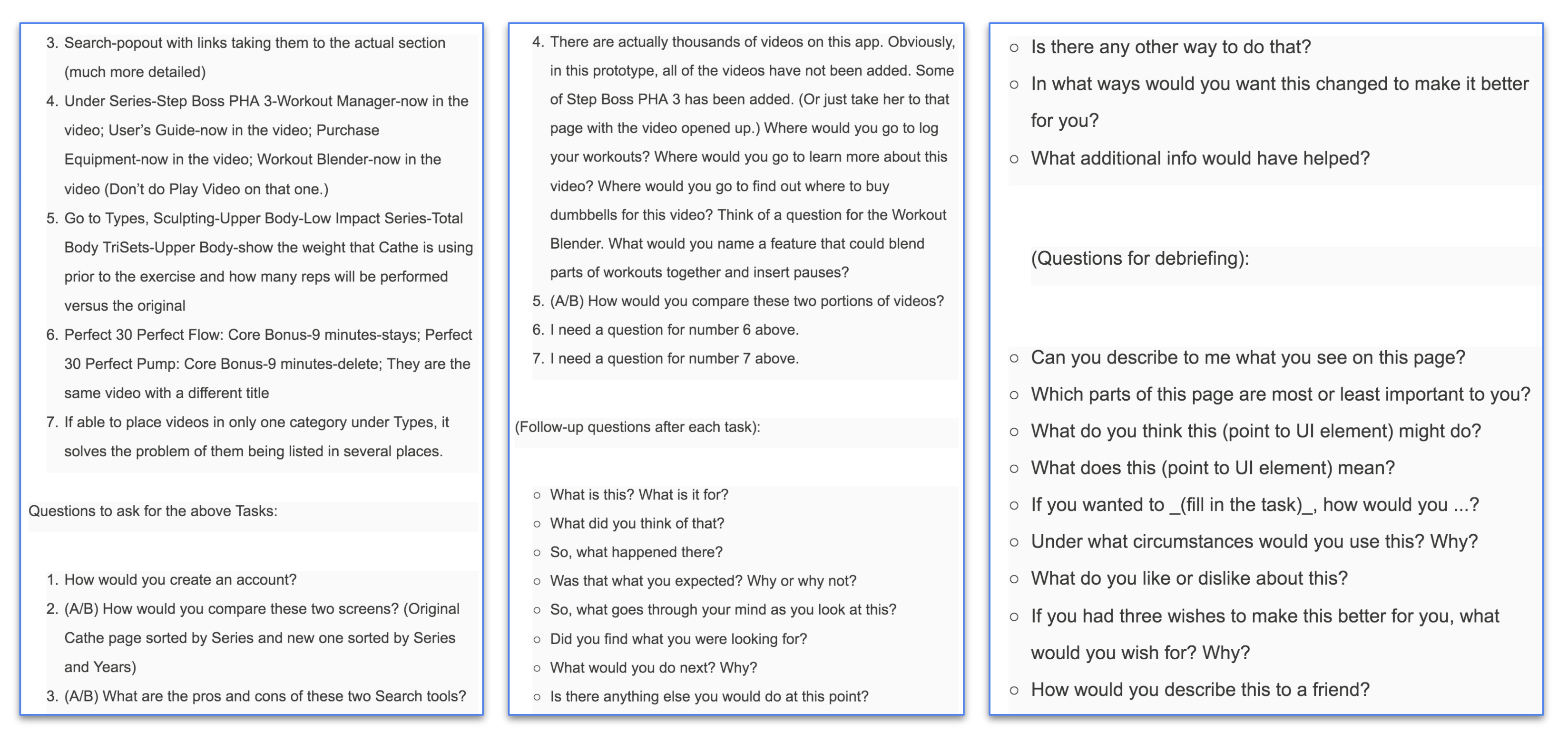
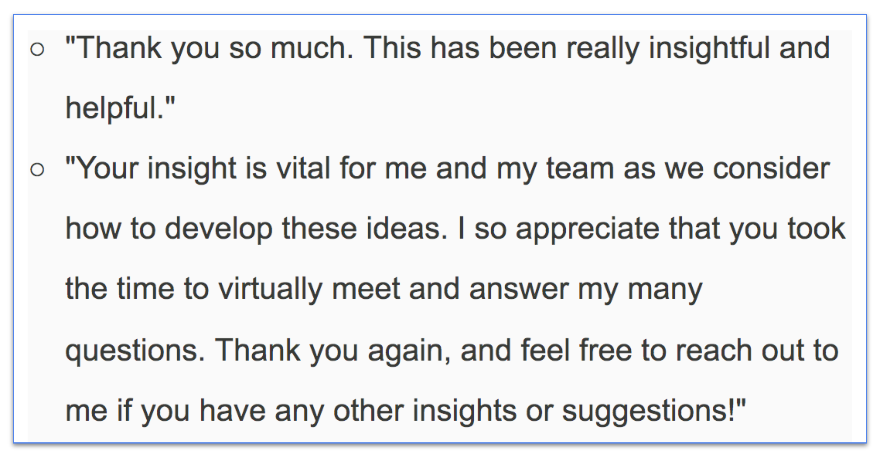
Before the interview:
During the interview:
After the interview:
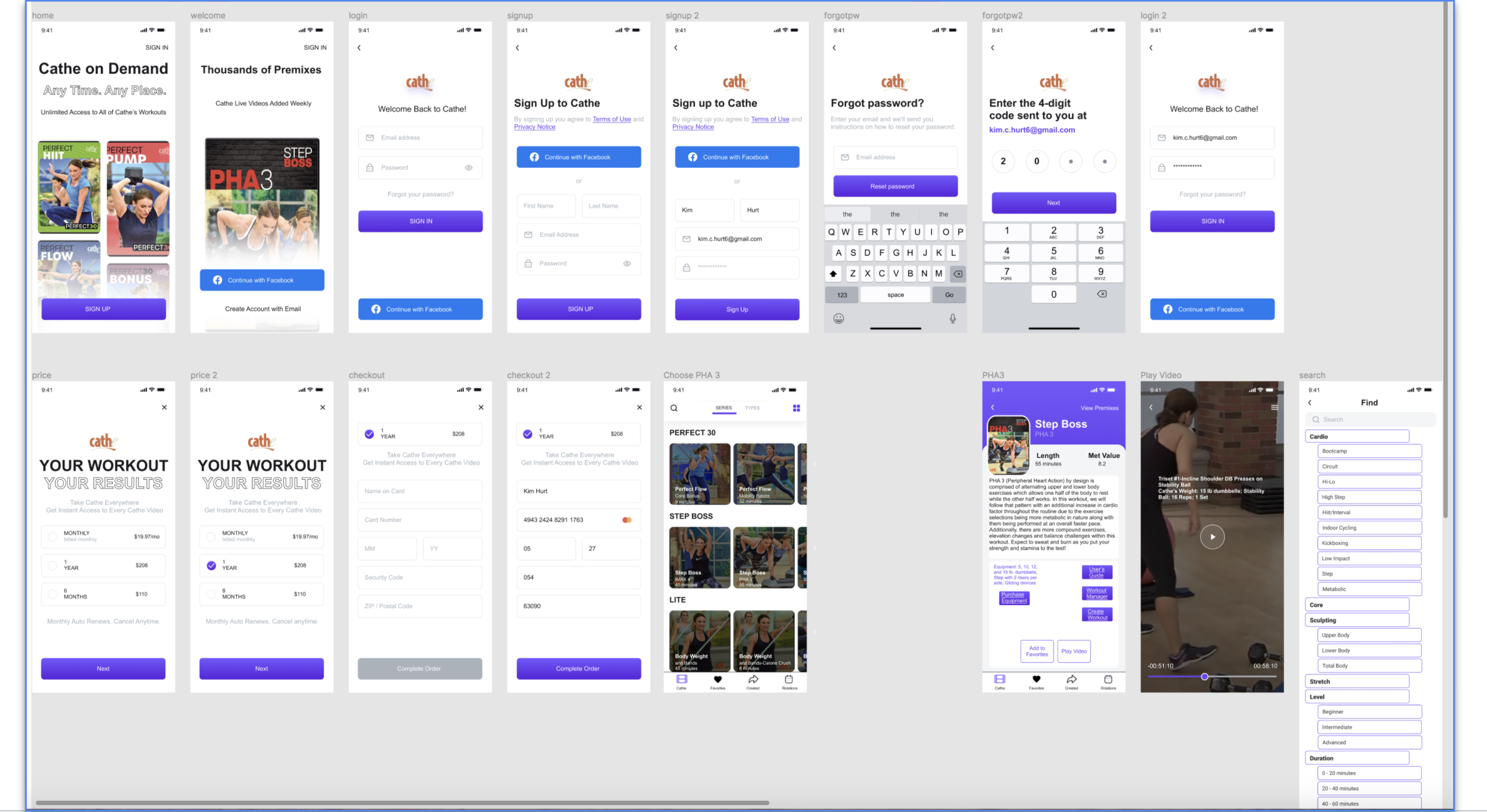
Some of the positive comments from the interviews were:
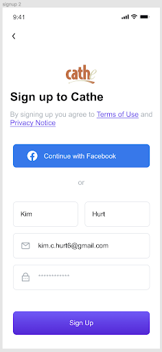
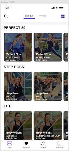
It’s good that you can sign up or in with Facebook; The sign-up button is large; Likes that there’s a link to buy equipment; Likes that there’s a link to the User’s Guide; It’s good that there’s a link to the Workout Manager; The link to the Workout Blender is good; Loves all of the categories the Search has; It’s good that the weight used, number of sets and reps, and other equipment flashes on the screen before the exercise.
Some of the negative comments from the interviews were:
The Start 7 Day Free Trial button needs to be changed because it is misleading; There’s not a benefit to signing up for six months or a year; The “Blender” icon needs to be changed-maybe to “Created;” The User’s Guide is for the whole series-either move it to the series or only show the guide for that one video in the link on the video; The “Workout Blender” button needs to be changed-maybe to “Create Workout;” The back button on the video screen needs to be more noticeable; and the “Recover Password” button needs to say: “Reset Password.”
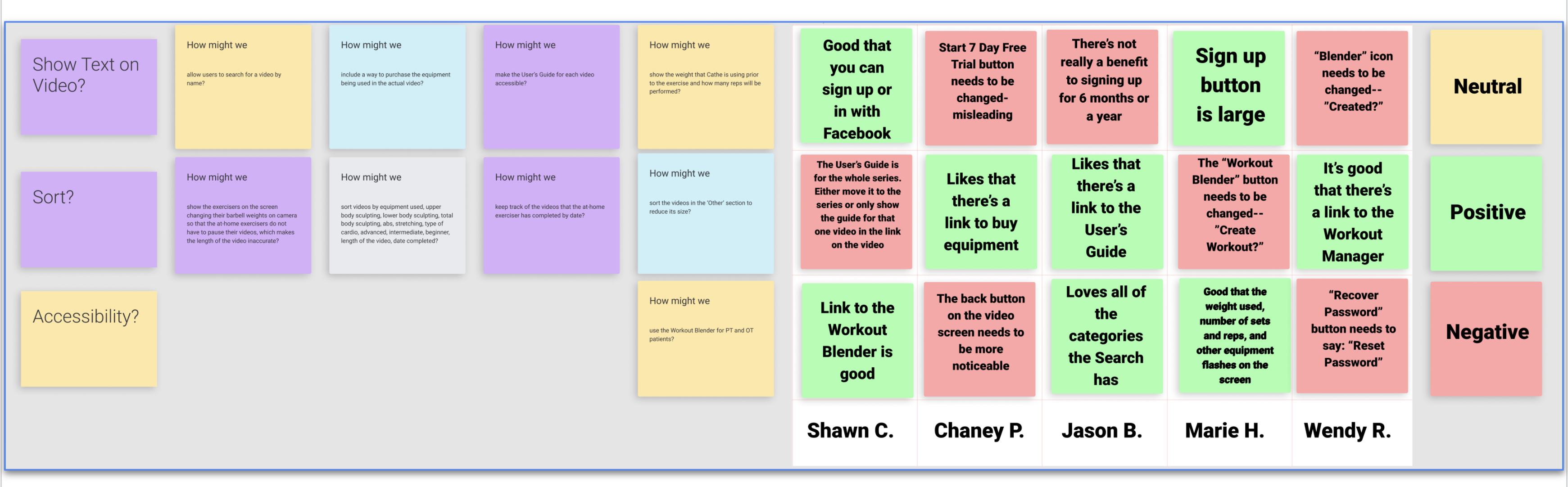
I used the following Sprint Retrospective template in Notion to summarize my findings. I summarized my findings in a one-page reflections document. I waited to conclude until I had taken a moment to step away from the task. I looked for patterns. After I had taken a break, I read over my notes and wrote down patterns. I made a list of all the patterns people noticed. I labeled each as positive, negative, or neutral. I reviewed my long-term goal and my sprint questions. I compared the patterns I saw in the interviews. Finally, I decided how to follow up after the sprint.
Download the Sprint template here.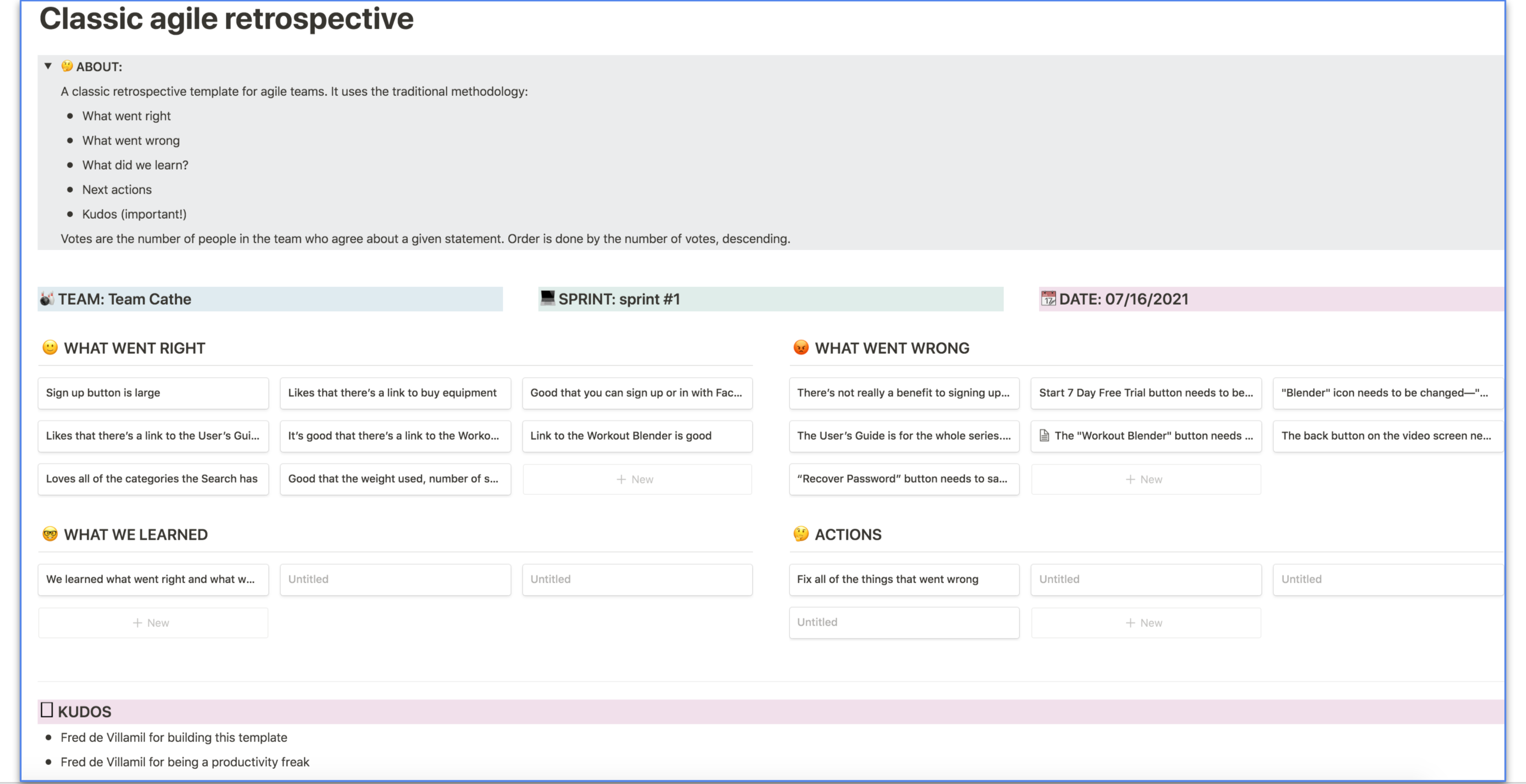
After user testing:
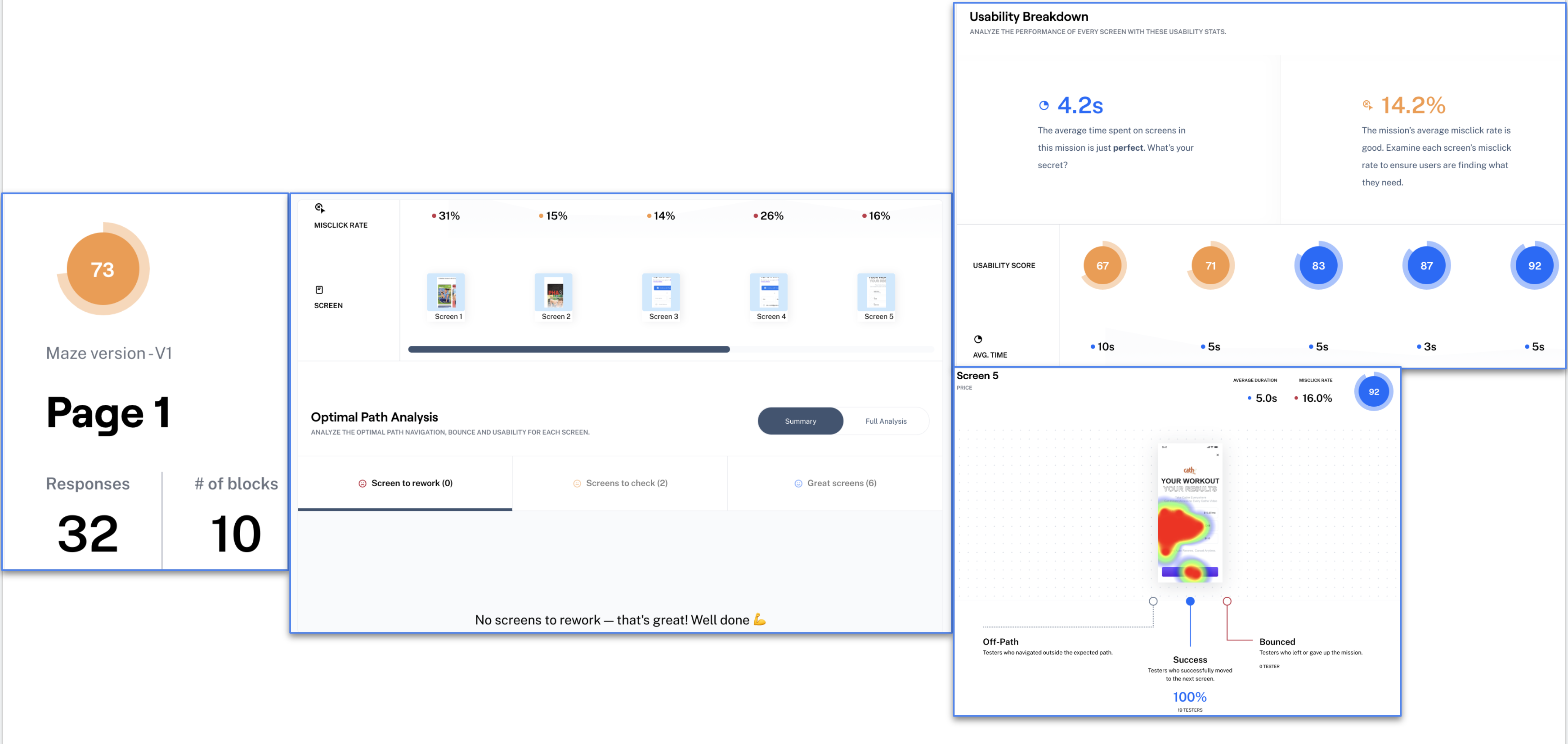
To get more quantitative data regarding my changes, I created tasks and surveys in Maze. I then posted this Maze in all Facebook groups that I had pictured earlier and more UX/UI Facebook groups. They can be the harshest critics. Trust me, I know. However, a great deal of their criticism stems from this being only the second Maze that I have created. I’m learning, but I still made some mistakes when I created the Maze. You are not allowed to correct the mistakes once you have set your Maze to ‘Live.’ Even though they were still very harsh, it didn’t seem nearly as bad as my first attempt. I had 32 responses. I only needed to check two screens on my first task, and I didn’t have any screens to rework. In the Usability Breakdown, the average time spent on screens in that mission was 4.2 seconds, and the misclick rate was 14.2 percent. There are heatmaps for each of the screens as well.
Maze doesn’t have multivariate testing on the free plan, so I created an open question and inserted images. The first image below is what you see on the original Cathe page when you try to sign up. The original app takes you to her website to sign up, and it shows you several more pages that are just as text-heavy to sign up. I’ve included an image of some of the comments from the testers when I asked them about the actual app sign-up process.
Here is a link to Cathe’s site.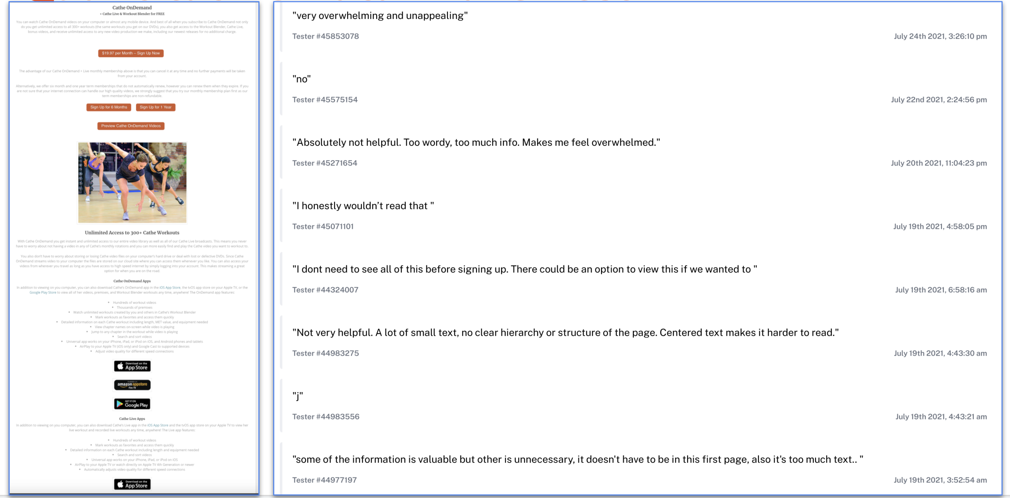
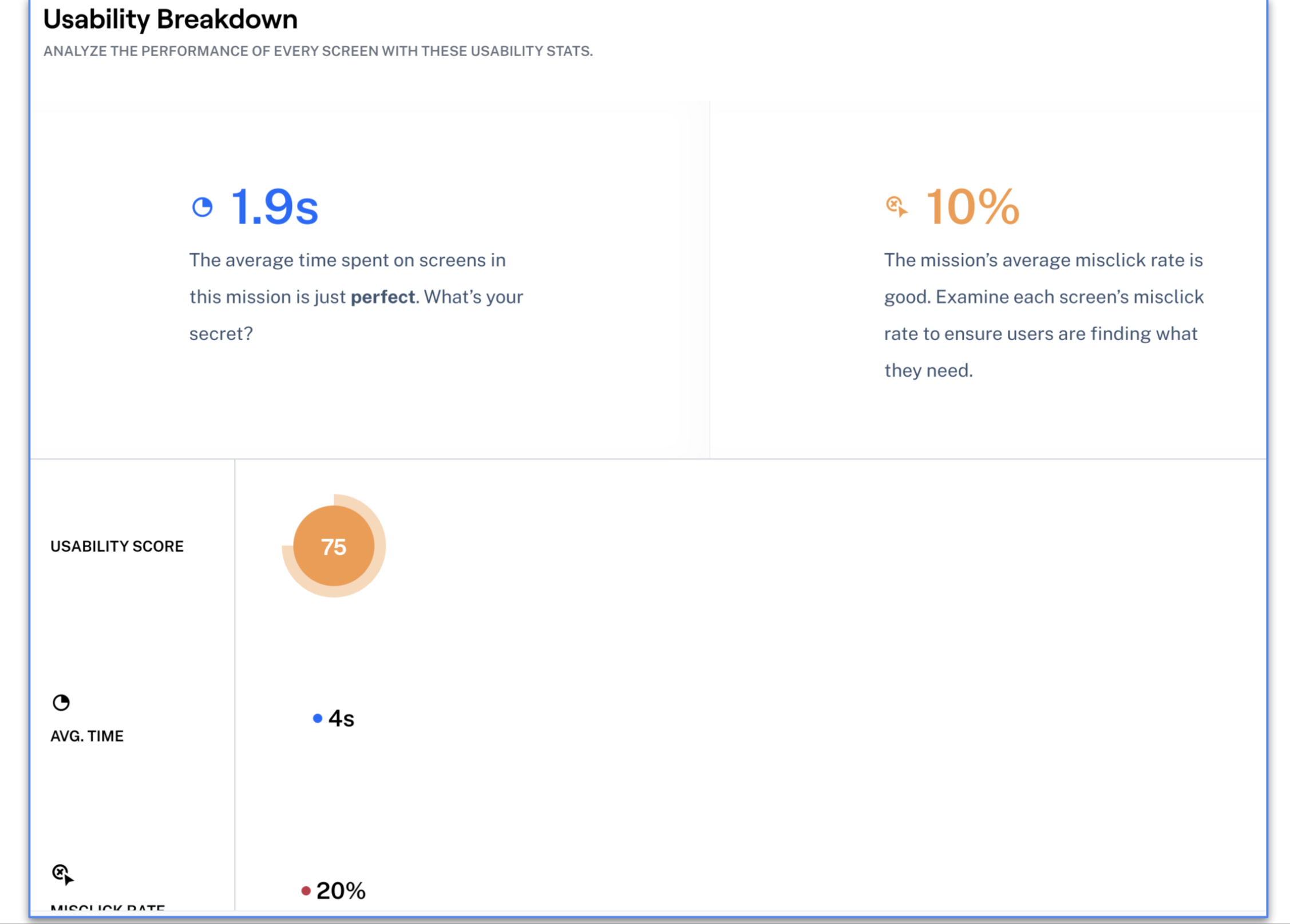
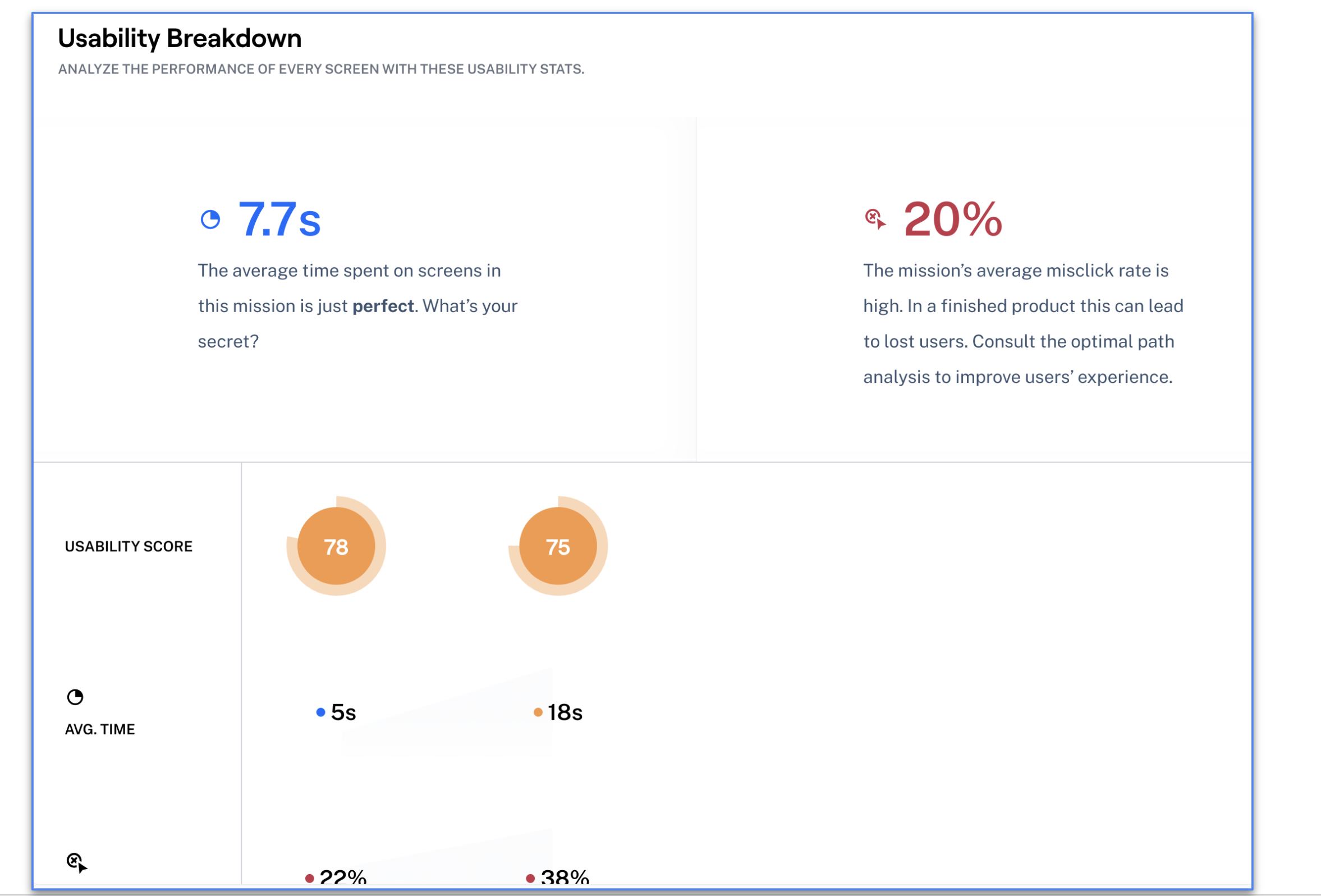
The usability stats of my second mission are pictured in the following image.
I asked the testers about the following User’s Guide that Cathe offers on her website for this series of workouts. It is 30 pages long. From their comments, the User’s Guide would be more helpful if it was shorter. Maybe it could be broken down for each video instead. Also, per their comments, it could be built into the app.
Download the User’s Guide here.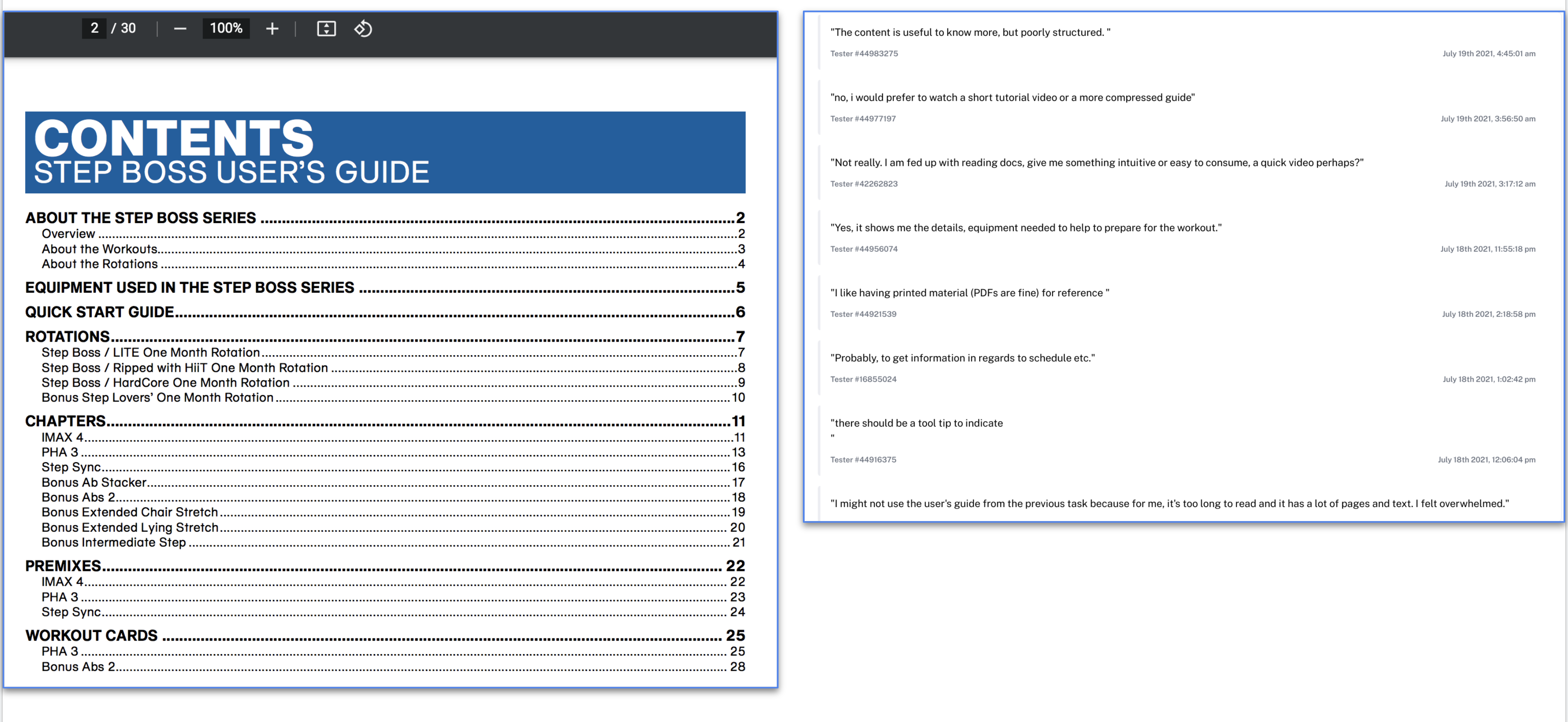
I asked an open question about the Workout Manager from Cathe’s website. The Workout Manager is pictured below, as well as some of the comments from testers. The testers seem to prefer that the Workout Manager be built into the app.
Here is a link to the Workout Manager.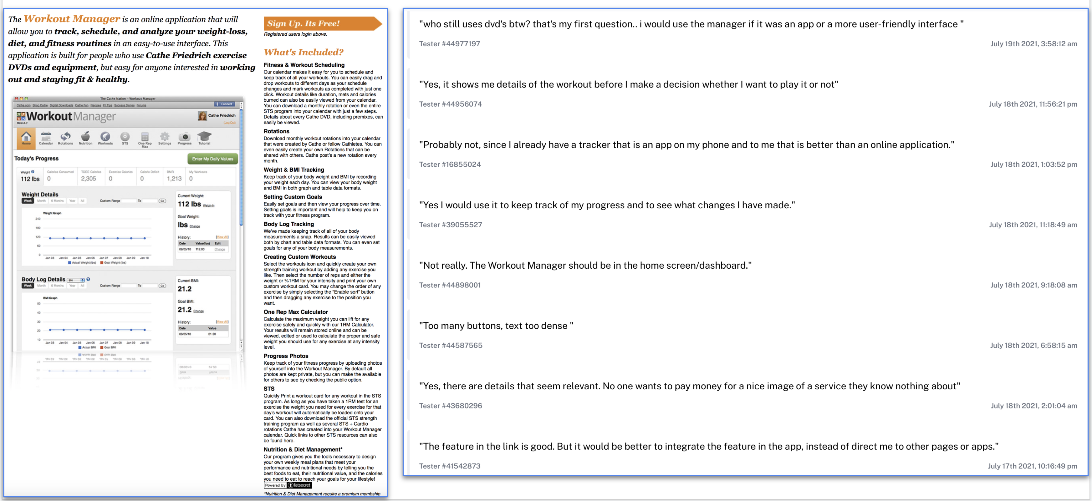
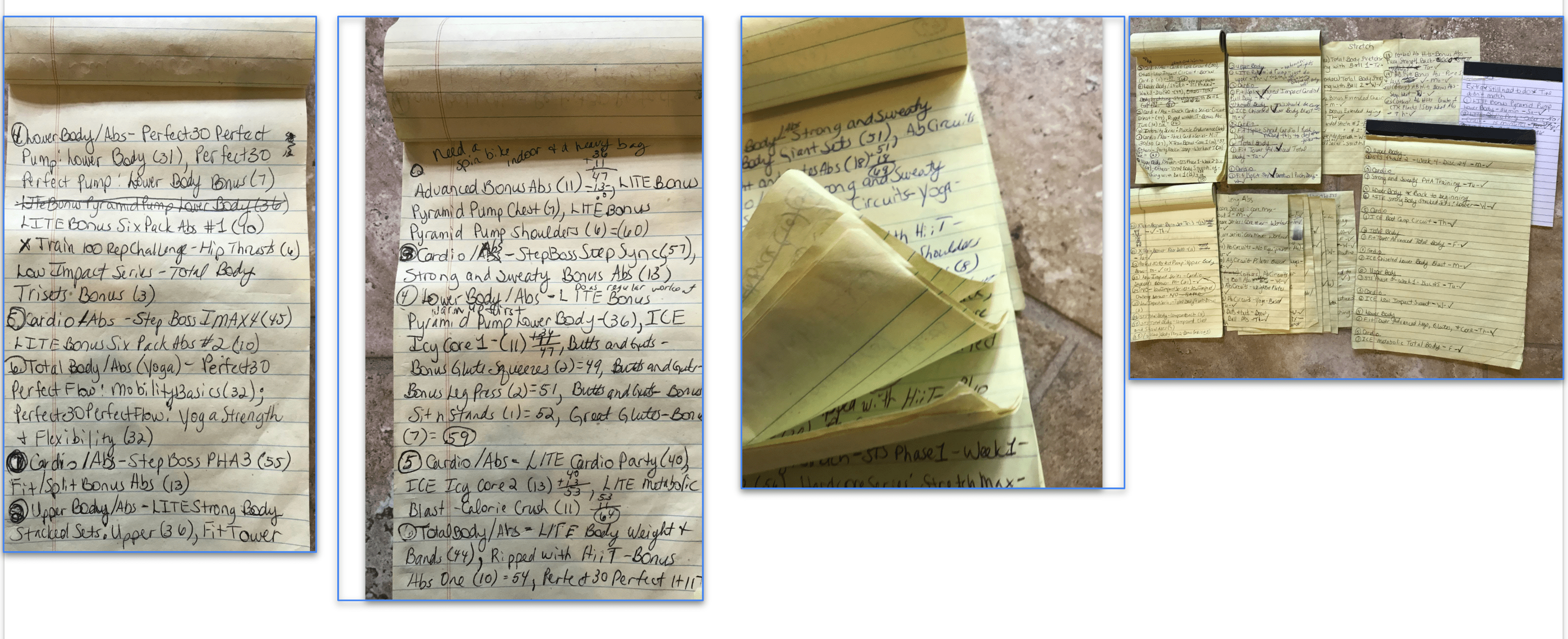
My client did not even know the Workout Manager existed on Cathe’s website. She has been using the app for many years. Pictured below is what she was using to keep track of her workouts from the app. She has even more notebooks full of workouts. It would have helped her to know that the Workout Manager even existed. She said it would be beneficial for her if it were built into the app.
I included an open question about the link I had where you can purchase equipment from Cathe’s website to use in the video. A portion of the page is pictured below and the comments from the testers. Again, they would use it if it were incorporated into the app.
Here is a link to Shop Cathe.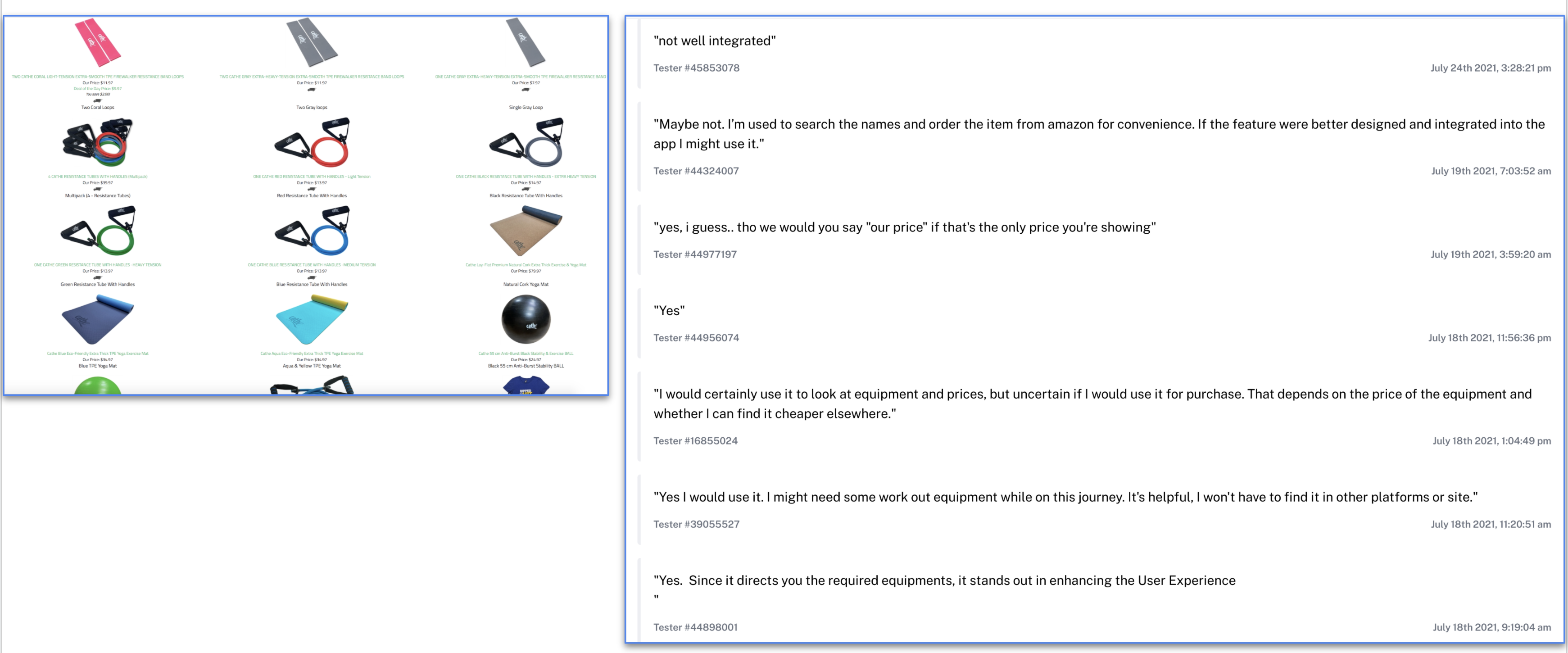
Also on Cathe’s website is the Workout Blender. Below is a portion of the page on her site. Interviewees and testers alike did not like the name: Workout Blender. They found it confusing. A lot of the testers, again, did not want to read all of this information. But, the testers and interviewees who understood the concept said that they would use it if it were integrated into the app. In hindsight, some of the original problems that the client had before we began this process were eliminated by using the Workout Blender. She had no idea what it was capable of either.
Here is a link to the Workout Blender.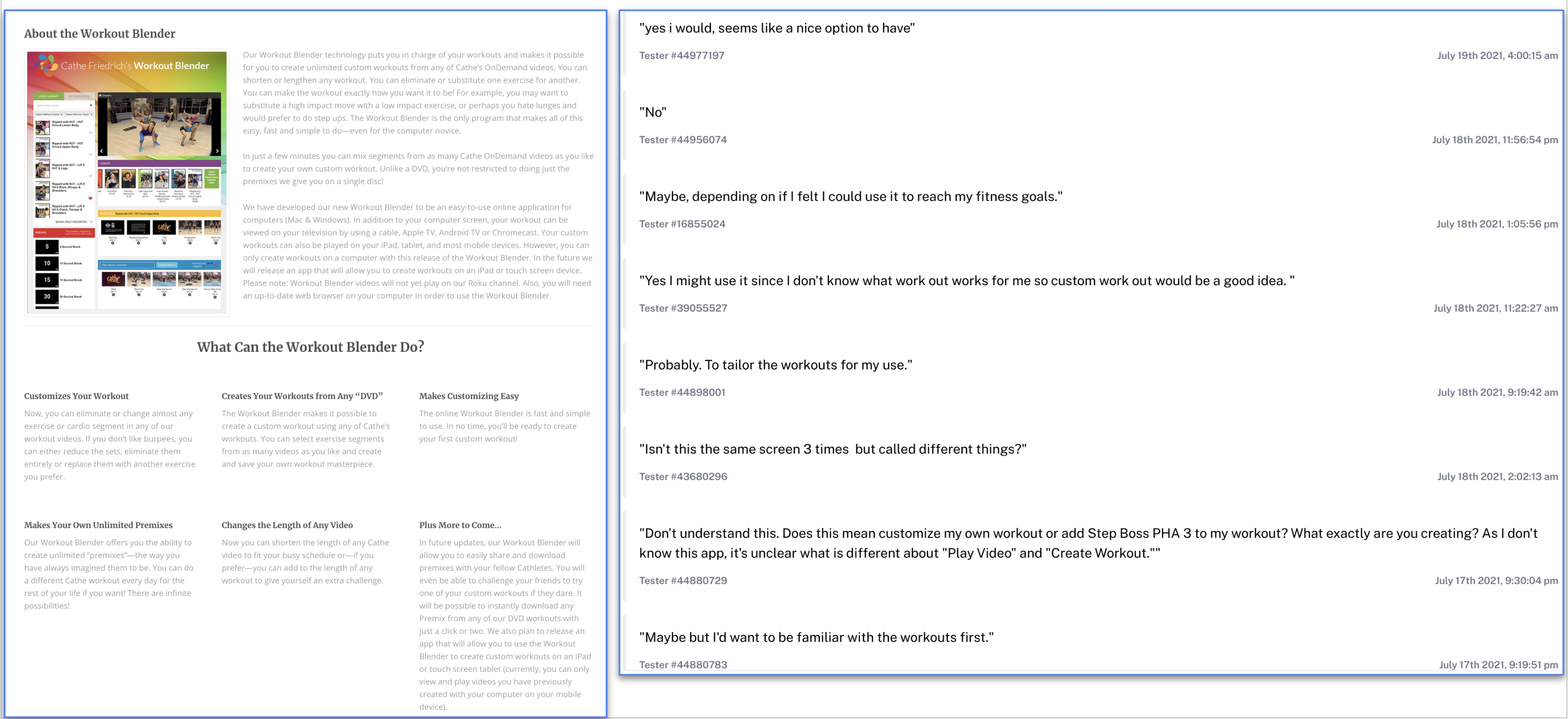
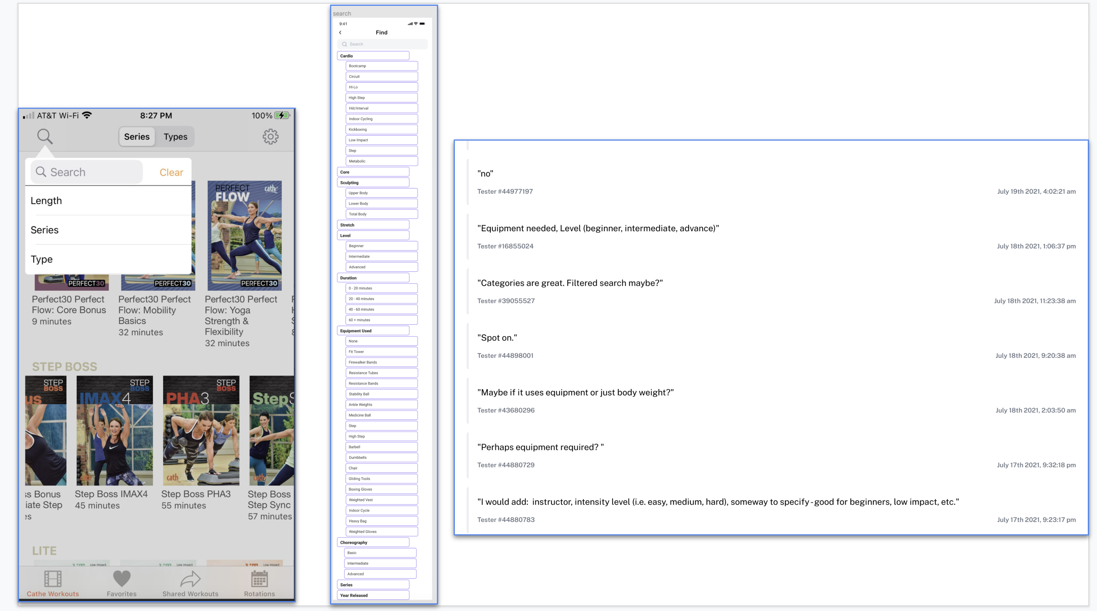
In my final task, my misclick rate was high. I had to analyze the data to realize that this was one of my mistakes when I created my Maze test. I forgot to mention that in the prototype Search portion, I did not make the categories clickable. The categories would be clickable in the app and would open up to show which videos matched that category. But, this mistake pales compared to the colossal mistake I made when I forgot to mention that the links to the different pages on Cathe’s site would be integrated into the app in the actual app.
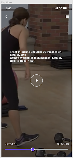
On Cathe’s app, the current Search function is pictured first below. The Search function for my prototype is pictured second. I asked an open question about the Search function on my prototype. The comments from the testers are pictured below as well. Some of them said that they wouldn’t add or delete anything. If they did have suggestions for categories to add, as you can see, those categories were already in the Search.
These are the original problems my client had presented me with at the beginning of this project.
The Workout Manager will also assist the users with getting through all of the videos once each. The problems that are not numbered at the bottom were not able to be solved with this prototype; however, I would like to attempt to solve these problems in the future.
Based on the interviews I have conducted and the quantitative data gathered from the Maze testing, I would like to continue creating this app to reflect the users’ needs better.
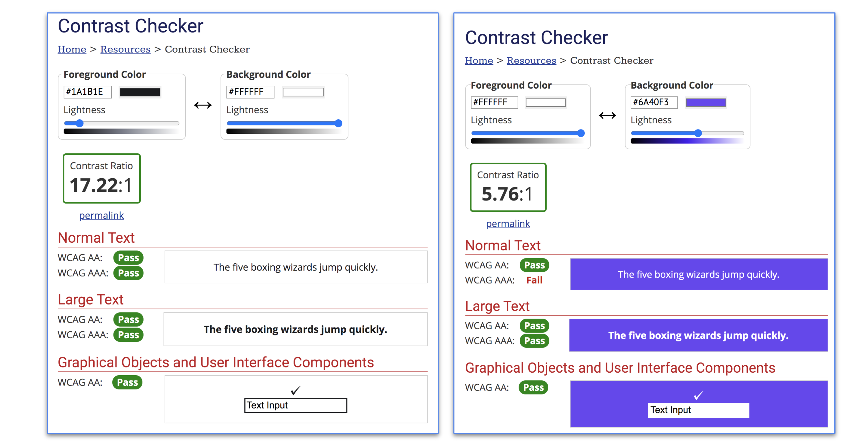
I confirmed that my color choices met contrast standards and checked how the combinations would appear to people with color blindness. I would like to continue to use blue because of what I had read about the psychology of the color blue in the checkpoint.
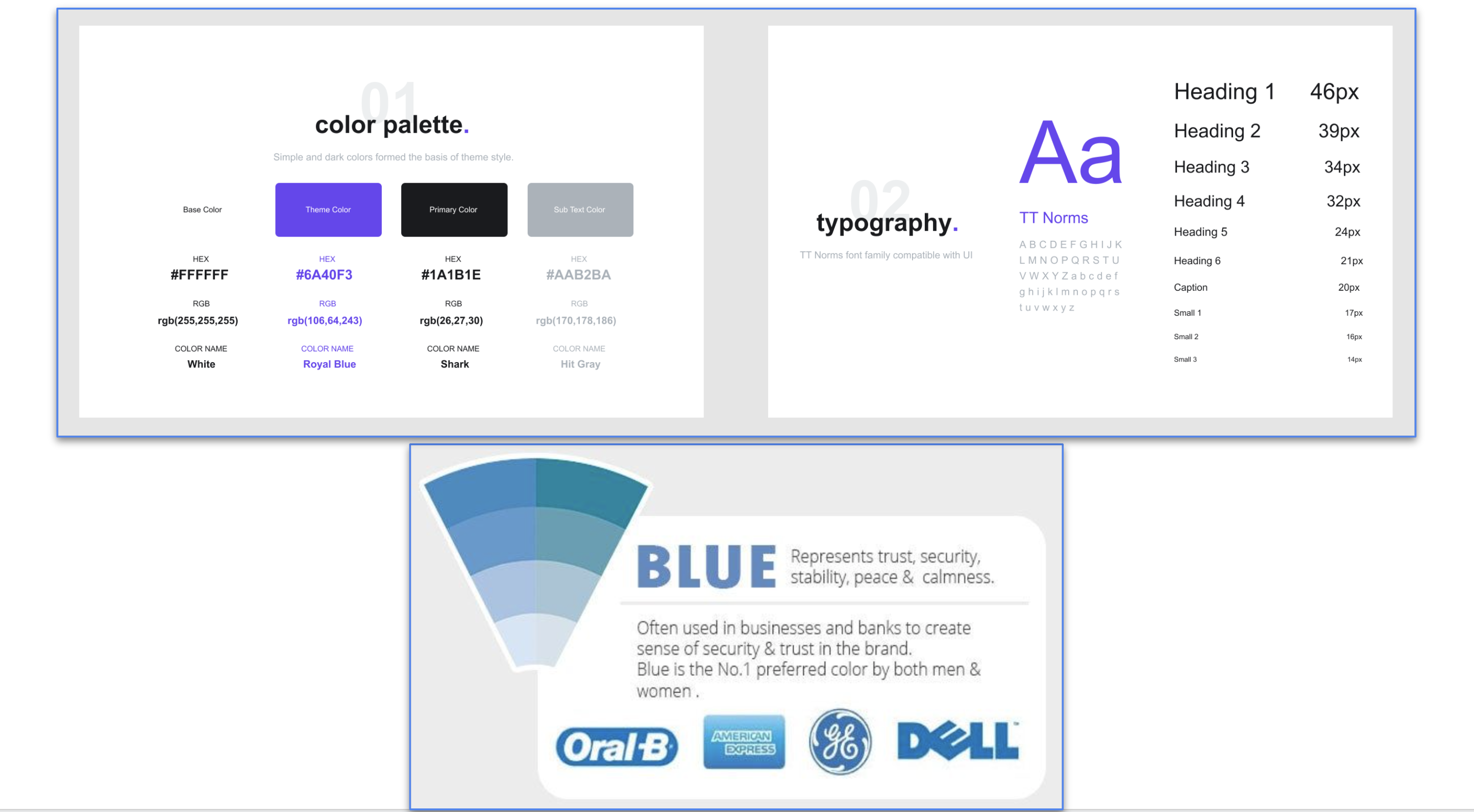
I chose a font and indicated what elements it would be used for. The specifications, including the size and color, were included. The font is web-safe. So, I would like to continue using it for this app.
I kept the logo the same as in the original app.
This is from page 83 of the Sprint book.
I learned so much from this design sprint.
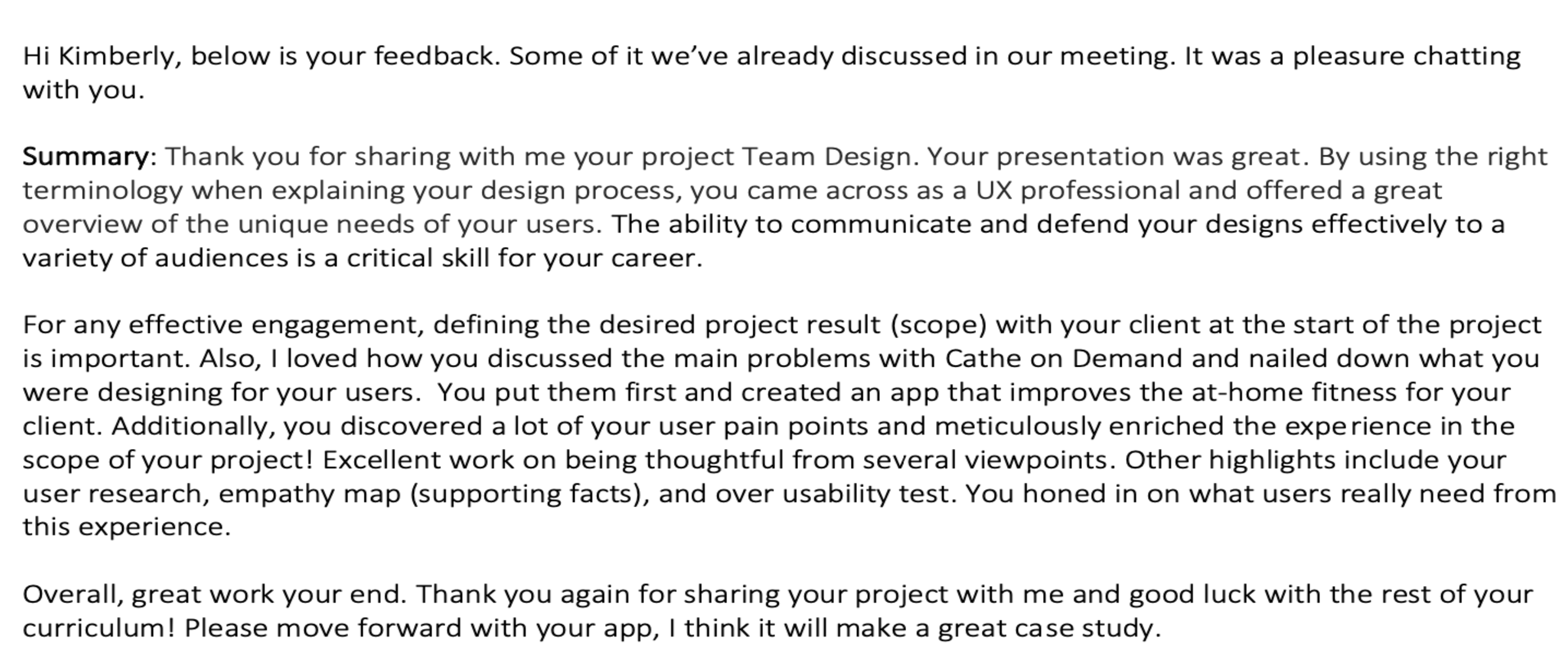
I received a lot of great feedback on my stakeholder presentation and enjoyed integrating some of the highlights. Below I’ve outlined the two major revisions that I made.
Revision #1-Provide more detail on the Search function in the prototype.
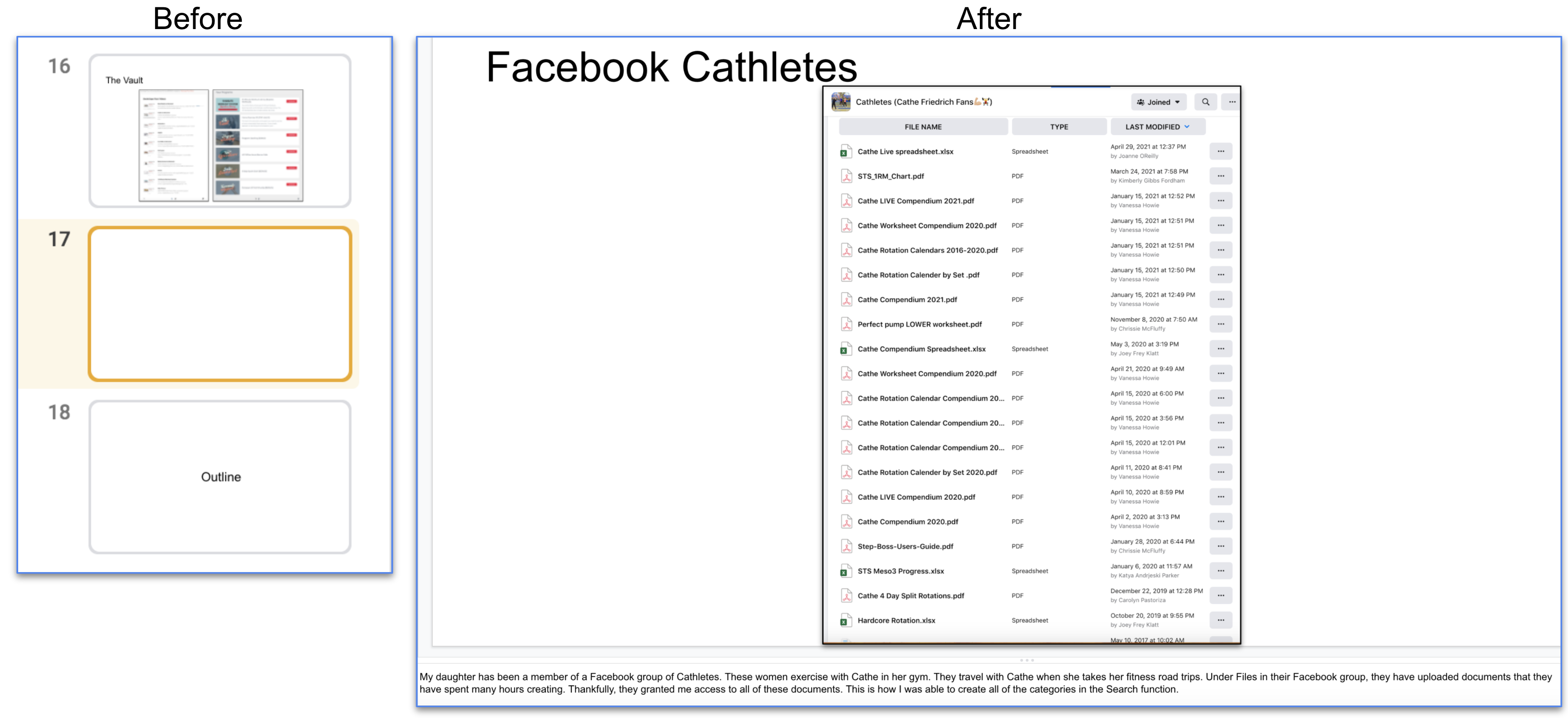
Summary of feedback: The first revision I made was based on feedback that I didn’t provide enough insight into creating my Search function in the prototype. She noted she wanted more evidence for my decisions.
Rationale and process: Originally, I only showed the Search function, but I didn’t detail how it was created.
Revision made: To create more transparency about creating the Search function, I included specific information about where I obtained the categories. This helped contextualize my decisions for the app.
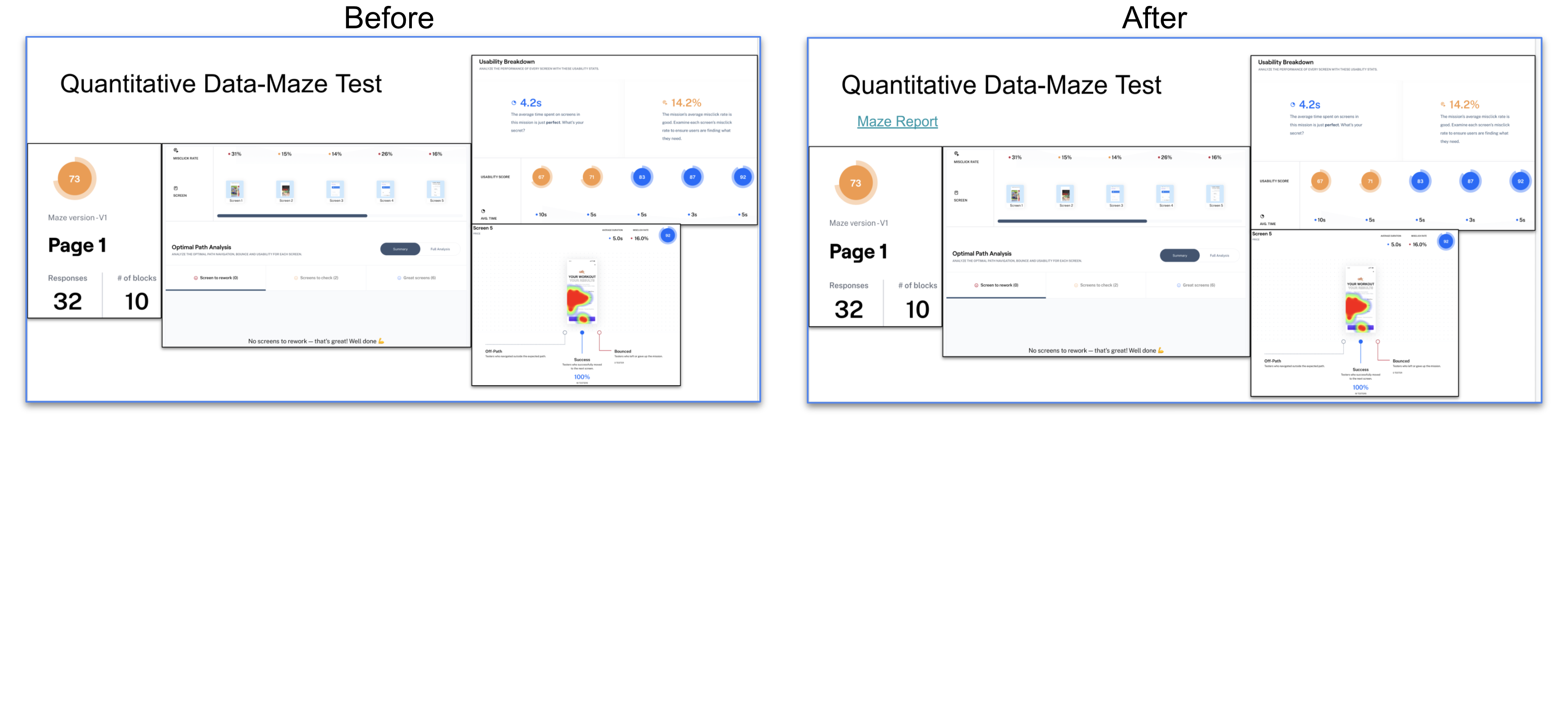
Revision #2 - Include a link to the Maze report.
Summary of feedback: I received feedback that I didn’t include a link to a copy of the actual Maze report.
Rationale and process: In hindsight, I forgot to include this critical information. I had included images of the report, but I now realize that I needed to include the link to the entire report for the client to view at their leisure. Therefore, I chose to make this revision because it gives the client much-needed additional information.
Revision made: I added a link to the entire Maze report. I wanted the client to see that I understood their needs regarding data.