
As a solo designer, I took on all the roles that a team might need: Maker, Stitcher, Writer, and Asset Collector.
These are the key requirements that I believe should be included for a successful MVP. I tested these assumptions in the next step when I conducted user research.
I had to think about my vision, goals, insights on who the users will be, how I wanted things to work with the product, and any previous efforts to accomplish this. I created a Target Audience Analysis. I defined my target audience using the research I’ve completed and my investigations.
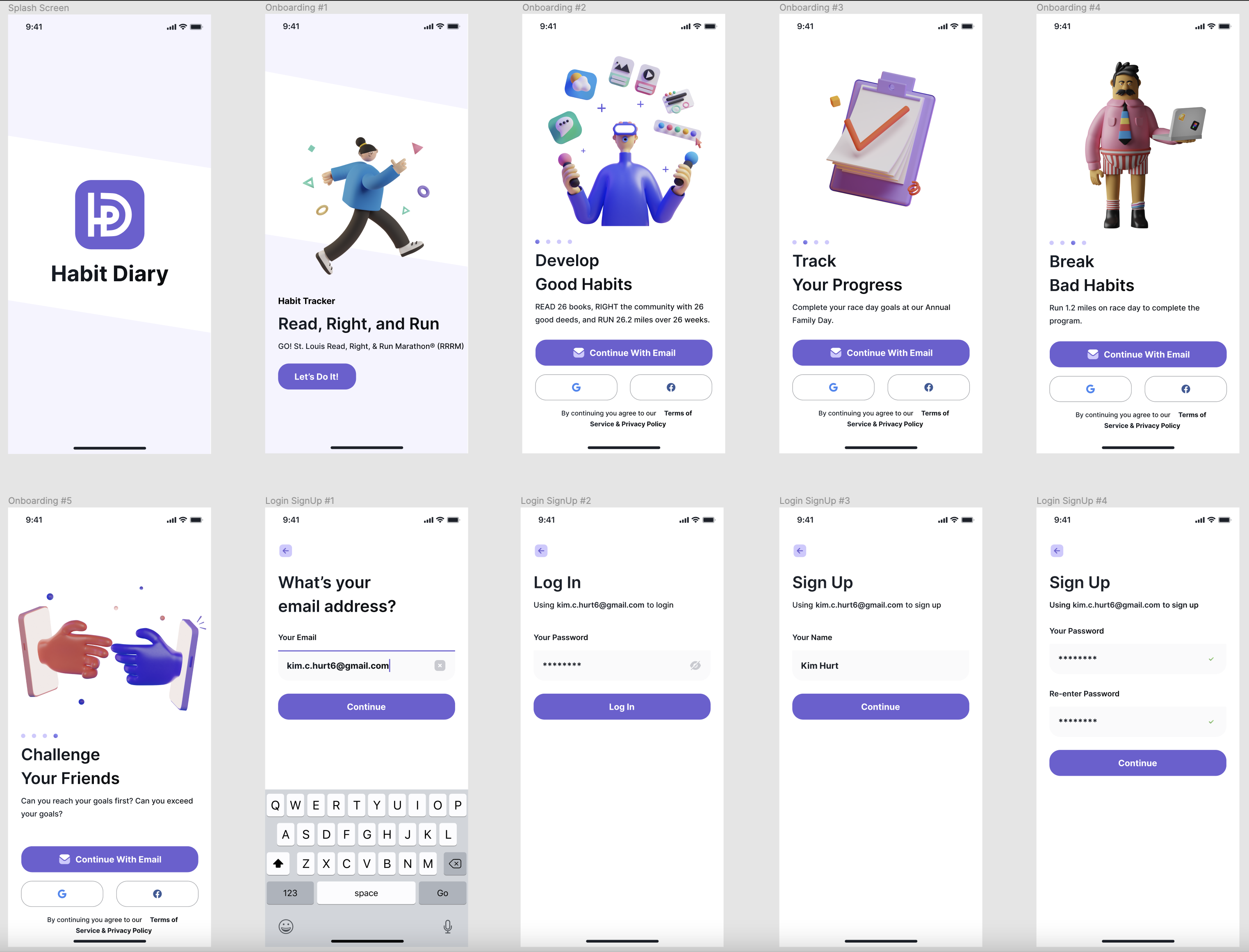
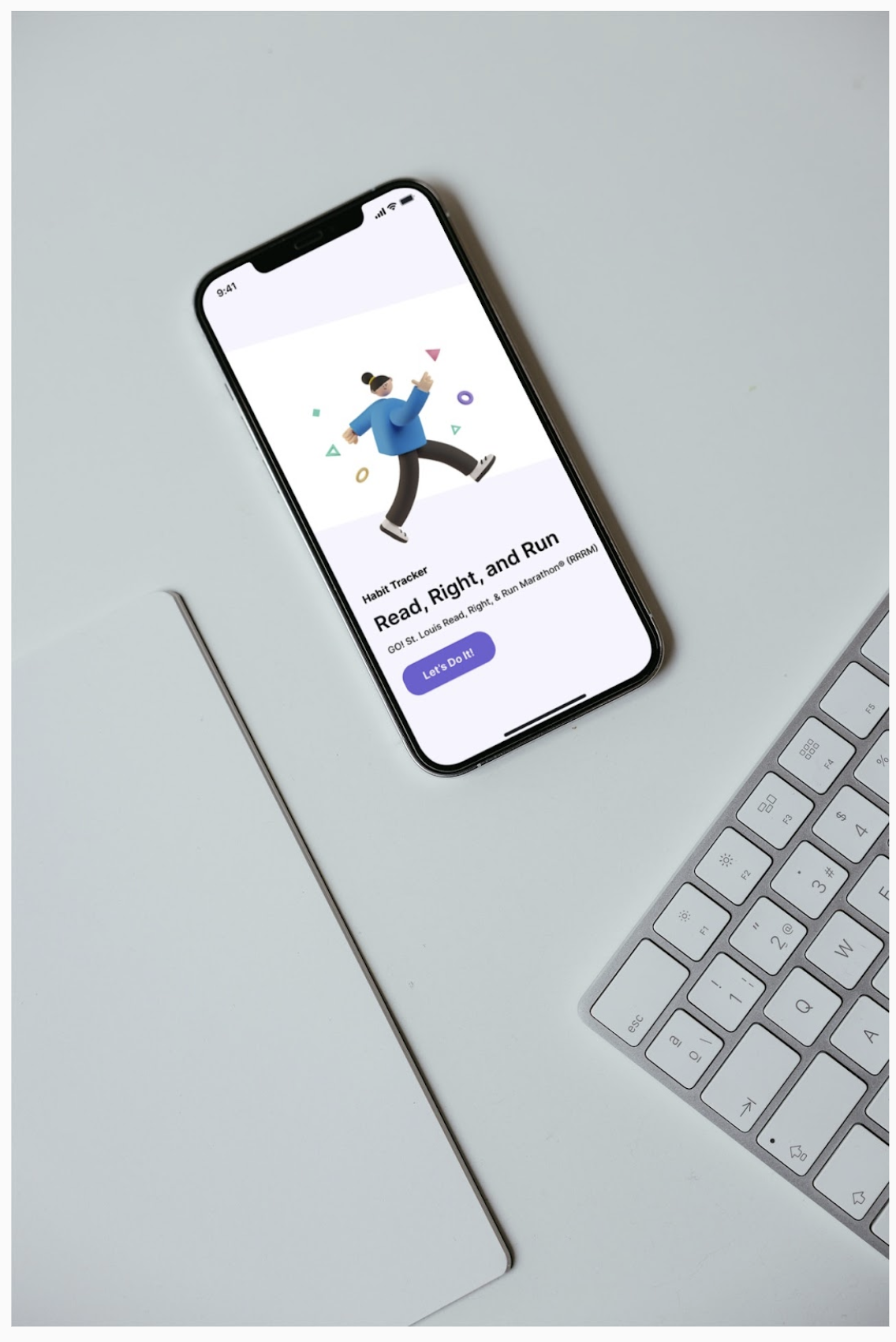
This portion solves the requirements: 1. The parent/guardian or teacher would have the ability to sign up and log in to the app for the child. 2. The child may also sign up or log in to the app.
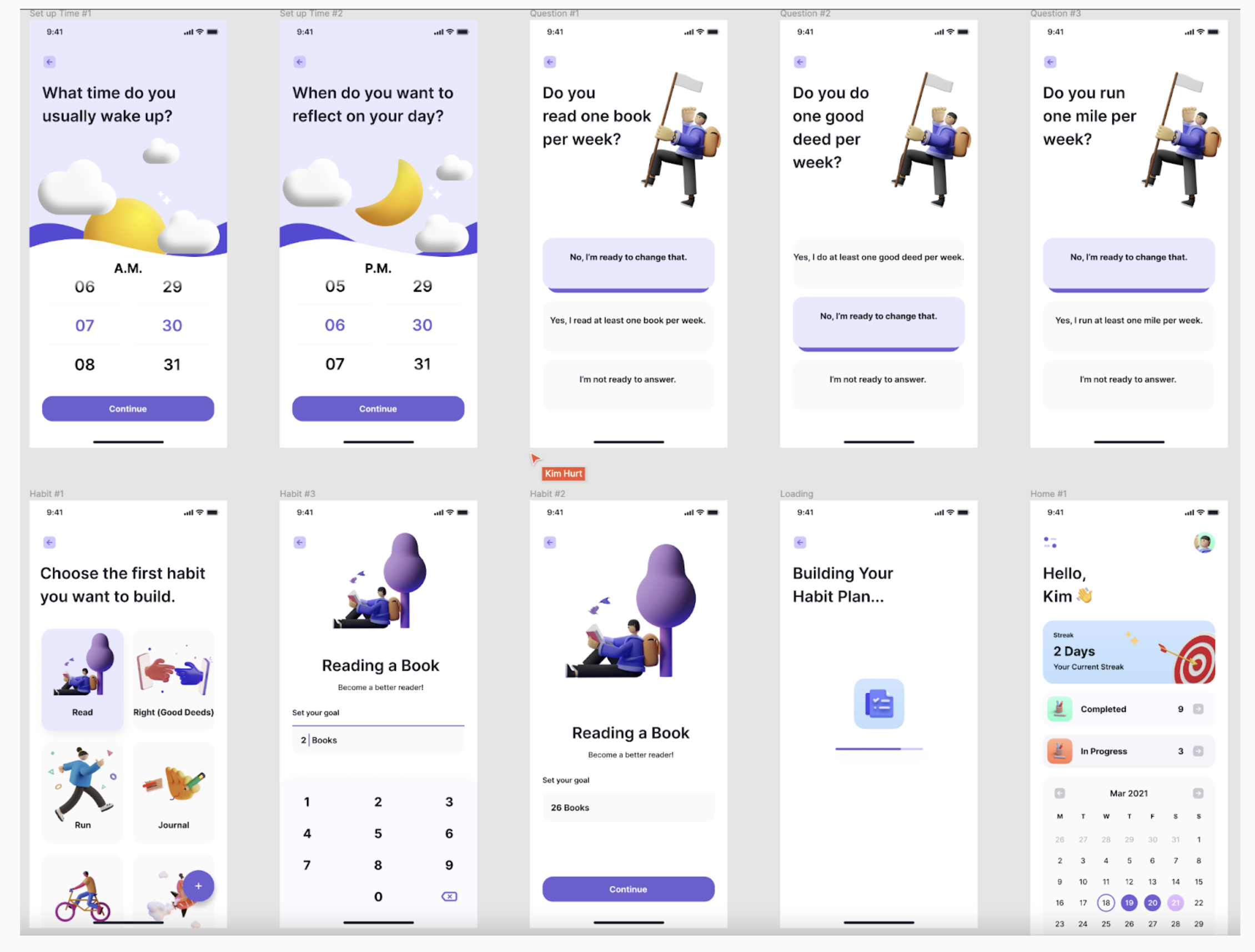
This portion solves the requirements: The child’s progress of reading 26 books, completing 26 good deeds, and running 26.2 miles in 26 weeks would be updated.
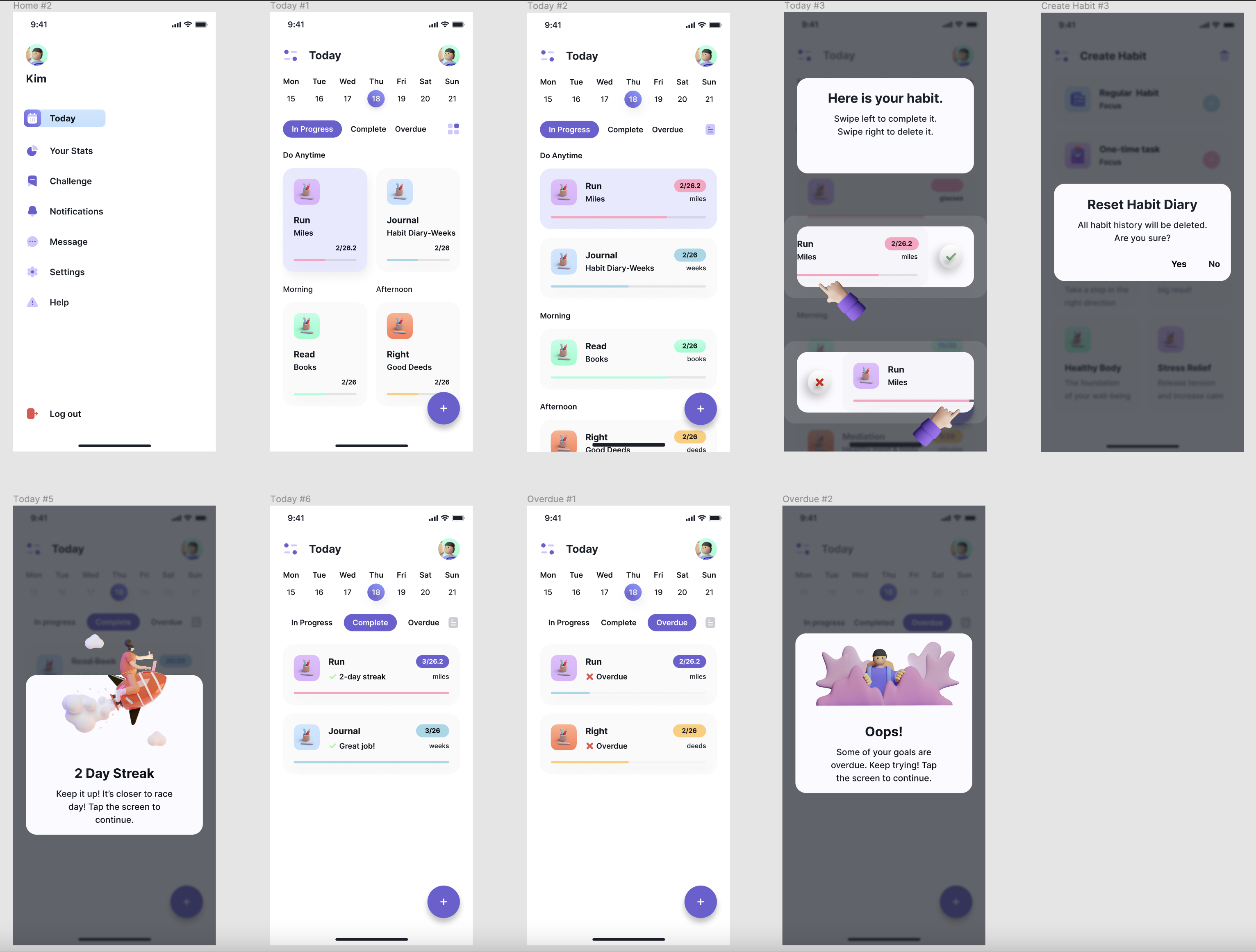
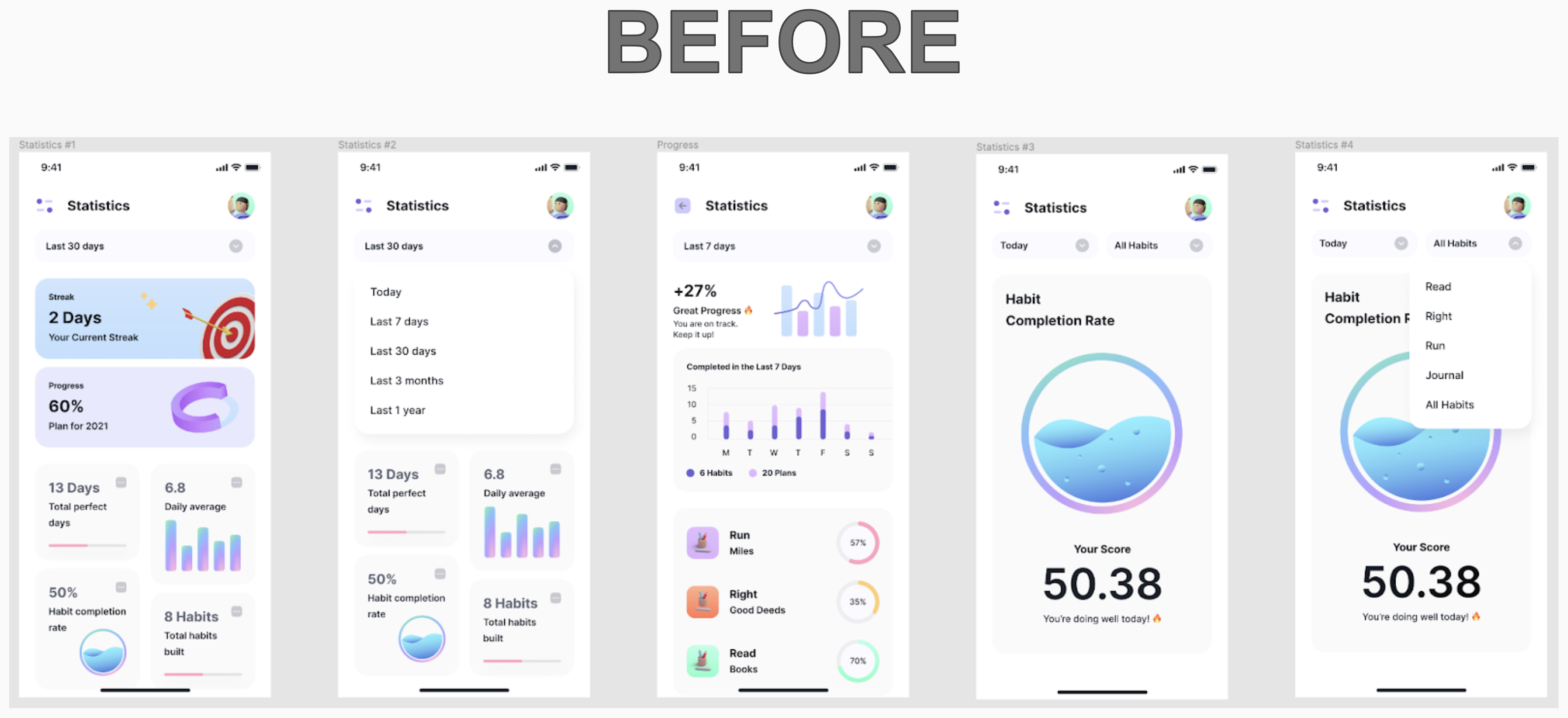
This portion solves the requirements: 1. The app would recognize streaks of days of positive progress. 2. The app would keep track of ‘Completed’ and ‘In Progress’ habits. 3. The application would send notifications to the user when it was time to complete a habit. 4. The app would alert the user when habits were ‘Overdue.’
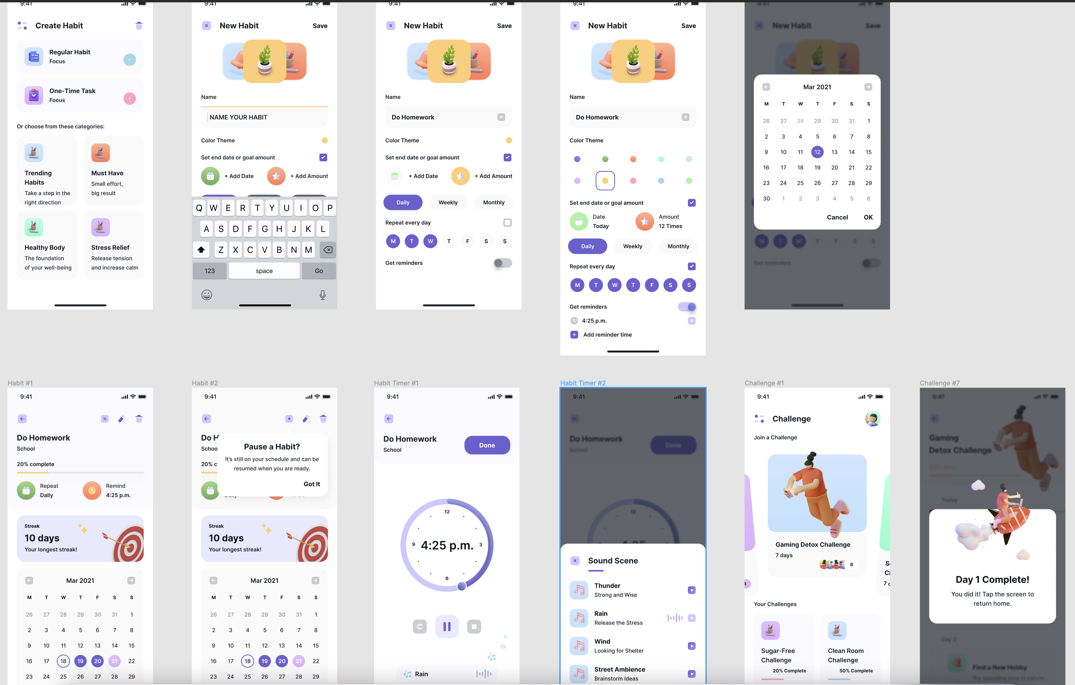
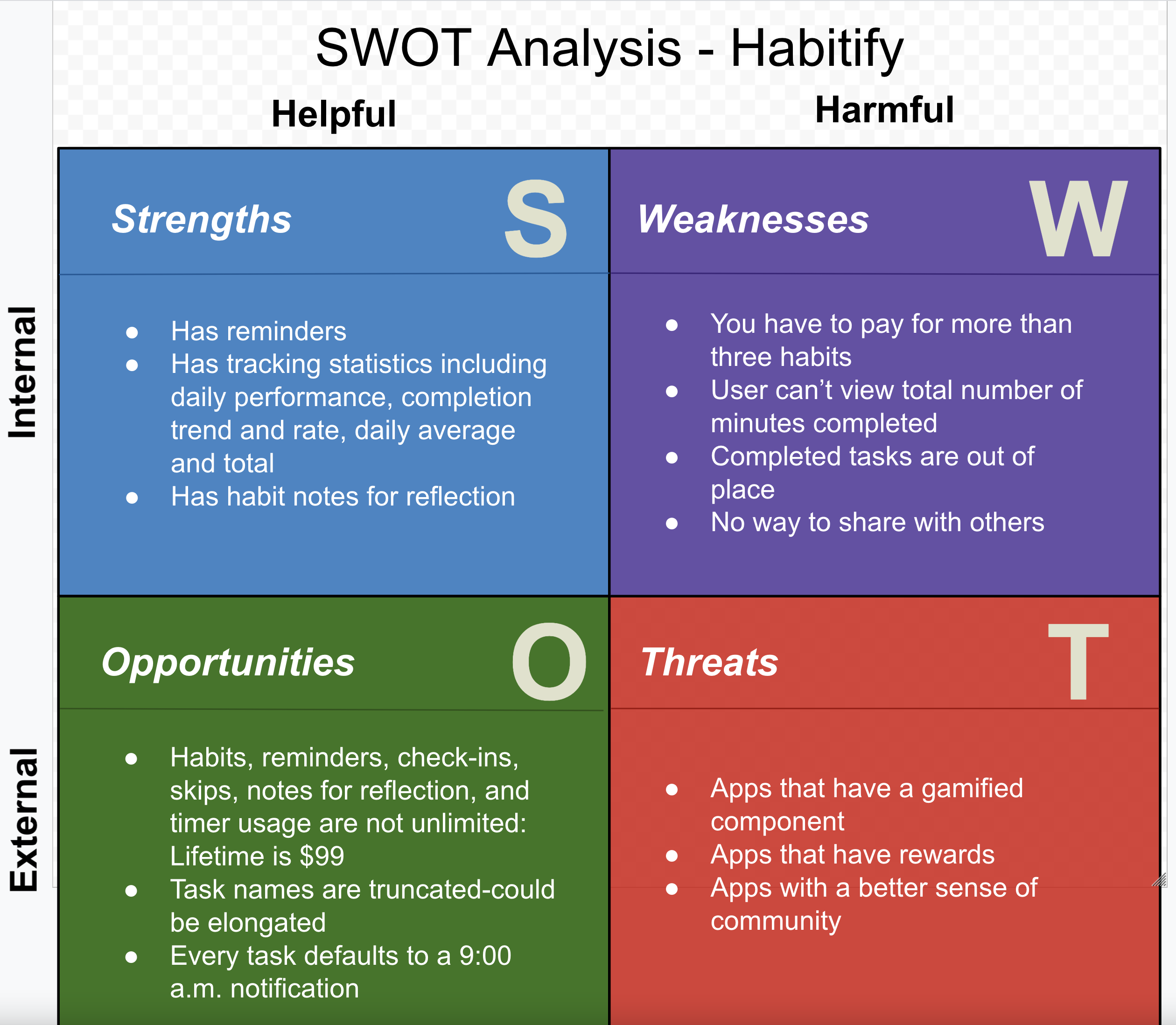
This portion solves the requirements: 1. The user could create new habits. 2. The user could pause habits.
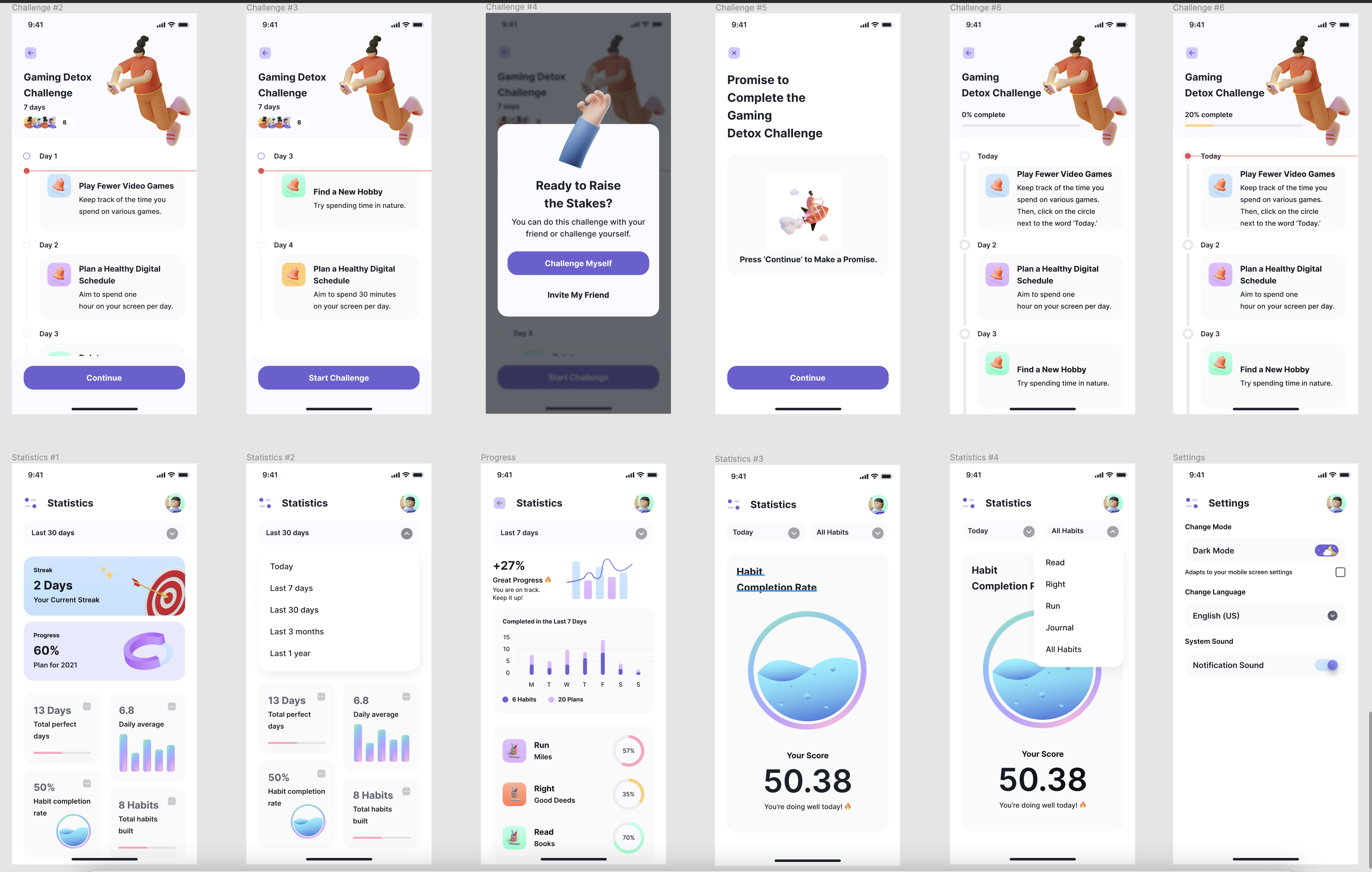
This portion solves the requirements: 1. The child would have the ability to challenge their friends or challenge themselves. 2. Statistics for the habits would be included on the app.
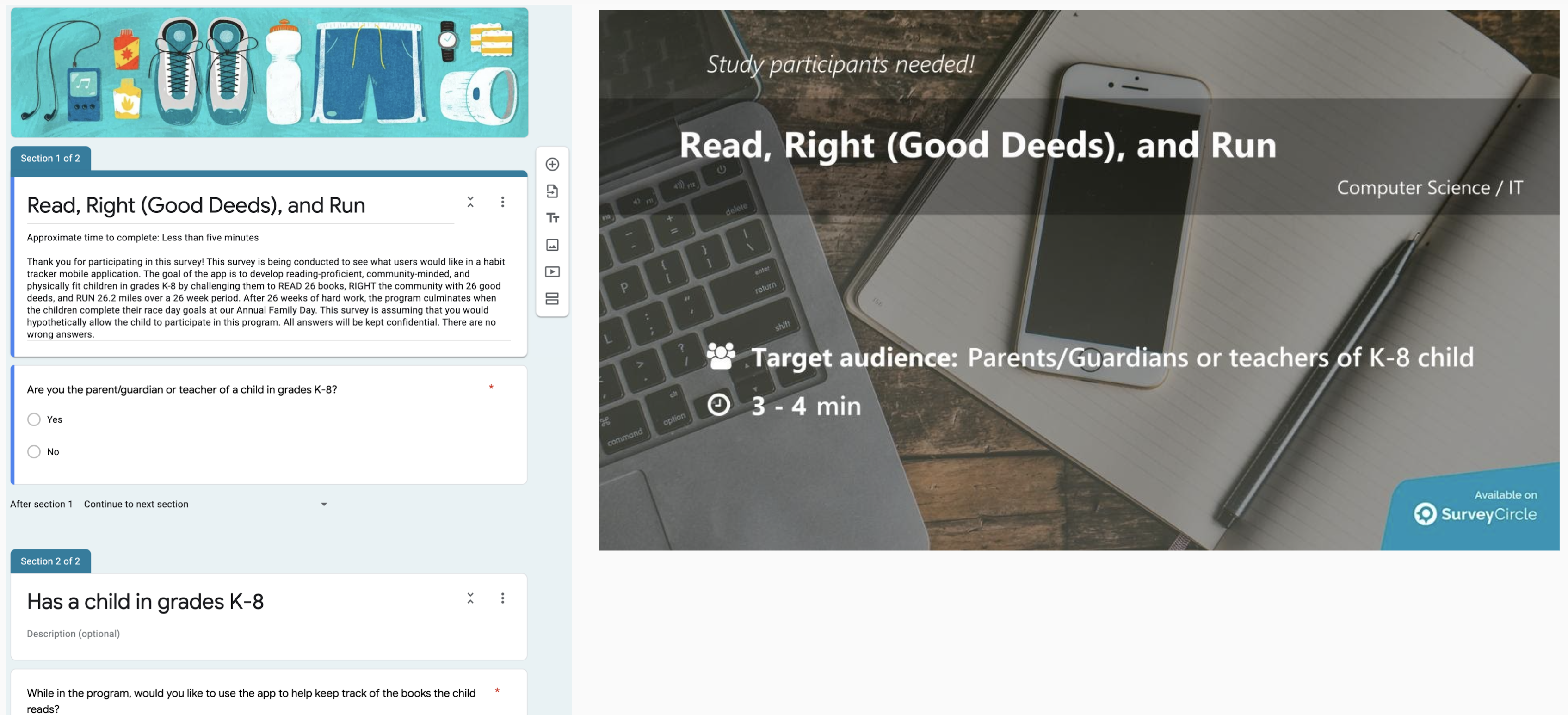
User surveys allow you to ask potential users questions regarding the functionality of your project. I created a survey using Google Forms. To help bolster the number of responses, I posted my survey on my social networks. I discovered that Survey Circle is very helpful at finding the correct participants!
Once I received the answers, I analyzed the results to help determine what problem I was attempting to solve and who my target audience was. Choosing what features users want is one of the primary goals of a survey. I allowed for open-ended responses and asked if I missed anything that the user would like to see.
Surveys are also great to augment my competitive analysis by getting users’ thoughts on the competition. I had questions asking if the respondent is a current user of one or more competing products and finding out what they like and dislike about those other products. Although, I should have separated that question into two questions for clarity on the survey.
The user survey had a total of 26 responses. 73.3 percent of the respondents wanted to keep track of the good deeds, books read, and miles run by their child. Sixty percent of the respondents wanted their children to have the ability to challenge their friends in completing those items on the app. 86.7 percent of the respondents would like the app to remind the user they need to record those items, and they would like the app to recognize streaks of days of positive progress. 86.7 percent of the respondents would like the app to keep track of completed and in-progress habits. 93.3 percent of the respondents would like the app to send notifications if habits are overdue. 86.7 percent of the respondents would like the user to be able to create new habits.
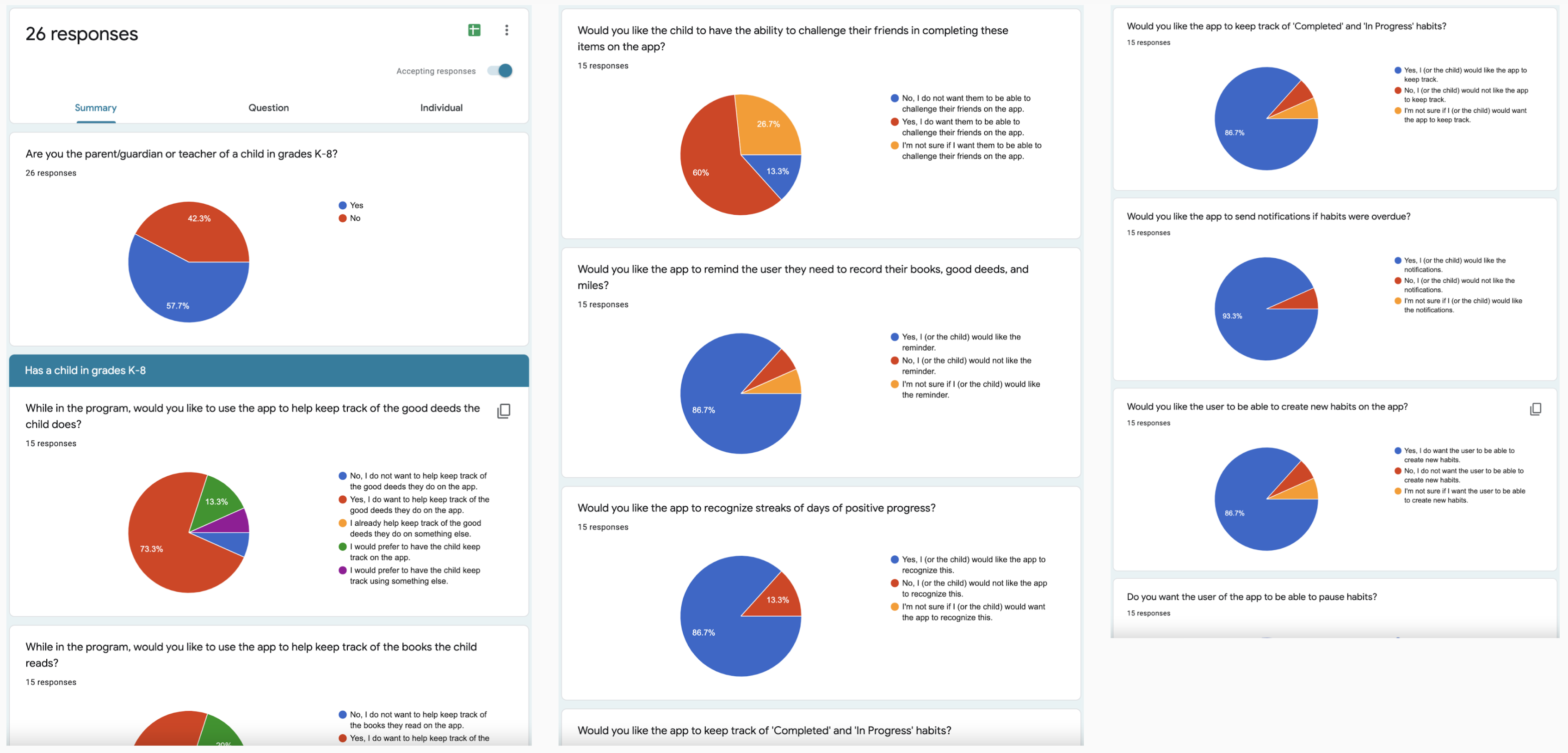
86.7 percent of the respondents wanted the user of the app to be able to pause habits. In addition, having the children’s statistics included was favored by 80 percent of the respondents.
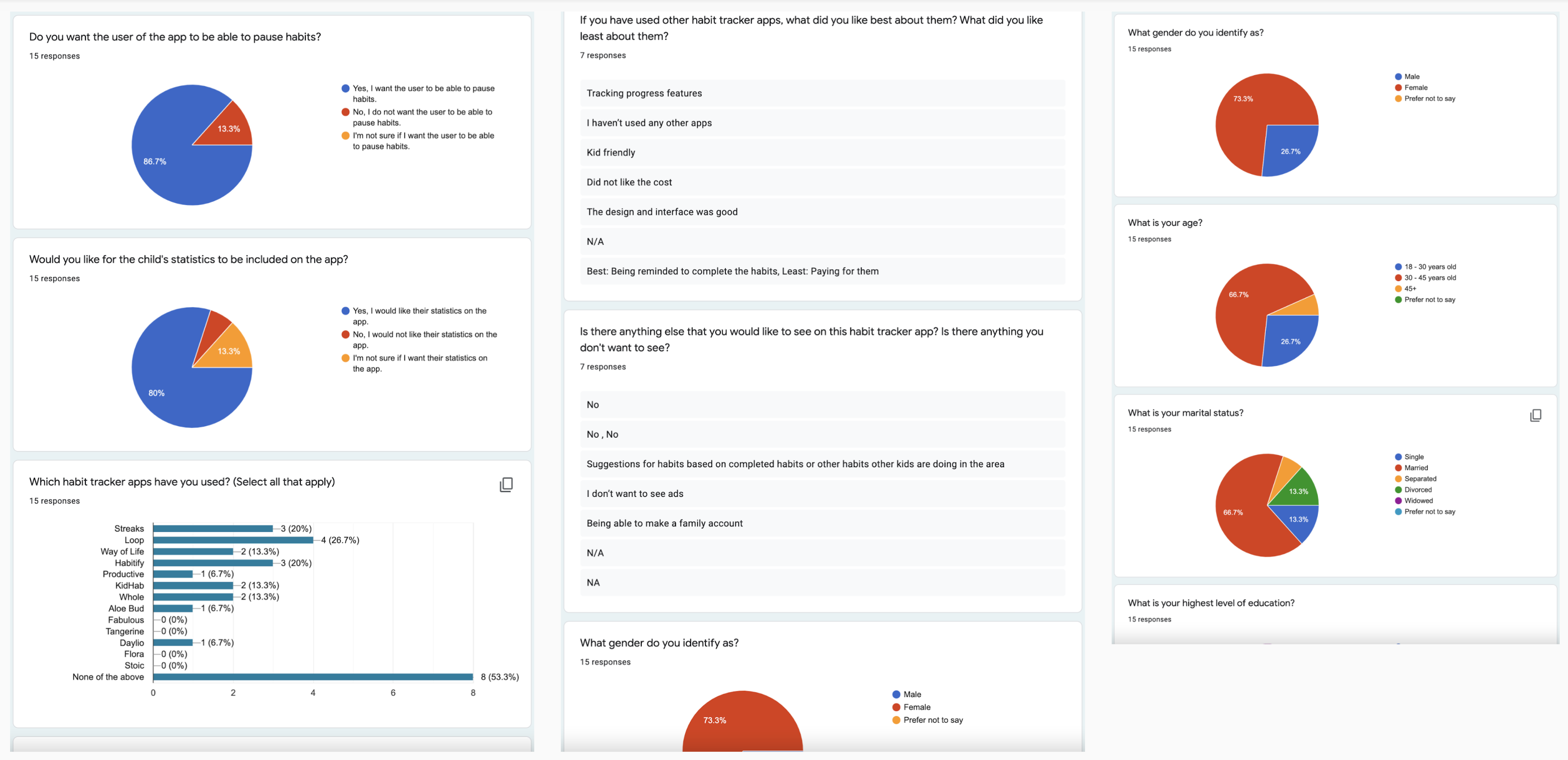
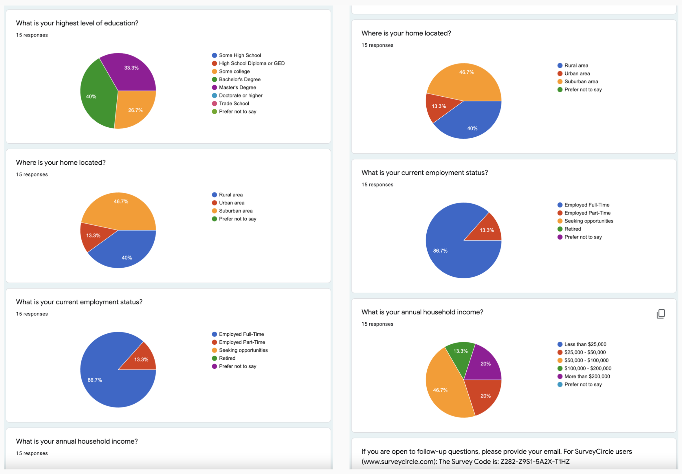
73.3 percent of the respondents were female. 66.7 percent of the respondents were between the ages of 30 to 45 years old and married. Forty percent of the respondents held a Bachelor’s Degree. 46.7 percent of the respondents lived in a suburban area. 86.7 percent of the respondents were employed full-time. 46.7 percent of the respondents had a household income between $50,000 and $100,000. I used the demographic information to create the user personas.
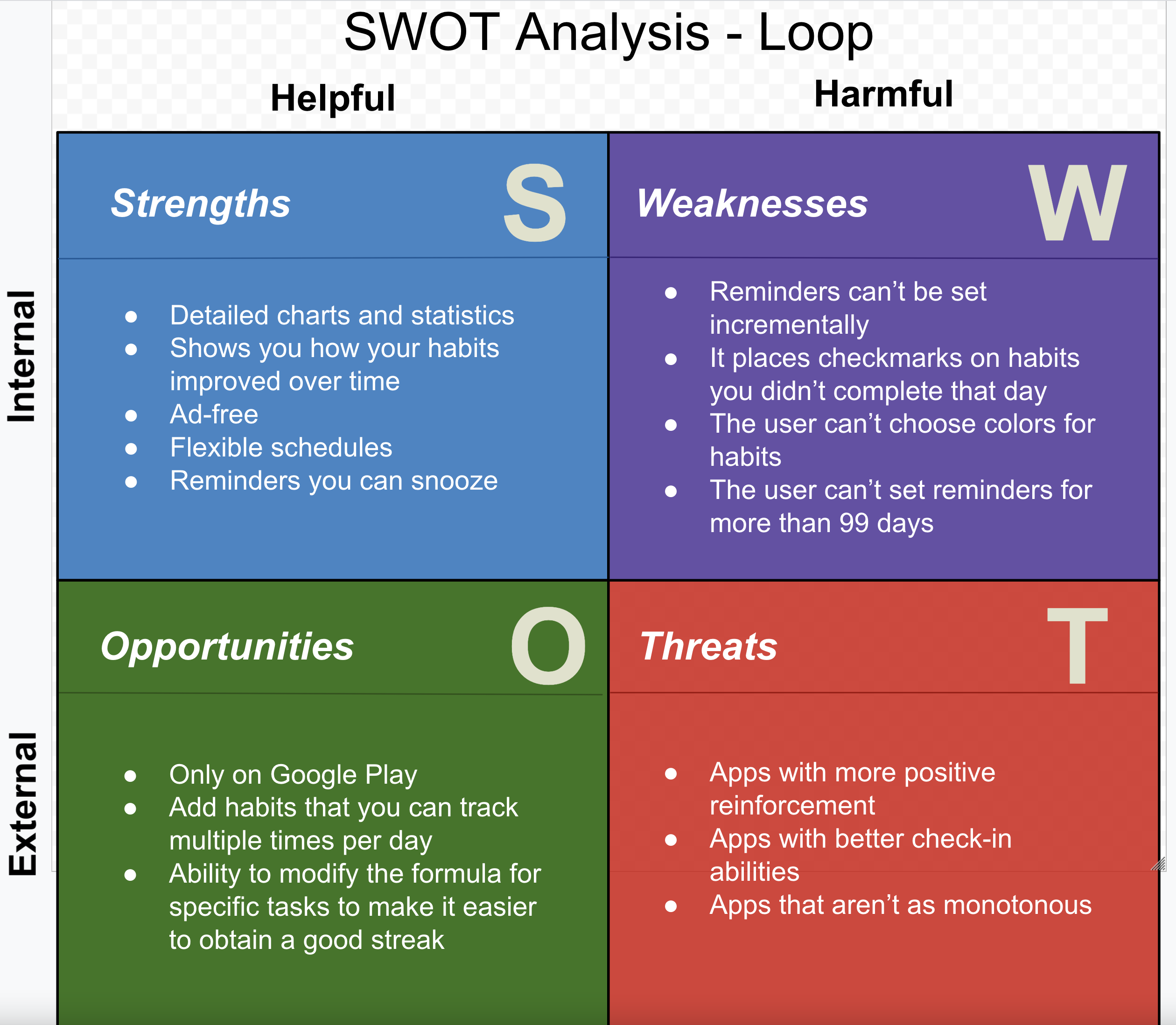
My survey results showed that 26.7 percent of respondents had used the Loop habit tracking app, 20 percent had used Streaks, and 20 percent had used Habitify. Therefore, I chose these three apps for SWOT competitive analyses.
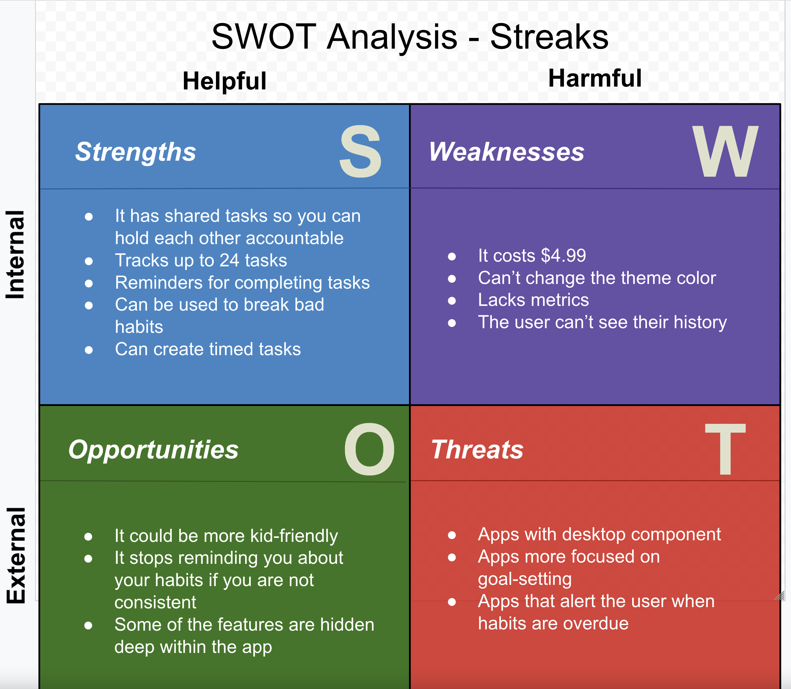
The respondents in the survey said that they would like to see an app that was kid-friendly. They would also like an app that would allow them to create a family account. Also, they wanted an app that would suggest habits based on completed habits or habits other children in the area were completing. Therefore, I included this information in my competitive analysis.
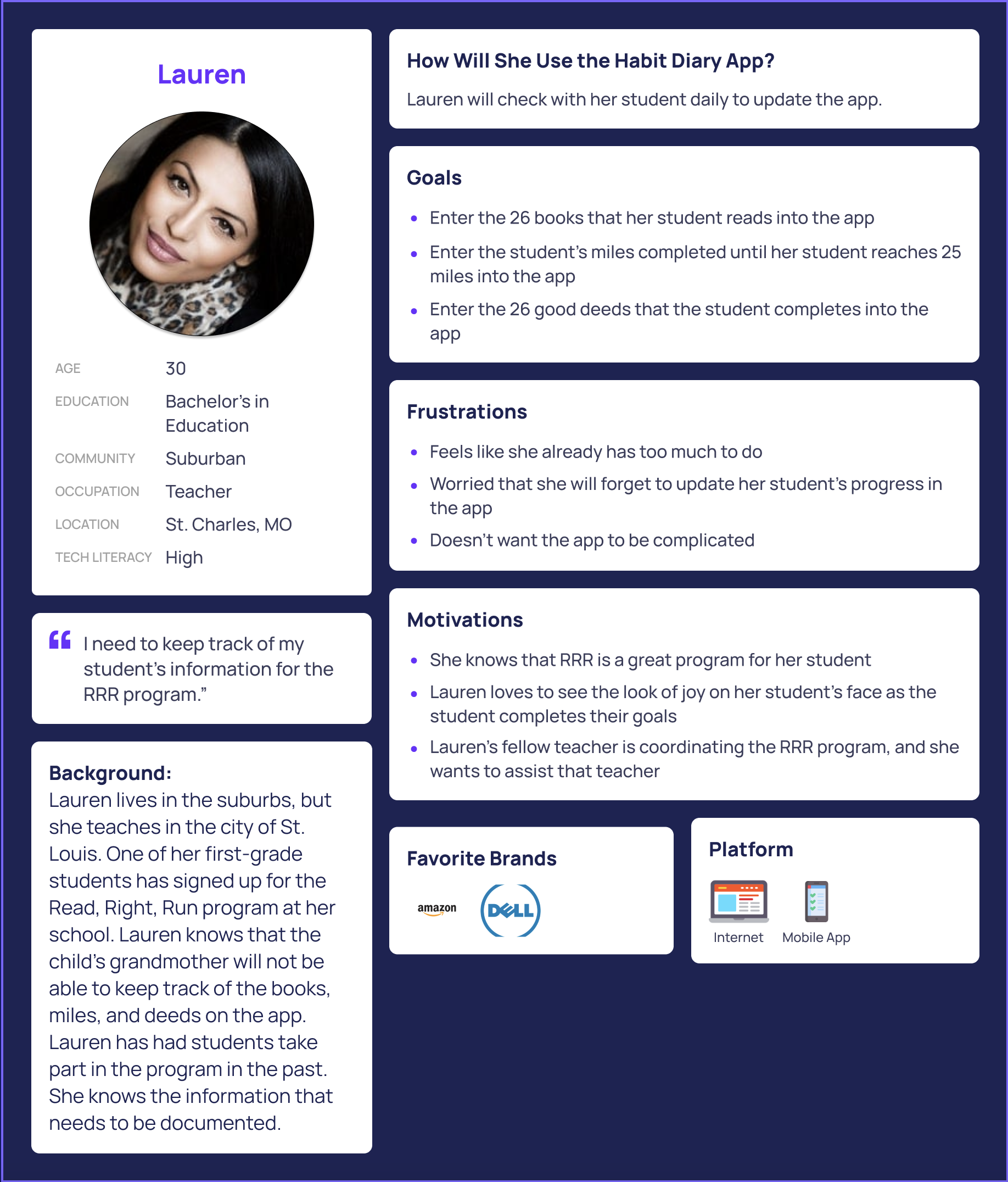
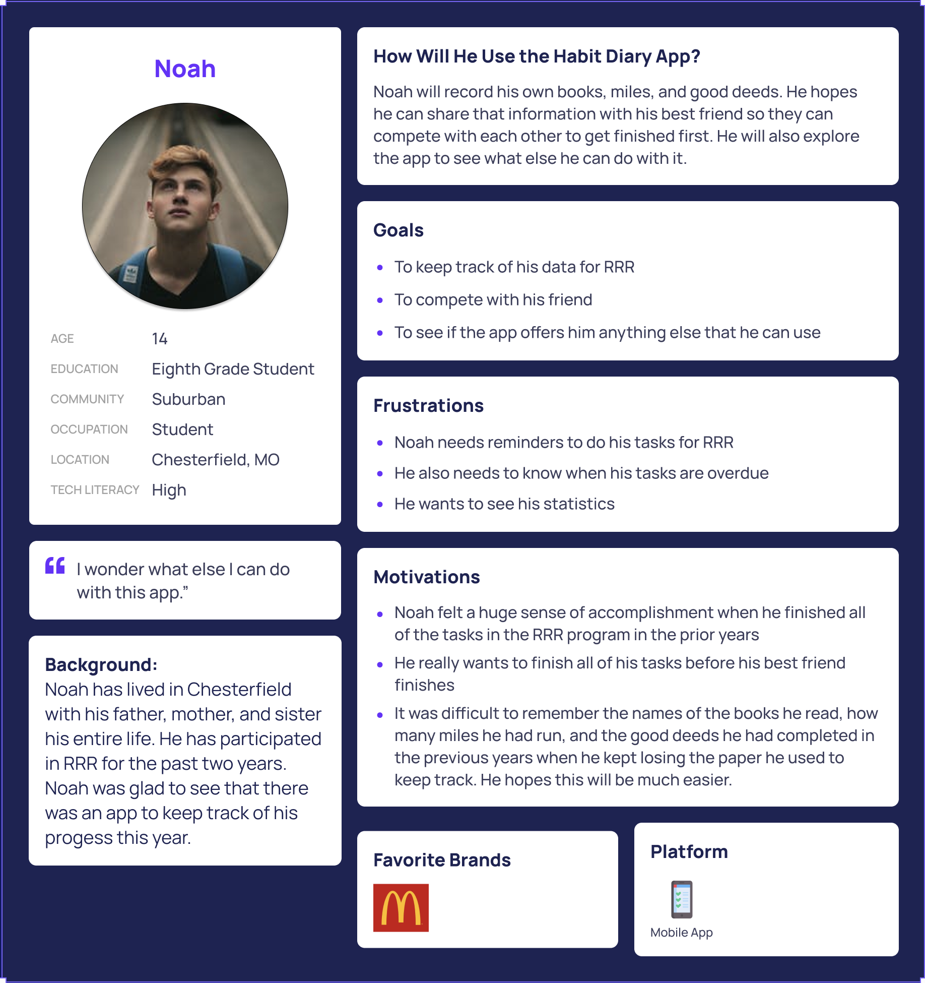
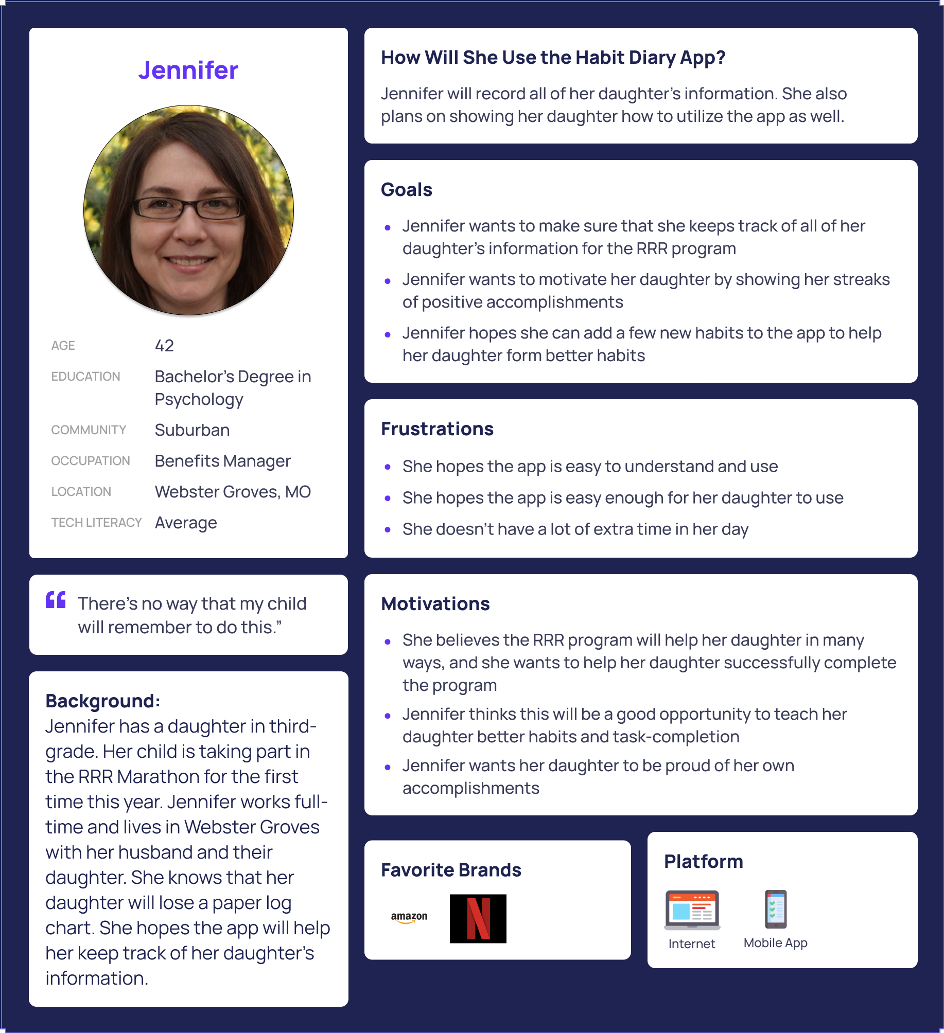
I also needed to understand who my interview participant was as a person, so I asked biographical questions that would assist me when I needed to write about the background of my user. From the notes I collected during those discussions, I created three personas representing the audiences my product could potentially serve.
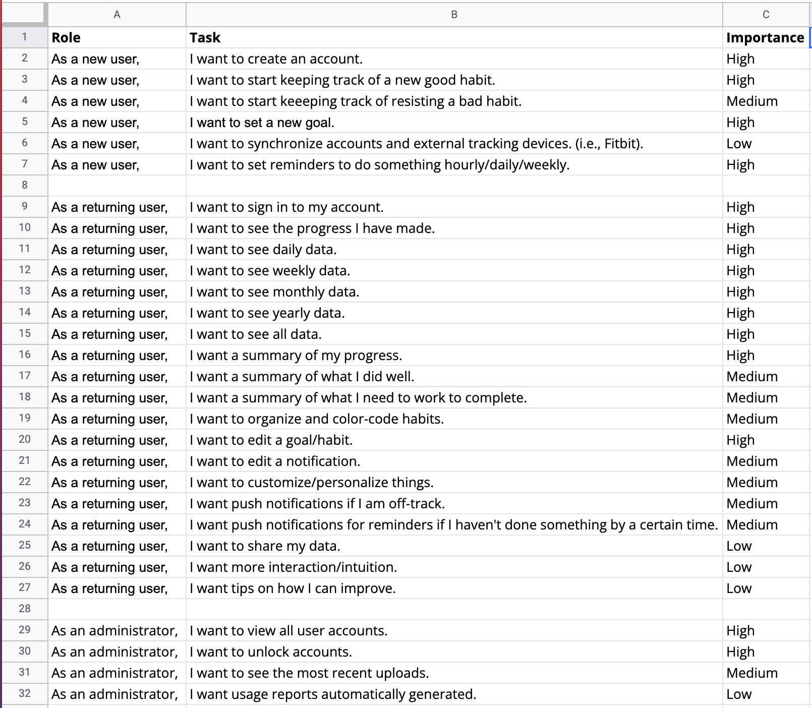
User Stories: Instead of self-editing as I created my user stories, I put them all into a spreadsheet. Then, I edited this list to conform with the Pareto Principle.
The Pareto Principle (also known as "The 80-20 Rule") states that users will use 20% of the features 80% of the time. Using this principle, I prioritized my user stories to focus my efforts on the most needed ones. This practice of prioritization rather than elimination will give my team insight into the more critical vision I have for a project while also showing my ability to show restraint. Feature creep is a genuine concern. I hope my ability to demonstrate control over the scope of a project will be an asset.
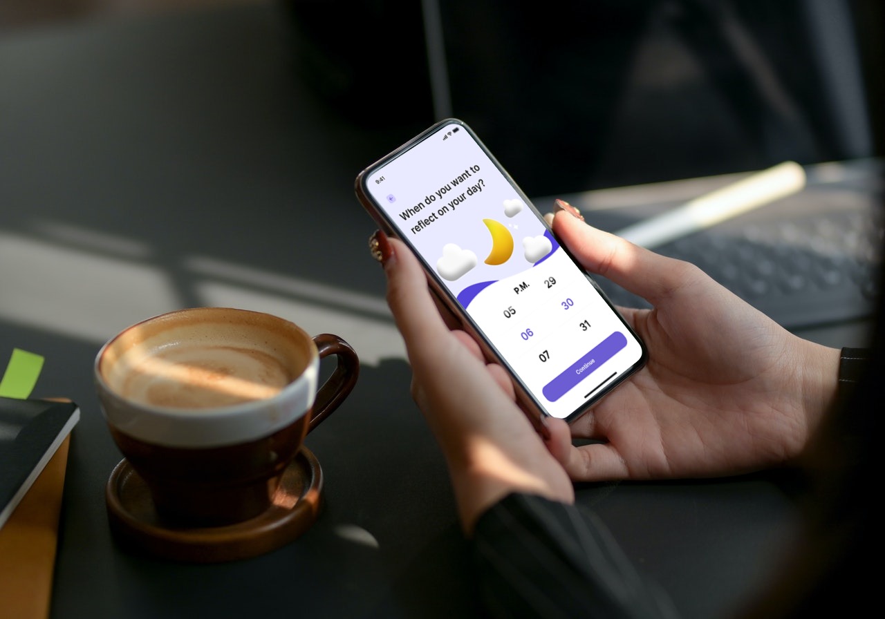
I developed a series of user flows for the five aspects of my project that I planned to put through user testing. Doing this helped define the scope of my project MVP. I determined the necessary steps for users to achieve the desired result. I came back to these flows later when it was time to test my prototype with real testers. As the design process progressed, things became less abstract and more visual. What previously was a prioritized list of features (user stories) eventually needed to become a wireframe. To do that effectively, I needed to create user flows first.
Wireframes are about visuals. They're the blueprints I used when designing my mockups, the underlying foundation. To create wireframes, I need to know why something should be higher or lower in the visual hierarchy; I need to understand how each item relates to other items on the page. Next, I want to draw the user’s eye down the page, hitting each item in the proper order. Finally, I need to know how a user will flow through the site. That's why I needed to transform my user stories into user flows. User flows form the backbone of wireframes. They provided the answers to the questions I had when I started laying out my wireframes. I referred back to my surveys, particularly the parts where users discussed what they liked and didn't like about the competition. I looked specifically for trends to present themselves in my analysis. There were trends present that I applied to my user flows.
Also, I looked at my user stories, in particular the prioritization. If something's a high priority, it should be near the start of a flow, not buried at the end. Any item marked as a high priority was a task that I wanted to test with potential users. There's no better way to determine what will be needed for a test than to create a flow for the task.
I thought about my personas as well. I needed to make sure these particular flows were meeting everyone’s needs. I walked through my flows with each persona in mind. I checked to see if something was more difficult than it should be. I also checked to see if I was adding friction to a task one persona might need because other personas didn't need that ability.
Site maps show the overall hierarchy of an application or website's page structure and the relationship of subsequent pages to each other.
Key attributes of a sitemap:
I wanted to take some of my written notes and make them a bit more tangible. For example, I found ideas for a page that I liked, and I started sketching some doodles. These didn’t need to be beautiful; they were meant to help me kickstart my thinking and drawing.
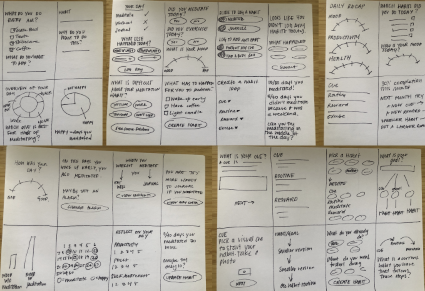
Wireframes provide great clarity into how I will organize the information on the screen. The absence of finishing details allows me to focus on how the data is contained rather than what it will look like in its final form. My focus is crucial because it is always essential to design my wireframes with accurate text whenever possible. Wireframes also provide me with a map that I can test on real people before investing time in the application’s visual design. When I opt to try my wireframe designs with a real person, I want to make sure I am focused on the functionality of the product I am designing and not how the app 'looks' to the user. This is why true wireframes have no color, no images, and are generally devoid of finishing touches.
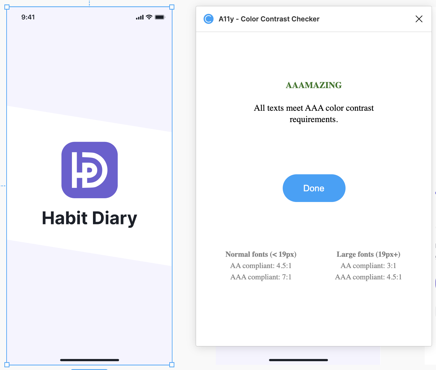
Name is the primary indicator of a brand for communication as well as brand awareness. When building a brand from scratch, it was essential to use no current associations to be unique. Habit Tracker and Habit Journal are two prevalent names that appeared when I researched the name for this product. I generated alternatives through word association and metaphors. For example, ‘diary’ is defined as: a daily record, especially of the writer's own experiences, observations, feelings, attitudes, etc. This word seems more personal than ‘tracker’ or ‘journal.’ A brand name should be memorable and should help create a mental picture that evokes emotion.
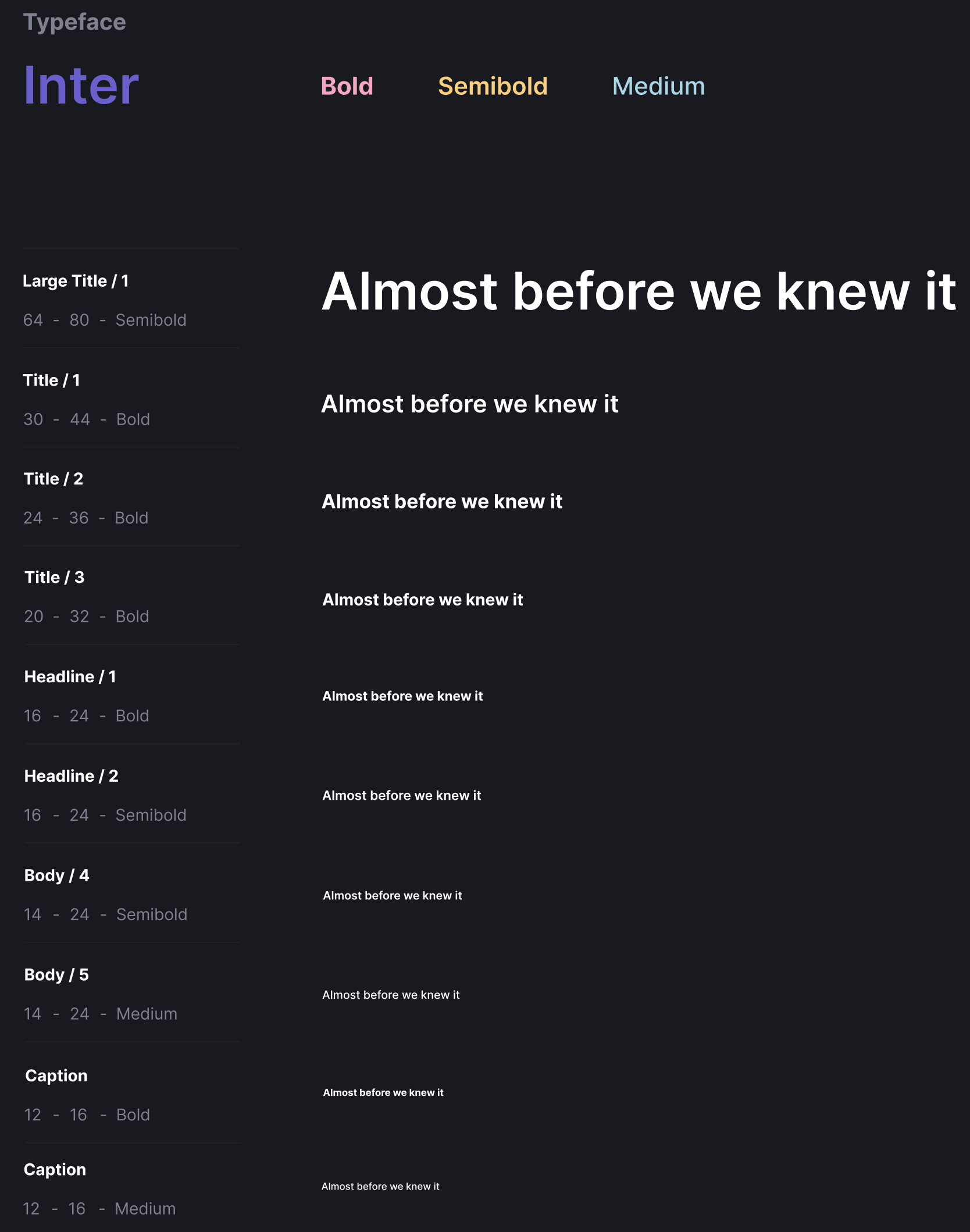
Inter is a variable font family carefully crafted and designed for computer screens. Inter features a tall x-height to aid in the readability of mixed-case and lower-case text. Several OpenType features are provided as well, like contextual alternates that adjust punctuation depending on the shape of surrounding glyphs, slashed zero for when you need to disambiguate ‘0’ from ‘o,’ tabular numbers, etc.
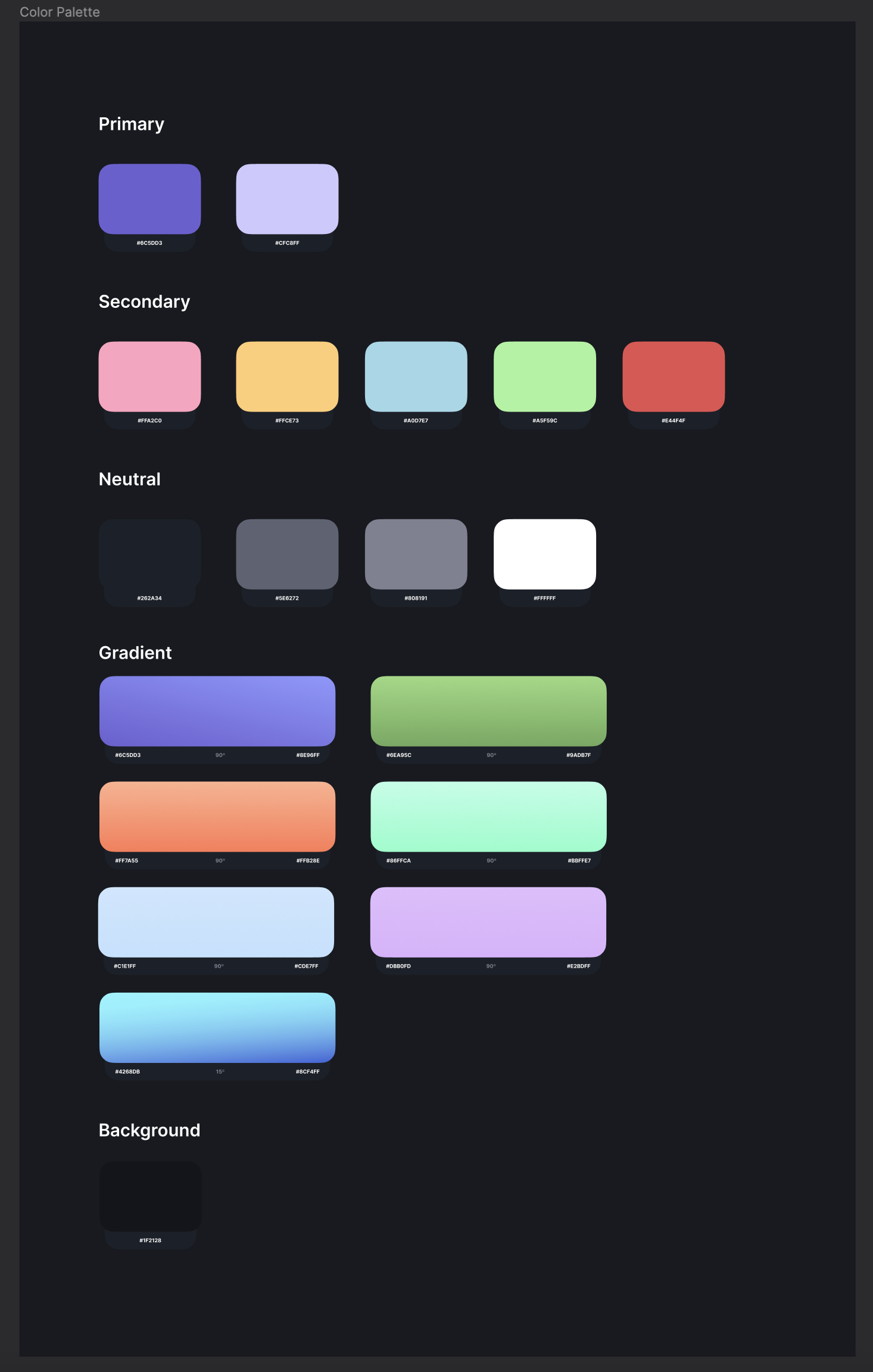
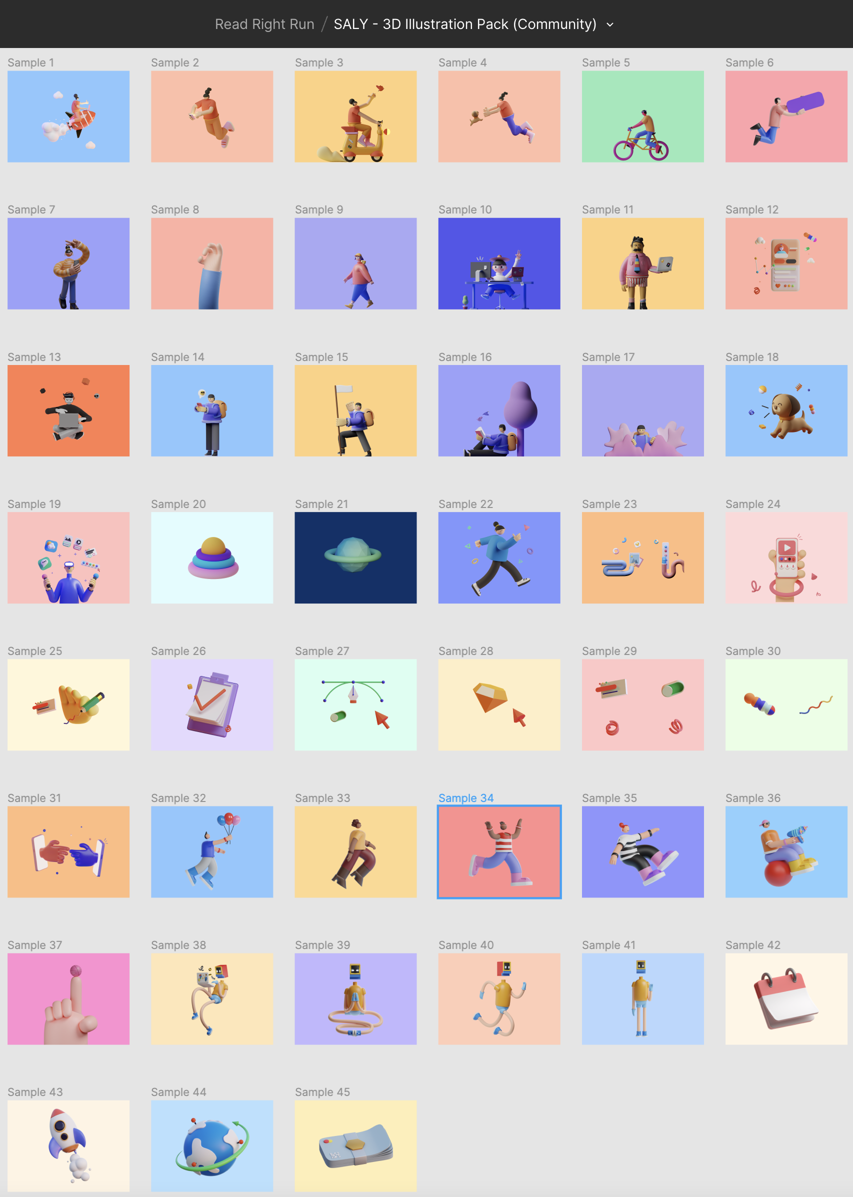
In a study published in the Journal of Experimental Child Psychology called Variables in the Color Perception of Young Children, Professor Rosslyn Gaines tested how the brightness and saturation of six different hues (green, red, purple, blue, orange, and yellow) affected color discrimination in children. In other words, is it more challenging for kids to distinguish different colors when they are darker or less saturated? According to this study, yes, it is more complex. While children are good at discerning colors when they are bright and saturated, the error rate increases as the colors get darker or more muted. Therefore, I chose to use the brightest colors from an illustration pack I found in the Figma Community.
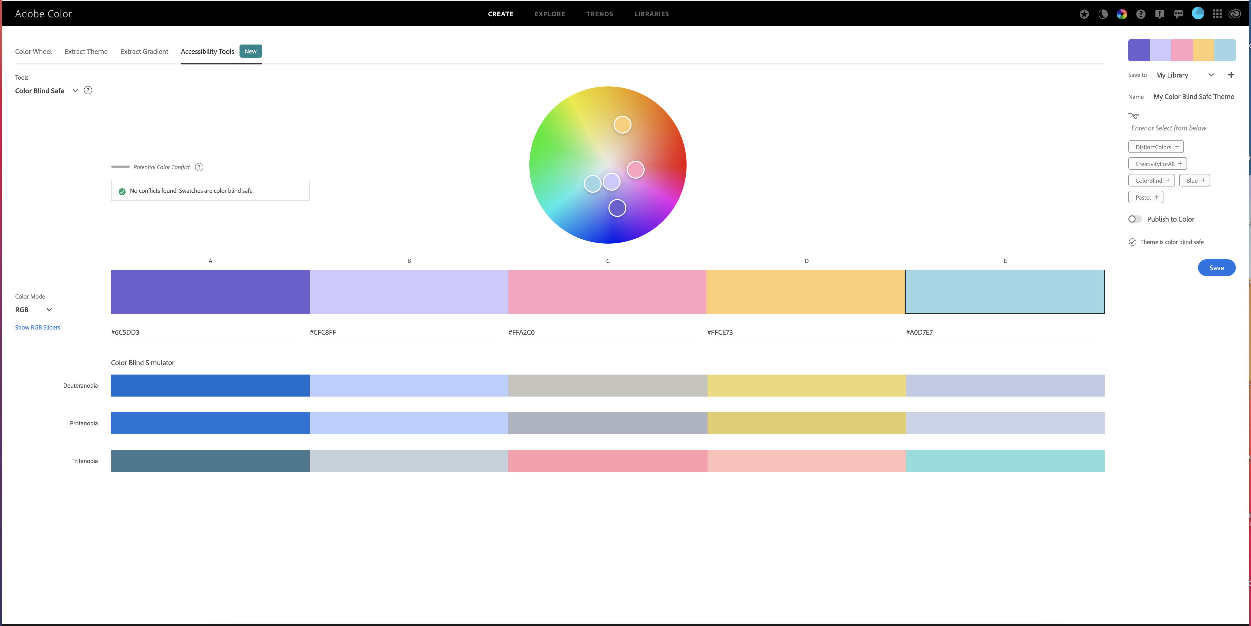
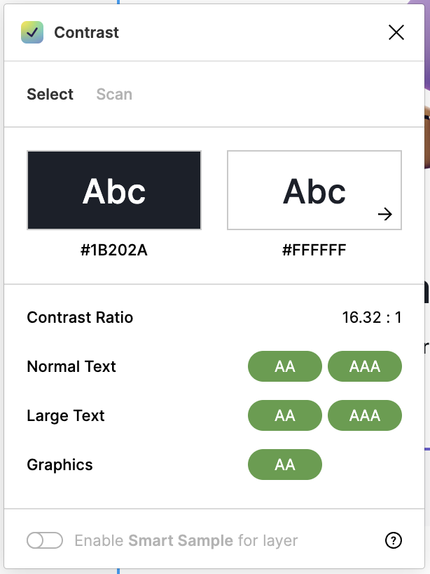
Whenever I am designing for people, I think about making it accessible for everyone. This applies to colors too. Color Vision Deficiency, more commonly referred to as color blindness, impacts between 3-8% of the world’s population. This means that not everyone is going to experience the colors I pick in the same way. Understanding how users may perceive my color choices early will save me from going back to the coloring board to find new shades when I discover my designs aren’t working for everyone. Using Adobe Color’s accessibility color tools from the start allows me to find accessible colors directly on the color wheel.
I chose to use two plug-ins in Figma:
With my finished mockups, I created a new project in Figma. Then, I developed a clickable, interactive prototype.
As part of our final checkpoint, we had to choose from three options. I chose Option 2: Visual design.To complete this path, I was expected to refine my prototype based on my feedback on this project. I focused on how my prototype looked and worked. I completed the following list of items:
After analyzing the feedback from the five participants, I learned that only one of the five individuals read the instructions before trying to swipe left or right. Therefore, I moved the instructions to the top of the screen.
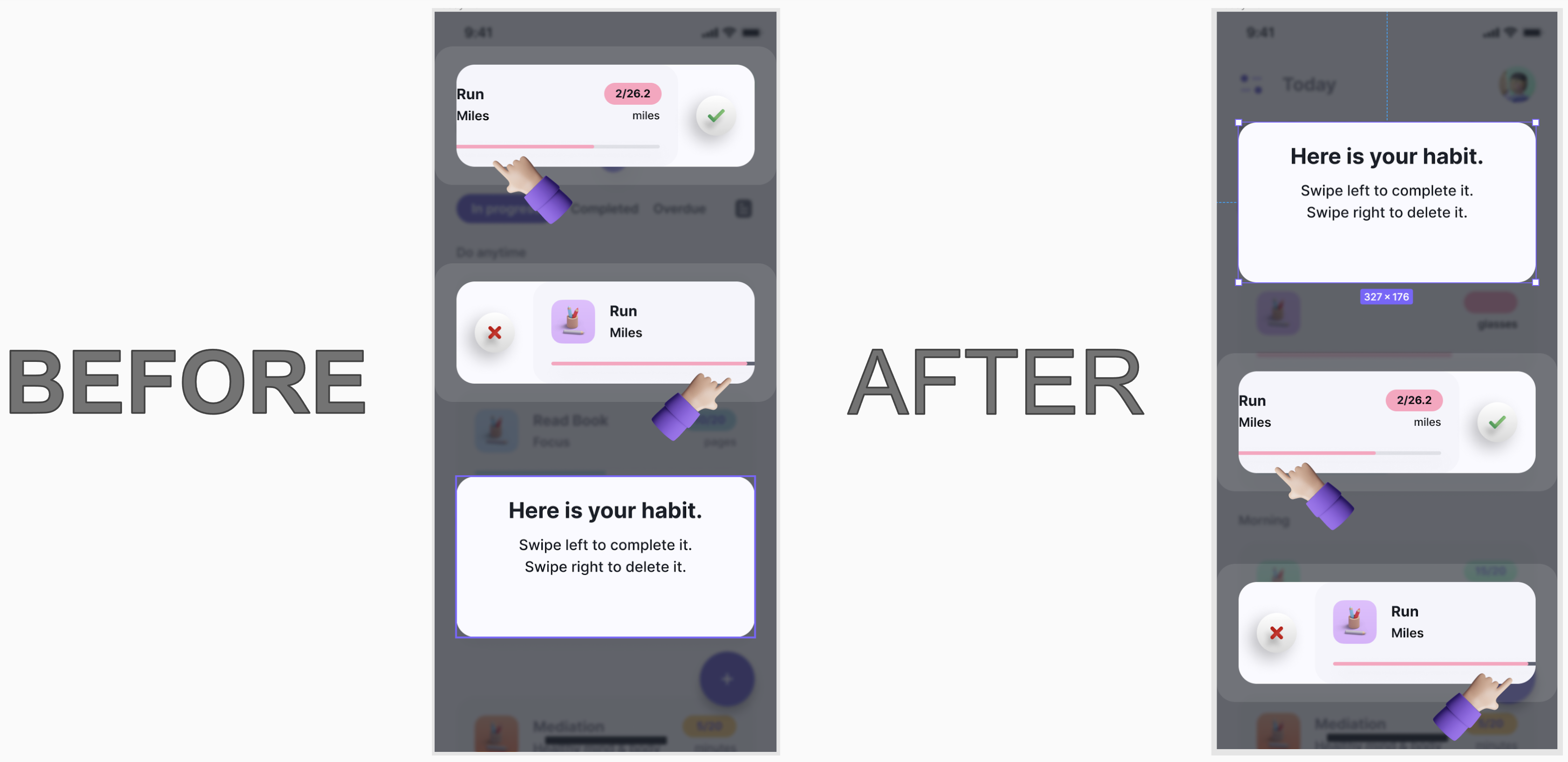
Three of the interviewees did not see the radio button next to the word ‘Today.’ They also didn’t know what a radio button was. So I had to change the wording to ‘circle.’ I also made the circles darker and more prominent.
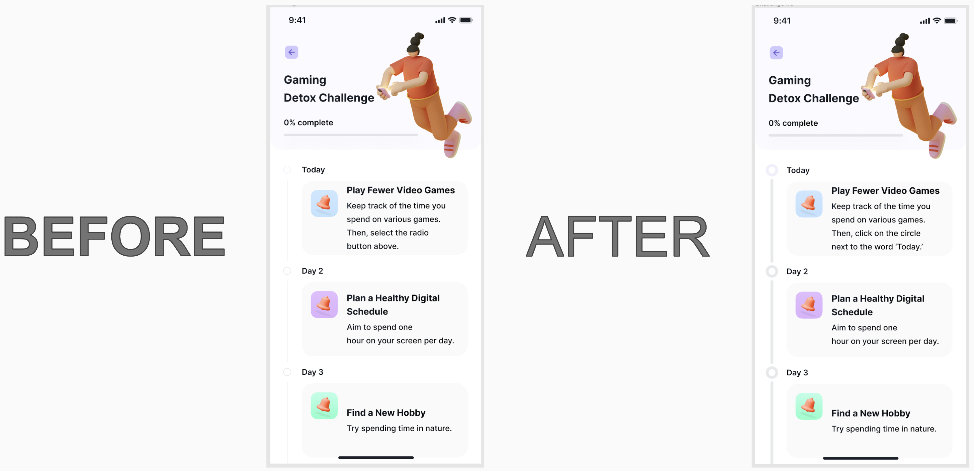
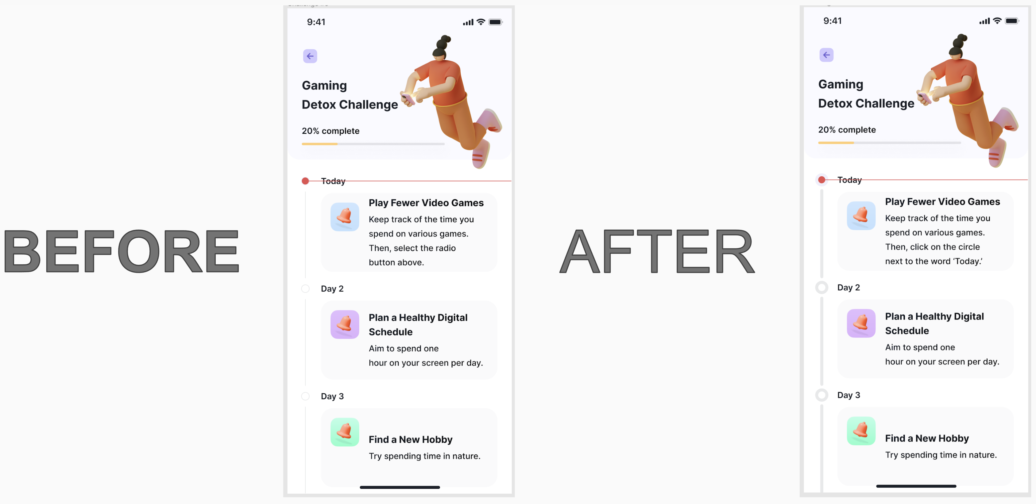
I changed this screen for the same reasons I updated the previous screen.
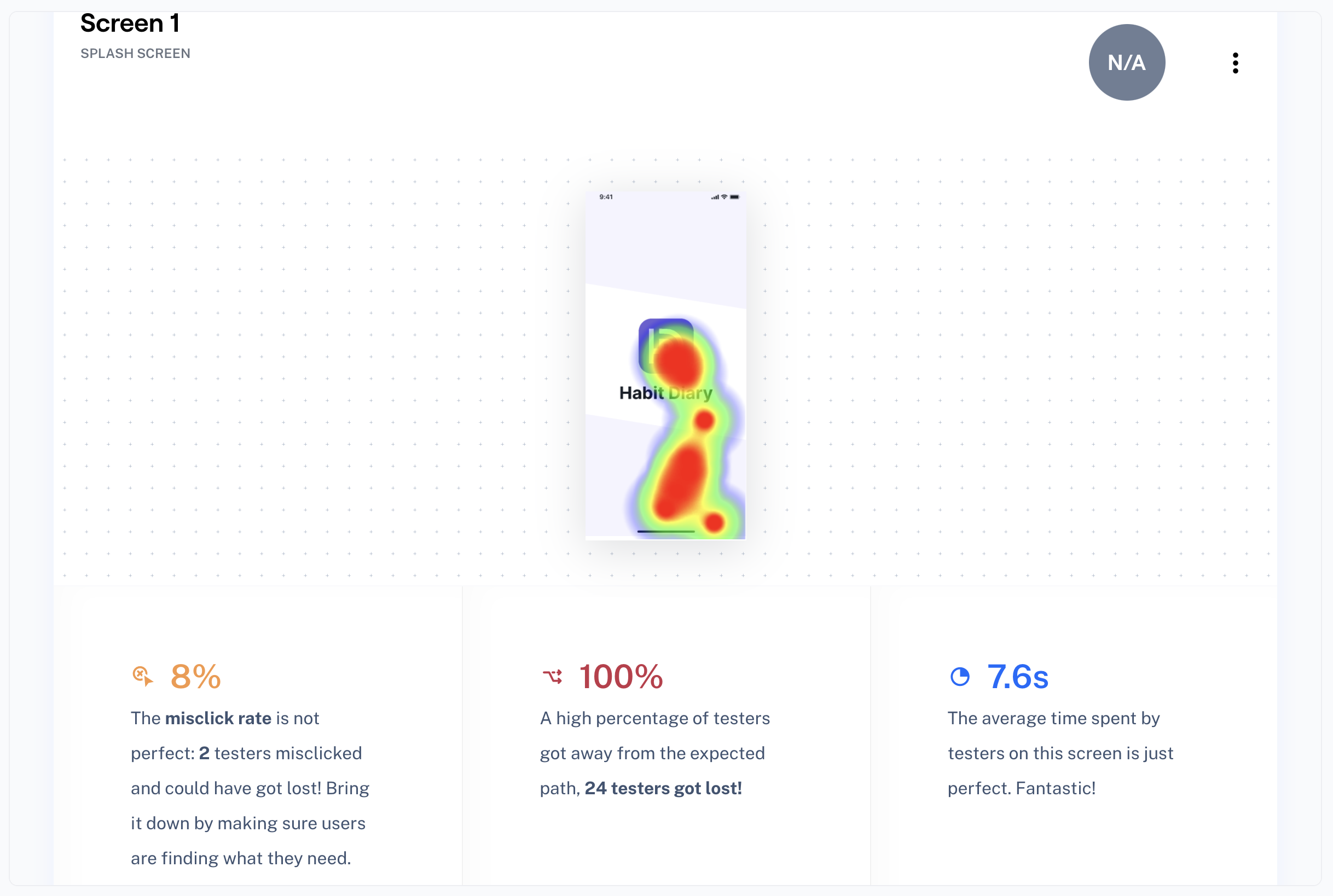
As previously mentioned, I utilized a Maze test to help fill in the gaps. There were 24 responses and ten blocks. Unfortunately, I learned a few things about the Maze test that may have skewed my results. Even if you remind the testers not to use their phones to take the Maze test, many will still try to use their phones. Also, they could not use some of Figma’s ‘interactions.’ They received errors on all of the screens that utilized ‘while hovering’ or ‘on drag.’
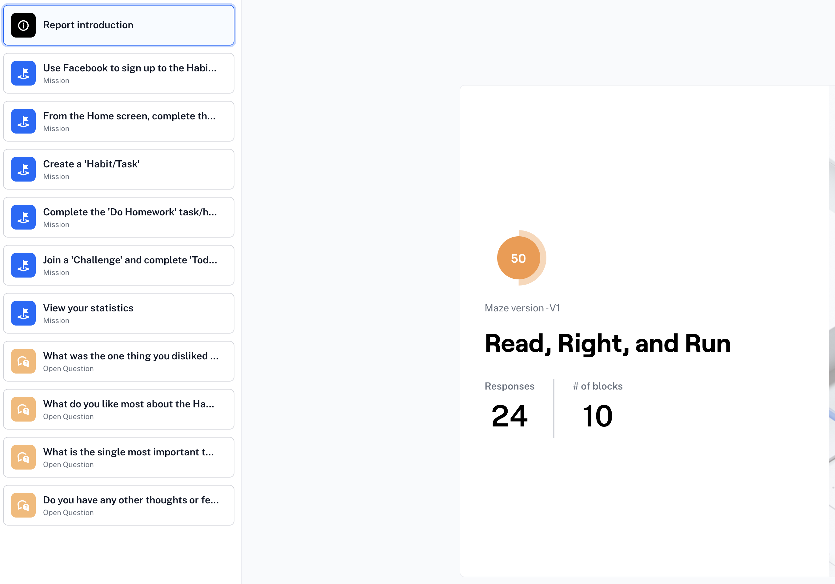
As you can see below, the very first screen has the ‘while hovering’ interaction on the prototype. Therefore, the test said that all of the testers got lost! However, they did not get lost. They simply did not have to click on the first screen. I have noted this problem for future Maze tests.
Two of the testers thought the drop-down icons should be larger. I have enlarged them and made them darker on the prototype.
The testers did manage to find a few things they liked about the prototype.
I’m glad that the users who tested the prototype on their computers instead of their phones found it easier to complete the Maze testing.
As previously mentioned, two of the testers found the drop-downs difficult to see.
I have enlarged the drop-downs and made them darker on the prototype.
While completing this project, I learned that Maze only allows your prototype testers to ‘CLICK’ on the prototype while testing. Other Figma interactions are not recognized. I paid for some Maze testers that aligned with my app’s audience, or I would have just created a new Maze. After I thoroughly researched the data of the Maze test, I was able to sort out the errors that skewed my results.
If given more time, one of the things I would have done differently would have been to create a way for the users of the Habit Diary to start a family account. I would also have the app suggest habits based on completed habits or habits other children in the area were completing.
In the future, I would like to create book suggestions for each age group. As a teacher, I had my students use the myON® website, which places ‘a personalized digital library at every student’s fingertips.’ I would also like to have resources for the children’s good deeds. For example, when I was coordinating this program as a teacher, I would have the children go to the website: Freerice. The United Nations World Food Programme is the world’s largest humanitarian organization. As the students answered questions on WFP’s site, they donated free grains of rice to people driven into hunger. Finally, I would like to include suggestions for running the miles required. I always ran with the students after school so they could complete their miles before the marathon.